
The Unicode Standard needs to encode regular and bold math calligraphic/chancery alphabets as well as regular and bold and fancy-script/roundhand alphabets, since chancery and roundhand alphabets are used contrastively by some authors and [La]TeX can support both kinds of letters. In most documents, chancery and roundhand styles can be substituted for one another pretty much as a choice of font. Accordingly, when the math alphanumeric symbols were added to the Unicode Standard, the two script styles were unified. But since then people have documented that the two styles aren’t always interchangeable and that mathematicians need a way to distinguish chancery from roundhand in the same document. This post discusses two ways to do this is spite of the quandary that some math fonts have chancery letters at the existing math-script code points, while the Unicode Standard has roundhand letters at those code points.
Note: the January 2021 meeting of the Unicode Technical Committee accepted 52 variation sequences for the upper-case script letters: 26 for roundhand and 26 for chancery. See L2/20-275R for the latest proposal.
Examples of both styles in same text
1) Here’s an example of chancery and roundhand F’s being used in the same document:
![]()
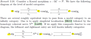
2) Here are examples featuring P’s and C’s in which script letters denote infinity categories
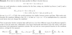
3) Still another paper has the following
4) Both script styles are in the OMS encoding for LaTeX as illustrated by
\documentclass{article}
\usepackage{calrsfs}
\DeclareMathAlphabet{\pazocal}{OMS}{zplm}{m}{n}
\newcommand{\La}{\mathcal{L}}
\newcommand{\Lb}{\pazocal{L}}
\begin{document}
$\La\Lb$
\end{document}
This LaTeX snippet displays a roundhand L followed by a chancery L
![]()
Accordingly, the need for both chancery and roundhand alphabets is attested.
Cambria Math/Unicode quandary
Complicating the addition of new alphabets is the fact that the current math-script alphabets may be chancery in one font and roundhand in another. Cambria Math, the first widely used Unicode math font, has chancery letters at the math-script code points, while the Unicode Standard has roundhand letters at those code points. For example, here’s the upper-case math-script H (U+210B) in Cambria Math followed by the one in the Unicode Standard:
![]()
The STIX math fonts have also had roundhand letters at the math-script codepoints, but in the STIX Two Math font, they have been changed to chancery. This removes the worst conflict in defining the new alphabets, although other math fonts might have roundhand letters at the current math-script codepoints.
Encoding methodologies
We discuss two unambiguous ways to allow math-chancery and math-roundhand symbols to appear in the same plain-text document:
- Follow a character in the current math-script alphabets with one of two variation selectors much as we use variation selectors (U+FE0E, U+FE0F) for emoji to force text and emoji glyphs, respectively. Specifically, to ensure use of the math-chancery alphabet, follow the current math-script letter with U+FE00. To ensure use of the math roundhand alphabet, follow the current math-script letters with U+FE01.
- Add the missing bold and regular script alphabets
Variation selector approach
The variation selector approach has the advantages
- Contemporary software supports variation selectors for East Asia and emoji, so adding new variation selector usage shouldn’t be much of a burden
- The variation selector U+FE00 is already used with a number of math operators
- No new code points need to be allocated
- Typical documents can continue to do what they have been doing: ignore the distinction
- If a math font doesn’t support the variation selectors, it falls back naturally to the current script letters instead of displaying the missing-glyph box (but the style difference is lost)
Adding two variation selectors for the math script letters may make people ask why we didn’t use variation selectors for the math alphabets in the first place, but we all know the arguments in favor of what we did (see the blog post on Math Font Binding). Adding two variation selectors seems to solve the script quandary quite well, although the use of variation selectors is generally a poor one for situations where symbol shapes need to be used in a contrastive manner—this case should therefore not serve as a general precedent, but should be seen as an exception, tailored to fit this specific case. One way to implement the variation-selector combinations is to use the OpenType feature tags ‘cv01’ and ‘cv02’.
Encoding with added normal and bold sets
The second approach adds the missing normal and bold script alphabets. These two new alphabets could go in the 1D380…1D3FF block which is reserved for math alphabets. Programs continue to display what they currently display by default.
Discussion
It might be worthwhile for programs like Microsoft Word to have a math document-level property that specifies which script alphabet to use for the whole document. Then a user who wants the fancy script glyphs could get them without making any changes except for choosing the desired document property setting. A similar setting could be used for choosing sans-serif alphabets as the default. Such alphabets are often used in chemical formulas.
The choice of chancery glyphs for the math script letters in Cambria Math is partly my fault. I had expected to see roundhand letters in Cambria Math as in the Unicode code charts. In my physics career I used math-script letters a lot, starting with my PhD thesis on Zeeman laser theory (1967) and followed by many papers published in the Physical Review and elsewhere and in my three books on lasers and quantum optics. Occasionally in a review article, chancery letters were substituted for roundhand letters because the publishers didn’t have the latter. And in the early days, the IBM Selectric Script ball and the script daisy wheels only had chancery letters. So I kind of got used to this substitution. Cambria Math was designed partly to look really good on screens, which didn’t have the resolution to display the narrow stem widths of Times New Roman and roundhand letters well. ClearType rendering certainly helped, but it seemed like a good idea to use less resolution demanding chancery letters. (Later Word 2013 disabled ClearType for various reasons and many readers of this blog have complained passionately ever since! With high resolution screens as on my Samsung laptop or the Surface Book, even Times New Roman looks crisp and nice with only gray-scale antialiasing, so hopefully this problem will diminish in time.)
Missing math Greek alphabets
LaTeX has the \mathsf{} and \mathsfit{} control words for math sans-serif upright and italic characters, respectively, and they work with Greek letters. Unlike the chancery/roundhand distinction, which is seldom used contrastively, upright and italic are usually used contrastively in mathematics. The Unicode Standard has upright and italic sans-serif math alphabets corresponding to the ASCII letters, but not for the Greek letters. Accordingly, these two math Greek alphabets should probably be added. The STIX Two Math font has them in the Private Use Area for the time being since users requested them.
Acknowledgements
Thanks to Asmus Freytag, John Hudson, Rick McGowan and Ken Whistler for enlightening discussions that substantially improved this post.
0 comments