
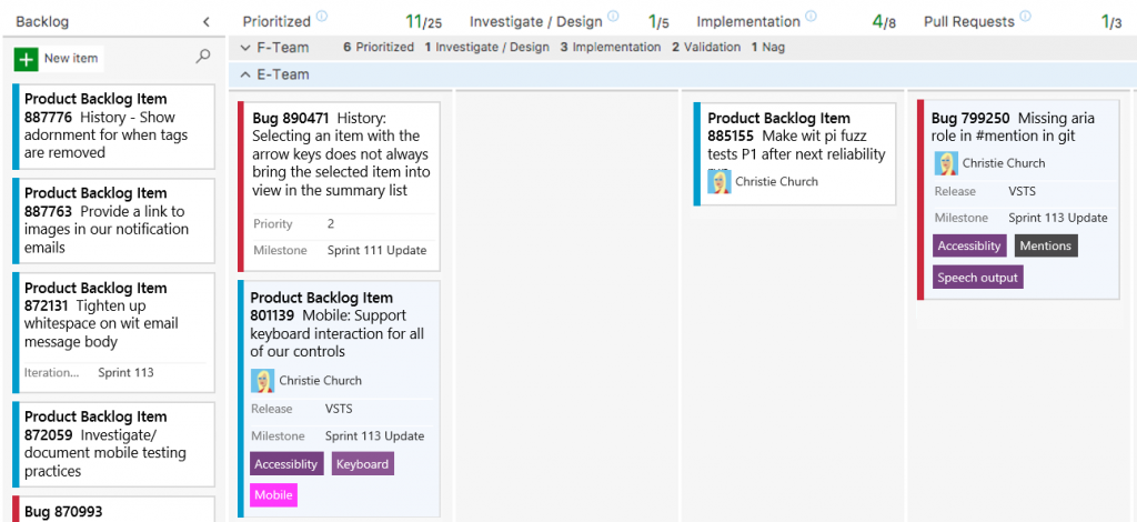
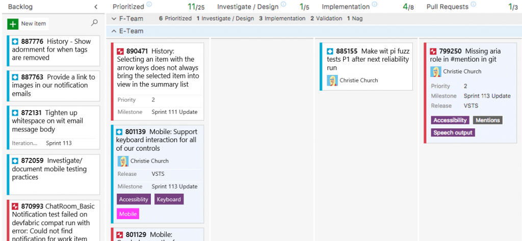
A little over a month ago, we rolled out work item type icons to all Visual Studio Team Services (VSTS) accounts and Team Foundation Server (TFS) with 2017.2.
It’s been awesome to see @VSTS tweets, Developer Community feedback, and direct emails from customers that are very excited about the icons. Additionally, we’ve received a lot of questions about the motivation for the change and if it was necessary to replace the color bar for everyone. In this post I’ll walk through what motivated our move to work item type icons, the design process, and some of our own learnings as we work to make VSTS accessible to everyone.
Identifying a potential problem
As part of our Visual Design tenet, color cannot be the sole means to convey meaning because users that cannot perceive all colors do not benefit from that information. While assessing the compliance of key WIT scenarios like viewing work items on the Kanban board, in work item grids, and in the links control we noticed that the work item type information is often omitted in favor of a color bar.
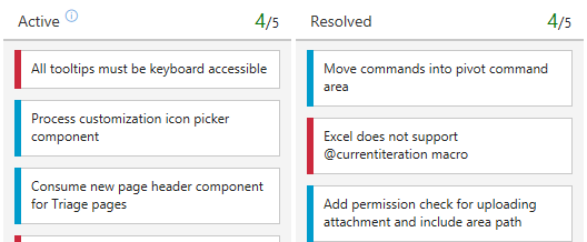
This becomes problematic when a user turns on high contrast mode because they immediately lose all work item type coloring, making every User Story, Bug, Feature, etc. appear the same.
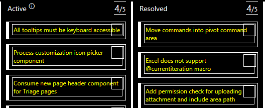
Looking at the side by side of the board with and without high contrast mode enabled, it was clear that this potentially violated the Visual Design tenet. However, we needed to dig deeper to understand if users associated meaning to the color bar.
Defining the problem
Before we started exploring new designs, we first had to identify if this was a violation of the color meaning requirement – Does the color bar provide value to our users? When asked, both internal and external users stated that they use the color bar to quickly understand work item type and many remove the work item type column because it’s unnecessary.
Since it is valuable, then What does a user with no visual impairment get from the work item type color bar? As we answered that question, we identified four important criteria our new design needed to meet:
- Recognizable – at a quick glance users should understand what types of work items are visible
- Minimalist – the new design should be compact and have a small visual impact
- Built in – the solution should be supported in VSTS as a first class citizen; no configuration necessary
- Flexible – users should be able to customize their work item type icons to fit the needs of their organization
Designing a solution
To meet our “Built in” criteria, we immediately discarded any design that required user or team configuration. We didn’t want to allow for the possibility that an admin could disable or remove functionality that was important to any of our users.
As we thought through the problem, we went through many iterations before landing on the design we have today. Below are a few of the iterations and reasons why we rejected them:
Work item type string
This was rejected because it did not meet our recognizable and minimalist criteria by increasing the amount a user must digest to get the type information. We also played around with 2-3 character short hand (PBI for Product Backlog Item) but determined strings were ultimately not as recognizable as an icon and presented additional complexity for TFS localization.
Abstract shape and color
This design meets all our criteria and in comparison to the type strings was minimalistic. It was eventually rejected in favor of icons due to the difficulty users had in associating the shape with a type.
Still iterating
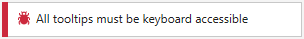
No matter how much thought goes into a design, there are always things that are unaccounted for; work item type icons was no exception. Almost immediately after rolling out the feature, we received user voice suggestions, developer community posts, and emails from customers who found the bug icon particularly unsettling. It was likened to “a disgusting cockroach” described by some as “vile and repugnant” and in extreme cases caused users a high level of anxiety due to their own fear of insects.
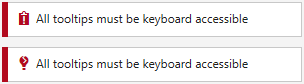
During design reviews of the new icons, we never imagined the impact a 16×16 pixel icon could have on a user’s work item tracking experience. In response to feedback, we added two other issue/defect type icons to our catalog as a customization option.
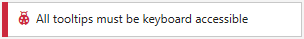
However, we ultimately decided that the best way to alleviate the strong reactions described by our users was to redesign the bug to be more friendly and approachable. After validating with customers both internally and externally, we strongly believe the new ladybug meets those design criteria
Helpful links
Below I’ve included some useful links to more information about customizing work item type icons as well as Microsoft’s inclusive design philosophy.
Feel free to leave your feedback or questions in the comments section below.
Thanks for reading!
0 comments