Note: The improvements discussed in this post will be rolling out throughout the next week.
I’m excited to announce that the preview of the mobile work item form in Visual Studio Team Services is finally here! In this post, I’ll walk you through some of the scenarios this mobile form enables, share the progress we’ve made, and give an update on what you can expect over the next few months.
Introduction
The mobile work item form optimizes the look and feel of your work items on your mobile devices. It also supports mobile-friendly controls to make your experience modern and intuitive.
On the go functionality
When on the go, getting key information quickly is extremely important. Now, when you click any work item link on your mobile device, Visual Studio Team Services will open a mobile-friendly version of the work item. This new experience has been optimized for both consumption and editing, streamlining the process of getting a notification and acting on it.
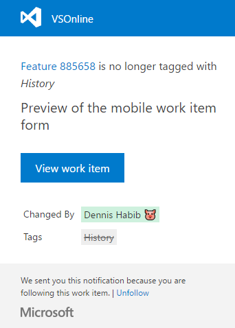
- Email – Whether you’re following an item that has been updated or @mentioned in a discussion, clicking on View work item will automatically open the new mobile experience if you’re on a mobile device.
- Microsoft Teams – You can also try our integration with Microsoft Teams. Hint: Try setting alerts for work item changes.
Mobile-friendly controls
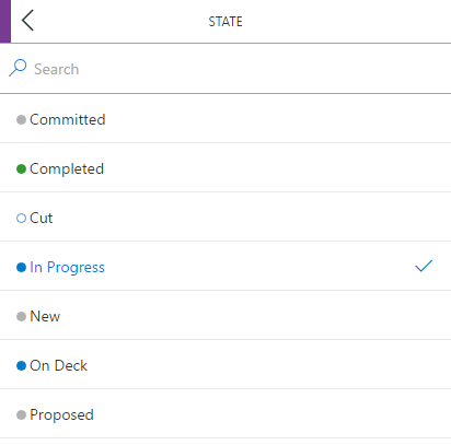
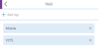
Controls on the form have been optimized for mobile. Editing any field will trigger full-screen experiences. For example, some of the most common actions such as changing the state of an item, moving to a different area path, adding an attachment, and creating/removing tags are all supported. Here’s a sneak peek at some of these experiences:
Coming soon
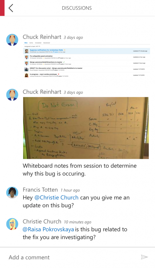
In the upcoming sprints, we will make the existing discussion experience mobile-friendly and will be looking at making the triage experience better through the use of our new account pages. Making some of the code experiences mobile-friendly is also in our road map, so stay tuned! Here is a visual teaser for discussion:
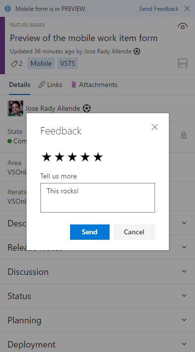
This functionality is still a couple of sprints away from being deployed across the service but hopefully this gives you a sense of where we are going. The team is excited to hear your feedback as we’re committed to making this mobile form one that you love using every day. Feel free to leave a comment below or use the Send Feedback experience in the banner at the top of the form:
Thanks, Jose Rady Allende @JMRady

0 comments