Gain understanding and insights into projects in Visual Studio Online with Power BI
The Visual Studio Online team is proud to present the initial release of the Visual Studio Online content pack for Power BI. This is the first in a wave of additions to the analytical capabilities of Visual Studio Online using Power BI to easily visualize data and gain insights not previously possible. Understanding data is the key to making insightful business decisions, identifying gaps and issues, fixing those issues and monitoring progress. You can try it now by signing in to www.powerbi.com.
What’s available in this release?
Before showing off some of the features, it’s important to know what’s included. Our efforts are focused on delivering incremental value to our customers so we get working product in their hands as quickly as possible. This allows customers to use the capabilities we deliver and allows us to get rapid feedback on what has been produced. With this in mind, source control data from Git repos (including Pull Requests) and Team Foundation Version Control are included in this initial release. For specific information on what is included in each dimension, check out the official documentation. Other data will be added in short order in addition to fine tuning the existing capabilities. Work Item tracking data is next.
Start by getting a Power BI account. Go to http://powerbi.com and sign up. Signing up is free. When you sign up for Power BI, you must use your organization or school email account. This does not have to be the same credentials you use to connect to VS Online. When you connect to VS Online to pull data into Power BI, you will be prompted for your VS Online credentials. Your Power BI account is completely separate from VS Online – you get a Power BI account and then VS Online is one of many data sources from which you can pull data.
Connecting to Visual Studio Online
The connection experience authorizes Power BI to access your VS Online account and starts with selecting the Visual Studio Online connector. It is important to note that there are two different scenarios for the connection process. These scenarios are outlined here:
1. Your VS Online account is backed by AAD and is the same AAD account you log into Power BI with.
2. You log in to your VS Online account with an MSA (Microsoft account/LiveID) or you log into your VS Online account with different AAD credentials than you log into Power BI.
Scenario #1: VS Online and Power BI AAD credentials are the same
1. Once you log into Power BI, click Get Data in the upper left corner

2. Select the Visual Studio Online connector and click Connect
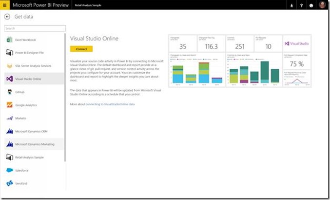
3. In the Configure Visual Studio Online dialog enter the account name (don’t include visualstudio.com so if the account is “corpx.visualstudio.com” just enter “corpx”) and the project you want to connect to.
a. Note that wildcards are supported. You could enter “” for every project in the account or, if you had projects with these names “Test1”, “Test2”, “Test3”, “App1”, “App2” and entered “Test” Power BI will retrieve data for the projects Test1, Test2 and Test3.
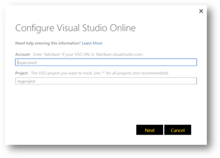
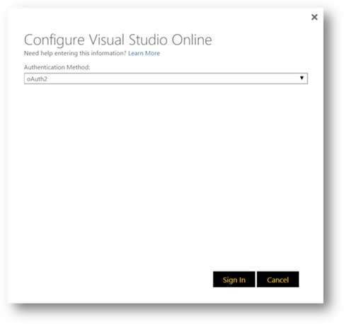
4. Clicking next will take you to the OAuth screen – only OAuth2 is currently supported at this time.
a. Please note that this is where the first issue may occur. It is possible, on the VS Online Connection Settings screen, for an administrator to turn off third party application access via OAuth. If an administrator did this, you will not be able to access your VS Online data through Power BI and you will need to contact your VS Online administrator. Here’s what the VS Online Settings screen looks like if everything is correctly enabled:

Click Sign In to continue. This will display the VS Online authorization dialog which allows Power BI to retrieve data from your account.
5. Click Accept

At this point, the screen will close and Power BI will begin importing your data.
Scenario #2: Using Microsoft Account or different AAD credentials (from Power BI) to log into VS Online
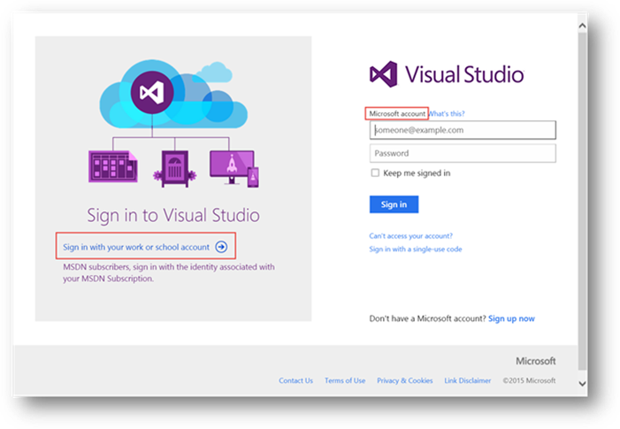
If you are using a Microsoft Account or different AAD credentials than you use for Power BI, you will need to supply those credentials to VS Online to get access to the data. This can happen in one of two ways. Either, the connect experience will prompt you for the credentials or, if you access VS Online often, your browser may have your most recent credentials cached. If the cached credentials match the account you are connecting to, it will work seamlessly, however, this caching can be confusing if the last account/username you used isn’t the one you need to enable Power BI to access the VS Online data. This can lead to Access Denied errors. If you are getting access denied errors without any prompt for credentials, then you should use In Private in IE or Incognito in Chrome to bypass the cache.
If your cached credentials work, you won’t get prompted. If you don’t have cached credentials, then you will be prompted to login to VS Online. If you are using a Microsoft account enter your credentials on the right hand side of the dialog. If you are using AAD credentials, click the link on the lower left hand side of the dialog.
Using Power BI with VS Online
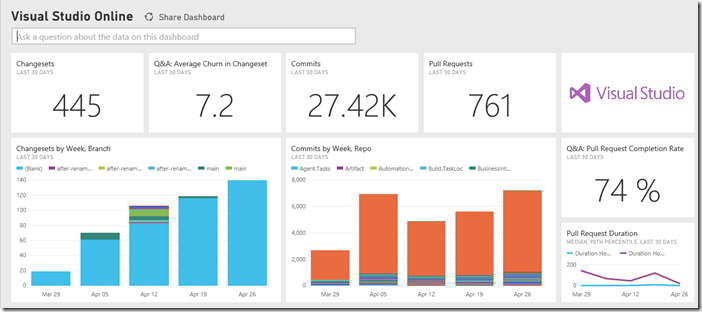
Once connected, data is populated in Power BI and an instant dashboard is created for you. Depending on the size of the data, this may take a few minutes.
Once connected, the first thing we recommend doing is changing the name of the data source. By default it is “Visual Studio Online”. If you connect to multiple VSO accounts, or multiple projects, this will become confusing. To change the name, hover over the datasets name and click the ellipses.

Click Rename to rename the dataset. It is also worth considering changing the initial report name and dashboard name.
Understanding how the data is retrieved, stored and updated
The data source that is connected to when retrieving data for Visual Studio Online is actually the public REST APIs. Once connected, data from the project is retrieved through those APIs and stored in a tabular model in Power BI. At the moment, every user who connects to Visual Studio Online retrieves a full copy of all of the data. The populated model cannot be shared but dashboards created from it can be shared (to share, select the ellipses next to the dashboard to share and click “Share”).
Currently the data is refreshed every 24 hours. Soon you will be able to schedule refreshes to happen more frequently so that the data is more up-to-date. For the moment, real-time data is best handled through the light-weight charting features within Visual Studio Online.
At this point the dashboard can be customized by novice or expert users in a variety of different ways. One of the newest and most innovative features in Power BI is the natural language query capability. As shown in the next picture, a user may ask a question such as “how many pull requests per day?” and the chart, scalar value or list (depending on the question) is dynamically generated – little knowledge of the underlying data model is required. This graph can then be pinned to the dashboard.

This capability gives stakeholders the ability to quickly ask a question in a non-technical manner and get a definitive answer back. As more data is added in subsequent releases, the types of questions that can be answered will expand.
Empowering the Enterprise
For more advanced users, custom reports can be created which allow data to be displayed in many different ways. Data from Visual Studio Online is a natural fit for the complex nature of development data. For example, while a graph can be created showing the amount of time it takes for pull requests to be completed, if some pull requests take longer, does this necessarily indicate a problem with the workflow? That question can only be answered by looking at correlated data. Perhaps the amount of time it takes to complete a pull request is related to the number of files changed in the pull request. With Power BI these types of correlations are simple to do.
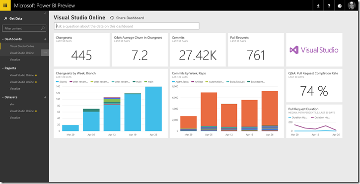
The default dashboard is backed by the default report that is created. Starting off with this dashboard:
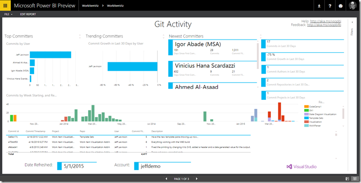
Clicking the Commits by Week, Repo will take you to a specific report with more detail (in this case the default report):
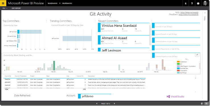
At this point everything on the page becomes interactive. Clicking the week of March 2nd on the middle graph results in the report looking like this:
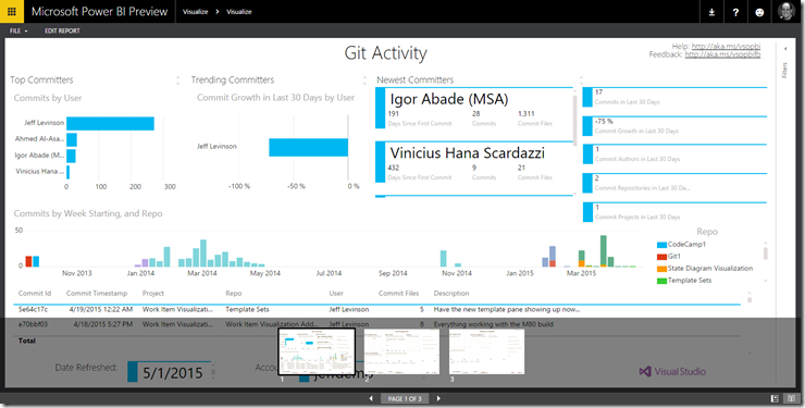
Now everything on the report is filtered by the week starting on March 2nd. And this exposes some of the amazing power provided by Power BI. Graphs are no longer static, they are all correlated to each other. Virtually anything that shows a visualization can be selected which causes everything else to be filtered. In addition, reports can have multiple pages which are easily navigated at the bottom of the page:
The default report creates three pages, a Git Activity, Pull Request and Version Control page.
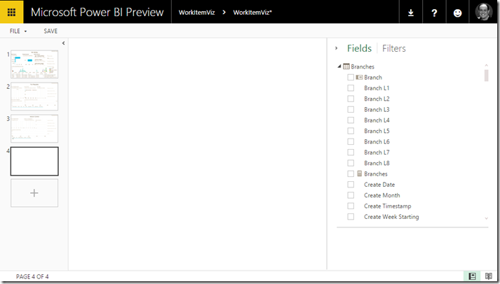
To add to the report for a given dataset, open the report and click Edit Report in the upper left corner. At this point all of the data in the dataset is exposed to you. Once you click Edit Report, click the plus in the blank page on the left side of the screen as shown here:
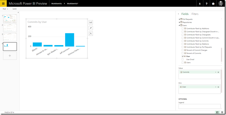
This adds a new blank page. To start creating new graphs, just click the fields (or measures which are represented by a calculator next to the field names) and they will be added to the report. For example, suppose you wanted to see the number of commits made by each user. Under the User dimension, click the User field (this will generate a “rank by commits” graph as the default so just remove the “Contributor rank by commit” entry from the values on the right side of the screen. Go up to the Commits section and check the Commits measure. You end up with this report:
Note the measure is the value field on the right and the Axis is “User”. Optionally you can drag another field to the legend area which will add another dimension to the graph. But we can take this one step further.
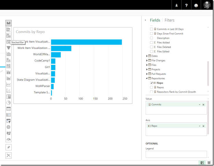
Say an end user (development manager maybe) is interested in who add/edited/deleted files in a given repo. Click anywhere in the blank space on the report to deselect the graph. Then expand the Repositories dimension and click the Repo field. Uncheck the measure that is added by default. Expand the Commits dimension and click the Commits measure. You can also just drag the Commits measure to any blank area of the canvas to create a new visual. You can even drag it into an existing visual to add it there too. The web experience is fully touch optimized, so you have a lot of fun with it on a touch screen. At this point there is a basic graph there. Change the graph type to a stacked bar chart as shown here:
The chart button will appear to the left or the right of chart when the mouse is hovering over the chart. Next, click the Files Added, Files Deleted and Files Edit measures in the Commits dimension. And with these few steps the following report is created:
Selecting the any of the bars on one chart will filter the results on the other. Either chart can be pinned to the dashboard once the report is saved.
These capabilities combined with the advanced visualization offered by Power BI let you make sense of your data faster than before. As we make more data available, more information and more correlations for deeper insight and understanding of you processes will become possible. Please give the new Visual Studio Online content Pack for Power BI a try and give us your feedback!
Sign up for Power BI at www.powerbi.com


 Light
Light Dark
Dark
0 comments