
The Azure Boards team is thrilled to announce the GA of Delivery Plans in the Azure DevOps Service!
We have worked hard over the past year to deliver a feature our customers have wanted for a long time. To use it click “Delivery Plans” on the left navigation under the Boards service. Delivery Plans will be available for Azure DevOps Server (on-prem) later this year with Update 2.
Thank you to all the customers who participated in the private and public previews, the feedback was invaluable.
Delivery Plans 2.0 delivers on 3 key scenarios
- A timeline view of the plan
- Progress of the work
- Dependency Tracking
These scenarios work across teams and projects. Delivery Plans 2.0 is now native to the product so an extension is no longer required. Plans created with the original Plans extension will continue to work in Delivery Plans.
Here’s a quick comparison of the differences between Plans and Delivery Plans
| Feature | Plans 1.0 (extension) | Delivery Plans 2.0 |
|---|---|---|
| Number of teams | Limit is 10 | Limit is 15 |
| Work item timeframe | Iterations only | Start/Target date and Iteration |
| Visualization | Full card view | Condensed and Expanded views |
| Roll-up information | None | % done of child and linked items |
| Dependency Tracking | None | Yes |
| Start Time visualization | No, only where work item ends | Yes, both start and target dates |
| Card Styling | No | Yes |
Delivery Plans Features
Below are the main features. Filtering, Markers and Field Criteria are also part of Delivery Plans.
Views
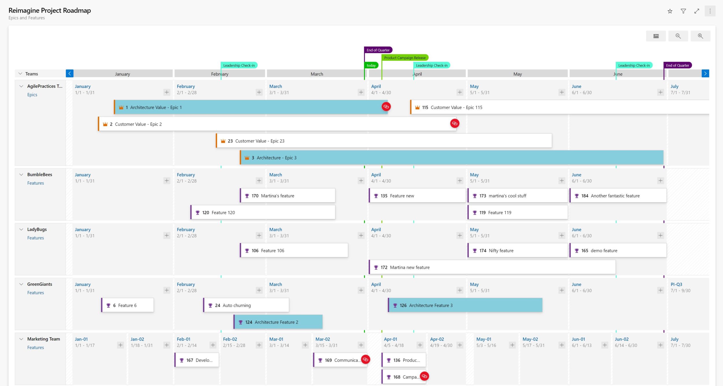
Work items in a Delivery Plans 2.0 plan are based on start and target dates, and iteration dates. The order of precedence is start & target dates then followed by iteration. This enables customers to add portfolio level work items like Epic which often are not defined to an iteration. There are two main views the condensed view and expanded view. Customers can also zoom in and out of the plan by clicking on the magnifying glass in the right-hand side of the plan.
Condensed View
The condensed view shows all work item cards “collapsed” meaning that not all card information is shown. This view is useful for an overall view of the work in the plan. To collapse the card fields, click on the card icon next to the magnifying icons in the right-hand side of the plan. Here’s an example of a plan toggling between the condensed and expanded views.
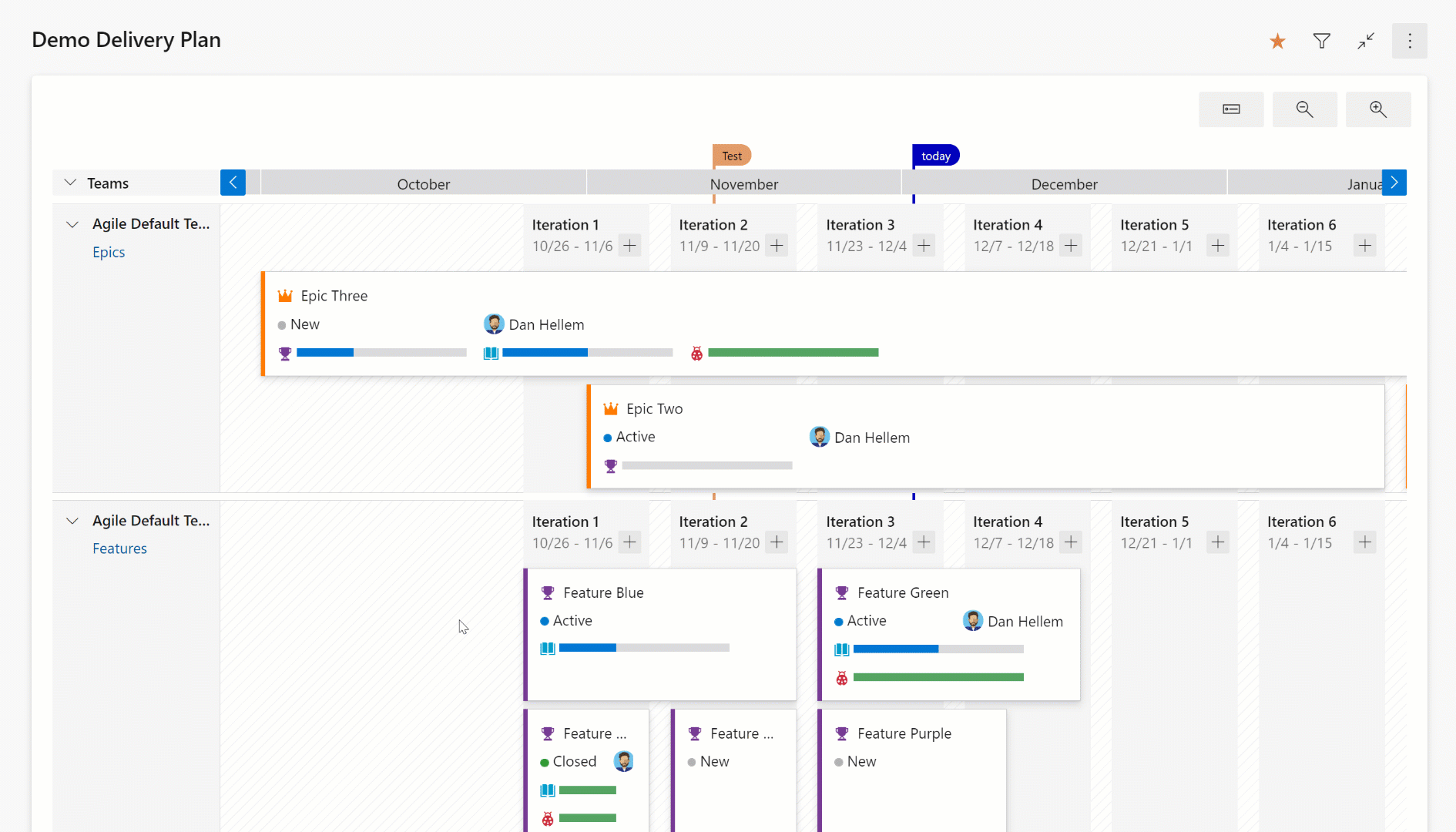
Expanded View
The expanded view shows the progress of a work item by counting the number of child and linked items and showing the percentage complete. Currently progress is determined by work item count. Here is an example of a plan using an expanded view. Note the progress bars and percentage complete.
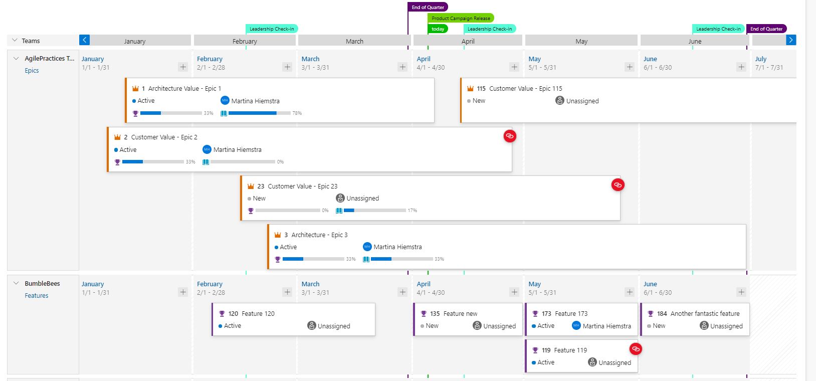
Dependency Tracking
Dependency tracking is based on predecessor and successor links being defined in work items. If those links are not defined, then no dependency lines will be displayed. When there is a dependency issue with a work item, the dependency link icon is colored red.
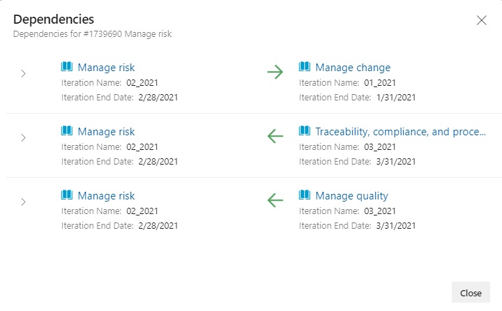
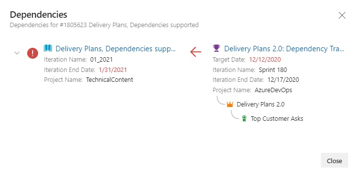
Viewing Dependencies
Specific dependencies are viewed through the dependency panel which shows all the dependencies for that work item, including the direction. A red exclamation mark indicates a dependency problem. To bring up the panel simply click on the dependency link icon in the upper right corner of the card. Here are examples of dependencies.
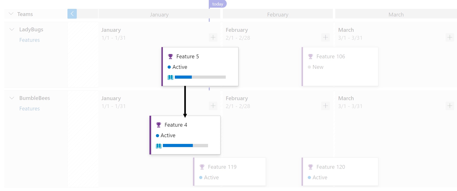
Dependency Lines
Dependencies between work items are visualized with arrow headed lines between the respective work items. Multiple dependencies will display as multiple lines. A red colored line indicates a problem. Here are some examples
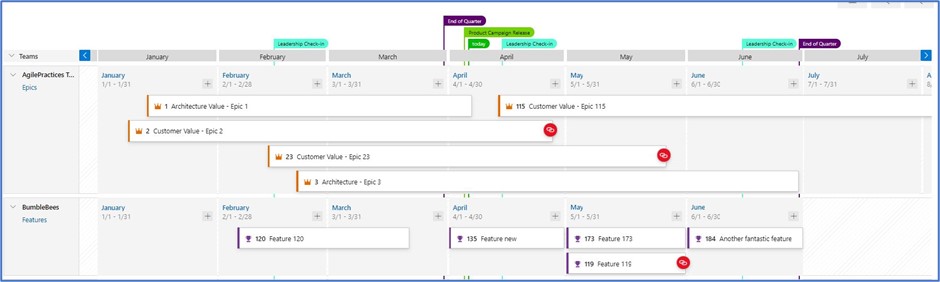
Here’s an example of a work item with multiple dependencies and it works using condensed view too.

When there is an issue the line color is red, and so is the dependency icon. Here is an example.

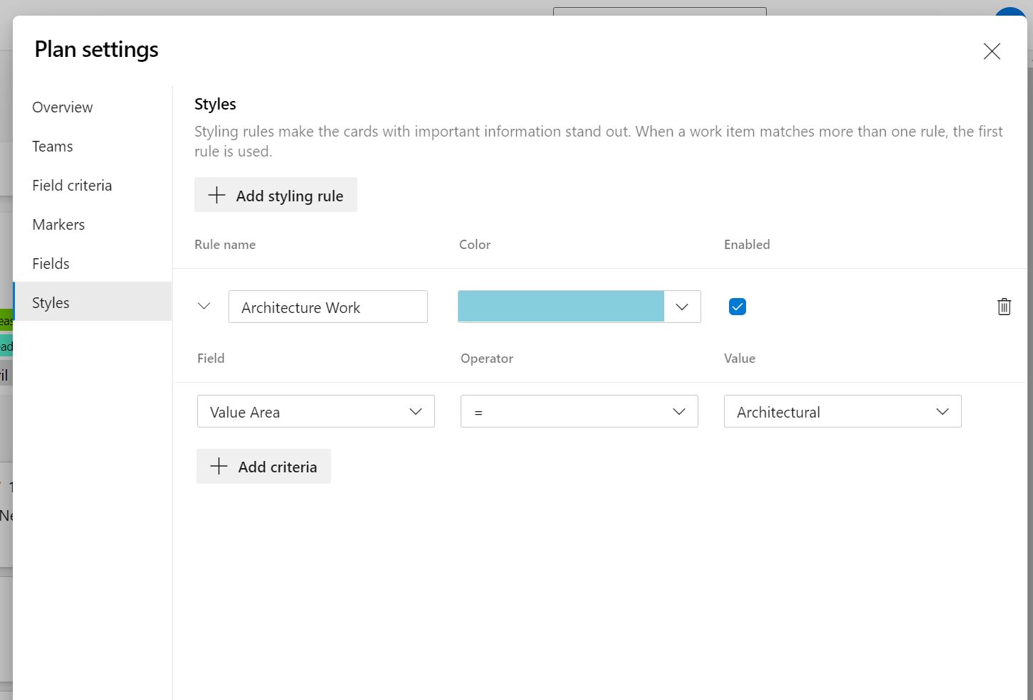
Card Styling
Cards can now be styled using rules, like the Kanban boards. Open the plan settings and click on “Styles”. In the Styles pane click on “ + Add styling rule” to add the rule and then click “Save”. There can be up to 10 rules and each rule can have up to 5 clauses.
This example shows the before and after views of a Delivery Plan with a card styling rule that highlights architecture work.
Before…

After…
Hi, I’ve been trying to understand how I create a plan with multiple projects, like a PMO view. This earlier article indicated that plans would support multiple projects.
I was hoping to use the planning view primarily for scheduling projects, resources, and in some cases mapping dependencies.
Any assistance/guidance or reference material would be greatly appreciated. Thank you.
I am trying to figure out the exact same.
I am having issues with rollups and dependencies across projects.
We were looking to have epics as our top portfolio item, have all epics in a separate project, and link features from other projects to these epics. This would let us tie the backlogs from several projects and teams together and follow up delivery status and dependencies on shared initiatives. Sadly nothing gets rolled up to the epic level.
This is such a nice feature! any idea on when will it be available for on-prem deployments?
Hi Martina,
Is it possible to re-arrange the vertical order of product backlog item in delivery plans permanently? At the moment I am able to re-arrange it but every time it is refreshed, the order will be arranged according to the product backlog item ID.
Hey, is there a way to bring in Tasks under delivery plan ?
Could you please direct me to the right place to request for this feature ?
For our companies use case, we really need to track the roadmap of our tasks.
Currently Tasks can’t be brought into Delivery Plans. Please provide the suggestion here: https://developercommunity.visualstudio.com/search?space=21
Thanks