During the Microsoft Ventures hackathon in May 2015 it became obvious that one of the startups (CreativeWorx) required a standalone Excel-like spreadsheet component for the web. This post describes the resulting React component, how it was built, and how it can be used today.
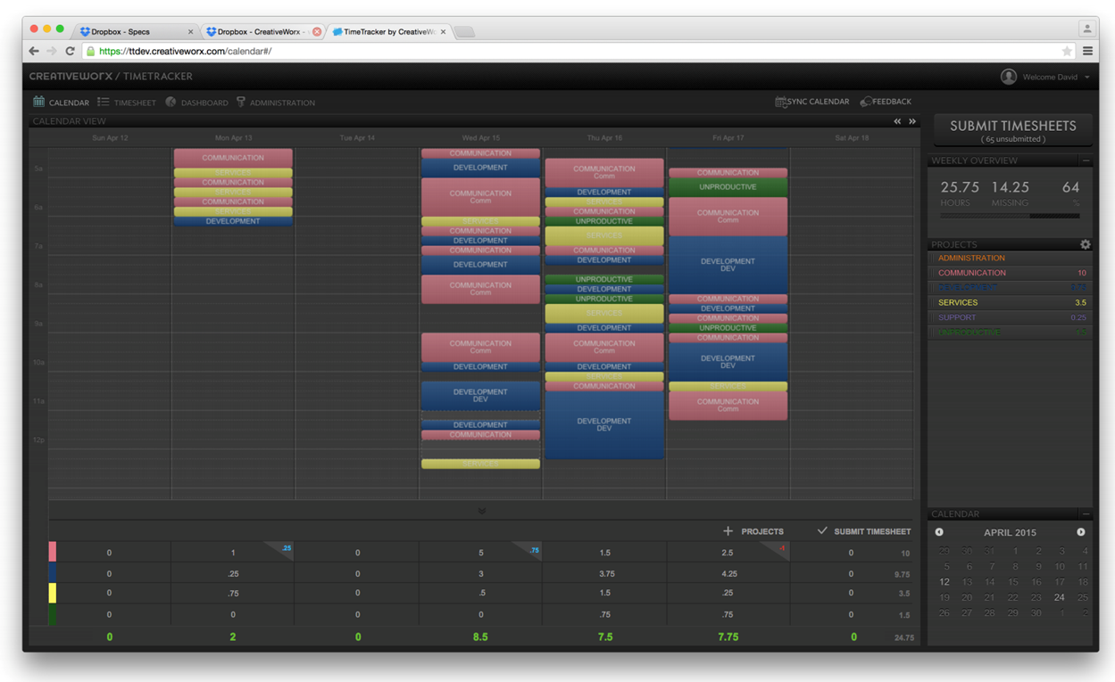
CreativeWorx is the company behind the CreativeWorx time tracker, which enables users to document time spent on a project in a calendar view. While this feature is the unique value proposition for the app, many users have requested an Excel-like input method to augment the information captured by the CreativeWorx calendar. Building such an input is surprisingly difficult: Users have grown fond of Excel’s keyboard navigation, allowing them to quickly switch cells and edit their inputs without mouse clicks. They wanted the same experience in CreativeWorx time tracker.

Overview of Solution
The CreativeWorx team was working on a significant rearchitecture of their application, and wanted to not add any additional dependencies. The Spreadsheet component was required to be entirely independent from the rest of the application.
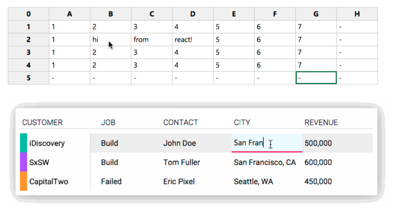
To solve that need, we used Facebook’s ReactJS, which is optimized for standalone components. The developed Spreadsheet Component is a self-contained spreadsheet component that can be run in a heavily styled mode, but also allows other developers to use it in a more Excel-like spread sheeting mode.

Implementation
The component is made up by three React Component Classes – the overarching spreadsheet component implements “row components” that in return implement “cell components”. This enables the spreadsheet to implement as many rows and columns as needed, including the dynamic addition of rows and columns.
Usage
The component is initialized with a configuration object. If desired, initial data for the spreadsheet can be passed in as an array of rows. In addition, one can pass in a second array filled with class names for each cell, enabling the developer to style each cell differently.
var SpreadsheetComponent = require('./src/spreadsheet');

React.render(<TableComponent initialData={initialData} config={config} spreadsheetId="1" cellClasses={classes} />, document.getElementsByTagName('body'));
Configuration
To ensure that the component could also be used by other developers and by CreativeWorx in different contexts, the configuration allows for a number of settings:
var config = {
    // Initial number of rows
    rows: 5,
    // Initial number of columns
    columns: 8,
    // True if the first column in each row is a header (th)
    headColumn: true,
    // True if the data for the first column is just a string.
    // Set to false if you want to pass custom DOM elements.
    headColumnIsString: true,
    // True if the first row is a header (th)
    headRow: true,
    // True if the data for the cells in the first row contains strings.
    // Set to false if you want to pass custom DOM elements.
    headRowIsString: true,
    // True if the user can add rows (by navigating down from the last row)
    canAddRow: true,
    // True if the user can add columns (by navigating right from the last column)
    canAddColumn: true,
    // Override the display value for an empty cell
    emptyValueSymbol: '-',
    // Fills the first column with index numbers (1...n) and the first row with index letters (A...ZZZ)
    letterNumberHeads: true
};
Initial Data Object
The initial data object contains an array of rows, which itself contains an array for every single row. Each index in the array represents a cell. It is used by the component to pre-populate the cells with data.
var initialData = {
    rows: [
        ['Key', 'AAA', 'BBB', 'CCC', 'DDD', 'EEE', 'FFF', 'GGG'],
        ['COM', '0,0', '0,1', '0,2', '0,3', '0,4', '0,5', '0,6'],
        ['DIV', '1,0', '1,1', '1,2', '1,3', '1,4', '1,5', '1,6'],
        ['DEV', '2,0', '2,1', '2,2', '2,3', '2,4', '2,5', '2,6'],
        ['ACC', '3,0', '3,1', '3,2', '3,3', '3,4', '3,5', '3,6']
    ]
};
Cell Classes Object
You can assign custom classes to individual cells. Follow the same schema as for the initial data object.
var classes = {
    rows: [
        ['', 'specialHead', '', '', '', '', '', ''],
        ['', '', '', '', '', '', '', ''],
        ['', 'error', '', '', '', '', '', ''],
        ['', 'error changed', '', '', '', '', '', ''],
        ['', '', '', '', '', '', '', '']
    ]
};
Data Lifecycle
The initialData object is only used in initialization to populate the state, so user input is not written to it. To capture user input, one can subscribe callbacks to the cellValueChanged and dataChanged events on the dispatcher. This enables the spreadsheet component to be used in more complex scenarios, like external data validation.
Get the full data state after each change
var Dispatcher = require('./src/dispatcher');

Dispatcher.subscribe('dataChanged', function (data) {
    // data: The entire new data state
}, "spreadsheet-1")
Get the data change before state change
var Dispatcher = require('./src/dispatcher');

Dispatcher.subscribe('cellValueChanged', function (cell, newValue, oldValue) {
    // cell: An array indicating the cell position by row/column, ie: [1,1]
    // newValue: The new value for that cell
}, "spreadsheet-1")
Other events are available for even more complex scenarios. The selection/deselection of cells, click on head cells, creation of new rows or columns, or even the beginning or ending of a cell edit process can be captured by external listeners.
Challenges
Cross-browser support was challenging. A lot of progress has been made recently on user input, but the Spreadsheet component could not make full use of the new DOM and JavaScript APIs and still be usable by older browsers.
Another challenge was interaction with the clipboard. CreativeWorx deemed it unnecessary, but if the popularity of the component continues to rise, we may consider revisiting it. Being able to copy and paste values without the current hiccups is likely to be a popular request. It’s important to point out that browsers heavily restrict the interaction with the clipboard for security reasons, which is why this feature is unavailable in Excel Online.
Opportunities for Reuse
The component is currently listed on Facebook’s own ‘Complementary Tools’ page and became Felix Rieseberg’s most popular GitHub repository within two days, so it’s clear that many developers are already considering reusing this component for their own apps.
Since the component is entirely standalone, it can be reused in any number of websites and web apps that require user table input.
How to run the Example
- Clone the repository from GitHub and open the created folder:
git clone https://github.com/felixrieseberg/React-Spreadsheet-Component.git
cd React-Spreadsheet-Component
- Install npm packages and compile JSX
npm install
grunt
If you are using Windows, run the following commands instead:
npm install --msvs_version=2013
grunt
- Open the example in
example/index.html.
