
This sprint is the smallest service change in a while. It was the last sprint for really wrapping up our TFS 11 on-premises work so most of our effort went into that. I’m expecting that we’ll see a significant increase in new service capabilities over the next couple of months.
So, for the most part, this deployment has a bunch of miscellaneous bug fixes. There’s really one significant change – some navigation restyling and one new feature.
Navigation restyling
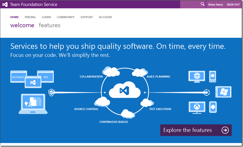
Before 7/16, the service navigation experience looked like this…
About a month ago we launched a new “Welcome” experience to learn about the Team Foundation Service.
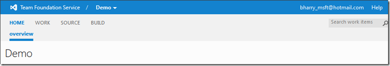
You’ll notice some difference. Among them, the welcome experience has color ![]() See, we did listen to all that feedback about colorless UI. The navigation section at the top is also styled differently.
See, we did listen to all that feedback about colorless UI. The navigation section at the top is also styled differently.
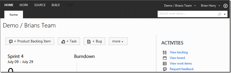
We set out this sprint on making some progress on consistency between the experience and addressing some styling aspects we didn’t like. This will be an iterative approach, so as we get more feedback, we’ll continue to refine it. We’ve started with the main nav experience (we haven’t updated the admin experience yet and in some ways, we’ve leap frogged the Welcome experience). The goal is to get some feedback on this and then apply the “good changes” to other areas. So, when you visit your project on Team Foundation Service after 7/16, it will look like this. Some comments…
1) We added some color to the top nav bar. The welcome site will stay purple and the project will be blue. This corresponds to Visual Studio where VS has a purple style when no project is loaded and a blue one when you load a project.
2) We removed the “tab look” and went to a more modern, chromeless look like we did in the welcome site (though we did add an underline to highlight the tab you are on).
3) We reorganized some of the elements, like project drop down, help menu, etc to align a little better with how we see the overall experience evolving.
We’ve also beautified the menus a little bit.
Ultimately style has a big personal taste component to it. We’re certainly interested in any feedback you all have and as I said, we expect to iterate on it a bit. One thing I’ve noticed is that it looks better on IE9 than IE8. There are some subtle differences that we need to do some work to improve.
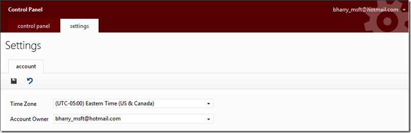
Time zone and Account Owner
The other significant thing we did this sprint was to add settings for time zone and account owner.
- The default time zone for the service has been UTC – a great value for all of you living in Greenwich, England. For a long time, we’ve had the ability to set the time zone on a person by person basis – that’s great for the lone person at a remote site but kind of a pain for a whole team sitting in Chicago. Now you can set the default time zone for the entire account and then individuals can override it in their profile.
- One of our bigger support requests over the past few months has been around changing the account owner. Each LiveID can only have one account. Sometimes people want to change their LiveID, etc. Changing the account owner has been something you had to contact support to do. Now you can do it yourself. A note, the LiveID you want to change it to needs to first be added to the account and then used to log in to tfspreview. It’s then an active ID in the account and can be selected as the owner.
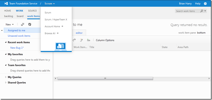
You can get here by clic king on the little gear in the upper right hand corner of the project UI. Then click on the “Control Panel” element of the bread crumb (upper left hand section).
As always, we’re thrilled to continue to bring ongoing service improvements.
Brian
0 comments
Be the first to start the discussion.