 Beautiful user interfaces sell mobile apps, and designing a successful user experience for your app is a great first step for success. But what about all of the little details that combine to create a fantastic design, such as colors and fonts? Even if you create what you believe to be the perfect design, users will often find something to dislike about it.
Why not let the user decide exactly how they would like their app to look? Many popular apps have taken this approach. Tweetbot has light and dark modes and the ability to change fonts to find the one that works best on the eyes during late-night Twitter sessions. Slack takes user customization to the next level by allowing users to customize the entire theme of the app through hexadecimal color values. Properly supporting theming also brings some tangible benefits to code, such as minimizing duplicated hardcoded values throughout apps to increase code maintainability.
Xamarin.Forms allows you to take advantage of styling to build beautiful, customizable UIs for iOS, Android, and Windows. In this blog post, we’re going to take a look at how to add theming to MonkeyTweet, a minimalistic (we mean it!) Twitter client, by replicating Tweetbot’s light and dark mode as well as Slack’s customizable theming.
Introduction to Resources
Resources allow you to share common definitions throughout an app to help you reduce hardcoded values in your code, resulting in massively increased code maintainability. Instead of having to alter every value in your app when a theme changes, you only have to change one: the resource.
In the code below, you can see several duplicated values that could be extremely tedious to replace and are ideal candidates for using resources:
Resources are grouped together and stored in a ResourceDictionary, a key-value store that is optimized for use with a user interface. Because a ResourceDictionary is a key-value store, you must supply the XAML keyword x:Key for each resource defined:
#33302E
White
24
You can define a ResourceDictionary at both the page and app-level, depending on the particular scope needed for the resource at hand. If a particular resource will be shared among multiple pages, it’s best to define it at the app-level in App.xaml to avoid duplication, as we do below with the MonkeyTweet app:
			#33302E
			White
Now that we have defined reusable resources in our application ResourceDictionary, how do we reference these values in XAML? Let’s take a look at the two main types of resources, StaticResource and DynamicResource, and how we can utilize them to add a light and dark mode to MonkeyTweet.
Static Resources
The StaticResource markup extension allows us to reference predefined resources, but have one key limitation: resources from the dictionary are only fetched one time during control instantiation and cannot be altered at runtime. The syntax is very similar to that for bindings; just set the property’s value to “{StaticResource Resource_Name}”. Let’s update our ViewCell to use the resources we defined:
Dynamic Resources
StaticResources are a great way to reduce duplicated values, but what we need is the ability to alter the resource dictionary at runtime (and have those resource updates reflected where referenced). DynamicResource should be used for dictionary keys associated with values that might change during runtime. Additionally, unlike static resources, dynamic resources don’t generate a runtime exception if the resource is invalid and will simply use the default property value.
We want MonkeyTweet’s user interface to be able to switch between light and dark modes at runtime, so DynamicResource is perfect for this situation. All we need to do is change StaticResources to DynamicResources. Updating our resources on-the-fly is super easy as well:
App.Current.Resources ["backgroundColor"] = Color.White;
App.Current.Resources ["textColor"] = Color.Black;
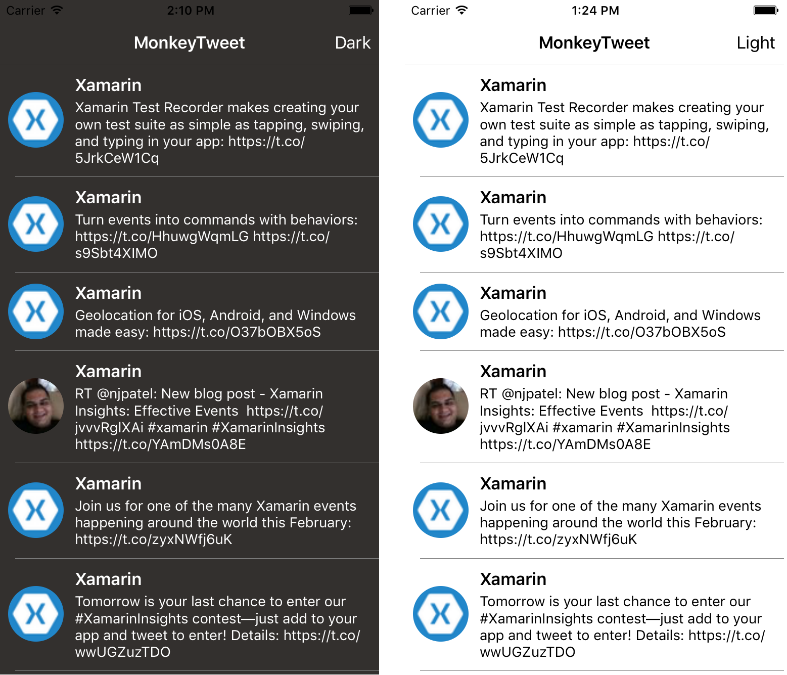
Users can now switch between a light and dark theme with the click of a button:

Introduction to Styles
When building a user interface and theming an app, you may find yourself repeatedly configuring controls in a similar way. For example, all controls that display text may use the same font, font attributes, and size. Styles are a collection of property-value pairs called Setters. Rather than having to repeatedly set each of these properties to a particular resource, you can create a style, and then simply set the Style property to handle the theming for you.
Building Custom Styles
To define a style, we can take advantage of the application-wide resource dictionary to make this style available to all controls. Just like resources, each style must contain a unique key and target class name for the style. A style is made up of one or more Setters, where a property name and value for that property must be supplied. The TargetType property defines which controls the theme can apply to; you can even set this to VisualElement to have the style apply to all subclasses of VisualElement. Setters can even take advantage of resources to further increase maintainability.
			#33302E
			White
We can apply this style by setting the Style property of a control to the name of the style’s unique key. All properties from the style will be applied to the control. If a property is explicitly defined on the control that is also part of a referenced style, the property set explicitly will override the value in the style.
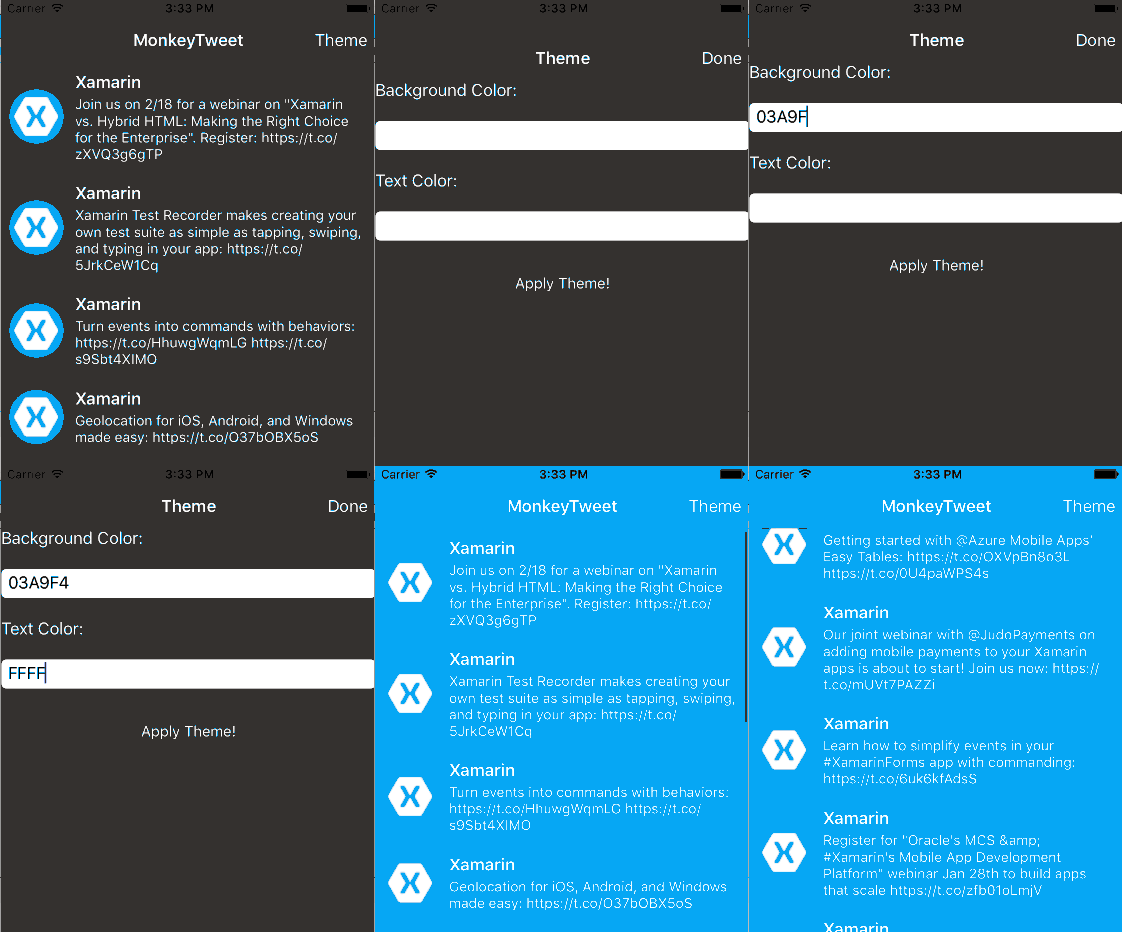
Our style is a dynamic resource behind the scenes, so they can be altered at runtime. I’ve created a custom page that allows users to enter their own hexadecimal colors to theme MonkeyTweet thanks to Xamarin.Forms resources and styles:
Conclusion
In this blog post, we took a look at theming applications with the Xamarin.Forms’ styles by theming our MonkeyTweet application to have a customizable, user-defined theme. We only just scratched the surface of styling; there are lots of other cool things you can do with styling, including style inheritance, implicit styling, platform-specific styling, and prebuilt styles. Be sure to download the MonkeyTweet application to apply your own theme and see just how easy it is to build beautiful, themed UIs with Xamarin.Forms!

