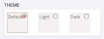
This weekend I was looking to update my settings page on my latest app, My Cadence, and introduce a new option to allow the user to select a default theme for their application. There are a few ways to implement this features. In previous applications I have built, I have used the Picker control to give users the option to pick a setting:

This is a pretty good experience, however I wanted to see if there was something new in Xamarin.Forms 5 that I could leverage to create a better experience. Browsing the documentation I stumbled upon the brand new RadioButton control that is fully templatable! This means you can completely customize the look and feel of the control while still maintaining the functionality of the control.
So, let’s take a look at how to leverage this new feature to create a new way for my users to select the theme.
Enter RadioButton!
The first thing to do is to add the RadioButton to your application. To create a theme selection UI we will create a Grid with 3 columns each with a RadioButton in it.
<Grid
    ColumnDefinitions="*,*,*"
    ColumnSpacing="10">
    <RadioButton IsChecked="True" Content="System Default"/>
    <RadioButton Grid.Column="1" Content="Light"/>
    <RadioButton Grid.Column="2" Content="Dark"/>
</Grid>
This will result with the default control that displays the RadioButton besides text.

One of the beautiful parts of the new RadioButton is that it has control templating built in. This means you can override the default template that is a Label with anything!
Control Template
In our ContentPage.Resources we can add a new control template that can be applied to the RadioButton. It controls what the RadioButton looks like and even has access to the VisualStateManager so we can customize what the Checked state looks like. Now, this is a bit of code, but what we are creating in a template where we are drawing the circle in the top right of a frame that has a ContentPresenter in the main area in which we can fill in any UI we want.
   <ContentPage.Resources>
        <ResourceDictionary>

            <Color x:Key="LightRadioButtonColor">#F3F2F1</Color>
            <Color x:Key="DarkRadioButtonColor">#9B9A99</Color>

            <ControlTemplate x:Key="ThemeRadioTemplate">
                <Frame
                    Padding="0"
                    BackgroundColor="{AppThemeBinding Dark={StaticResource DarkRadioButtonColor},
                                                      Light={StaticResource LightRadioButtonColor}}"
                    BorderColor="{AppThemeBinding Dark={StaticResource DarkRadioButtonColor},
                                                  Light={StaticResource LightRadioButtonColor}}"
                    HasShadow="False"
                    HeightRequest="80"
                    HorizontalOptions="Start"
                    VerticalOptions="Start"
                    WidthRequest="80">
                    <Grid Margin="4" WidthRequest="80">
                        <Grid
                            HeightRequest="20"
                            HorizontalOptions="End"
                            VerticalOptions="Start"
                            WidthRequest="20">
                            <Ellipse
                                Fill="White"
                                HeightRequest="18"
                                HorizontalOptions="Center"
                                Stroke="#2E2545"
                                StrokeThickness="1"
                                VerticalOptions="Center"
                                WidthRequest="18" />
                            <Ellipse
                                x:Name="Check"
                                BackgroundColor="Transparent"
                                Fill="#df6e57"
                                HeightRequest="10"
                                HorizontalOptions="Center"
                                Stroke="#df6e57"
                                StrokeThickness="0"
                                VerticalOptions="Center"
                                WidthRequest="10" />
                        </Grid>
                        <!-- This enables us to put in dynamic content -->
                        <ContentPresenter />
                    </Grid>
                    <VisualStateManager.VisualStateGroups>
                        <VisualStateGroupList>
                            <VisualStateGroup x:Name="CheckedStates">
                                <VisualState x:Name="Checked">
                                    <VisualState.Setters>
                                        <Setter Property="BorderColor" Value="#df6e57" />
                                        <Setter TargetName="Check" Property="Opacity" Value="1" />
                                    </VisualState.Setters>
                                </VisualState>
                                <VisualState x:Name="Unchecked">
                                    <VisualState.Setters>
                                        <Setter Property="BorderColor" Value="#F3F2F1" />
                                        <Setter TargetName="Check" Property="Opacity" Value="0" />
                                    </VisualState.Setters>
                                </VisualState>
                            </VisualStateGroup>
                        </VisualStateGroupList>
                    </VisualStateManager.VisualStateGroups>
                </Frame>
            </ControlTemplate>
        </ResourceDictionary>
    </ContentPage.Resources>
We can now apply this template to each RadioButton. It will continue to use our text label content but apply the control template that we just setup.
<Grid ColumnDefinitions="*,*,*" ColumnSpacing="10">
    <RadioButton ControlTemplate="{StaticResource ThemeRadioTemplate}" Content="Default" IsChecked="True" />
    <RadioButton ControlTemplate="{StaticResource ThemeRadioTemplate}" Grid.Column="1" Content="Light" />
    <RadioButton ControlTemplate="{StaticResource ThemeRadioTemplate}" Grid.Column="2" Content="Dark" />
</Grid>

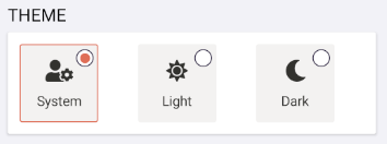
We aren’t done though as we can now leverage the ContentPresenter and set the Content to anything that we want. For this UI I want to put in an Image (in this case a FontAwesome label) and text on the bottom.
<RadioButton.Content>
    <StackLayout HorizontalOptions="Center" VerticalOptions="Center">
        <Image Scale="0.75" Source="{FontImage FontFamily=FA, Glyph={x:Static helpers:FAIcons.UserCog}, Color=#323130}" />
        <Label FontSize="Small" Text="System" TextColor="#323130" />
    </StackLayout>
</RadioButton.Content>
The full XAML for all three RadioButton controls would look a bit like this:
<RadioButton ControlTemplate="{StaticResource ThemeRadioTemplate}" IsChecked="True">
    <RadioButton.Content>
        <StackLayout HorizontalOptions="Center" VerticalOptions="Center">
            <Image Scale="0.75" Source="{FontImage FontFamily=FA, Glyph={x:Static helpers:FAIcons.UserCog}, Color=#323130}" />
            <Label FontSize="Small" Text="System" TextColor="#323130" />
        </StackLayout>
    </RadioButton.Content>
</RadioButton>
<RadioButton ControlTemplate="{StaticResource ThemeRadioTemplate}" Grid.Column="1">
    <RadioButton.Content>
        <StackLayout HorizontalOptions="Center" VerticalOptions="Center">
            <Image Scale="0.75" Source="{FontImage FontFamily=FA, Glyph={x:Static helpers:FAIcons.Sun}, Color=#323130}" />
            <Label FontSize="Small" Text="Light" TextColor="#323130" />
        </StackLayout>
    </RadioButton.Content>
</RadioButton>
<RadioButton ControlTemplate="{StaticResource ThemeRadioTemplate}" Grid.Column="2">
    <RadioButton.Content>
        <StackLayout HorizontalOptions="Center" VerticalOptions="Center">
            <Image Scale="0.75" Source="{FontImage FontFamily=FA, Glyph={x:Static helpers:FAIcons.Moon}, Color=#323130}" />
            <Label FontSize="Small" Text="Dark" TextColor="#323130" />
        </StackLayout>
    </RadioButton.Content>
</RadioButton>
This will result in great cross-platform custom RadioButton!

Learn More
Checkout the full documentation for RadioButton and also control templating for more insight on how to implement this in your app.
You can also browse the source code of LosGatos on GitHub, which is a delightful sample from David Ortinau that uses this technique.


Will XF 5 support grpc?Really look forward to this happen
Good work James. Ability to provide custom ControlTemplate like in WPF is definitely useful.
I noticed the VisualState.Setters with a target control does not accept the actual control target property.
It would have been easier to set Fill/Stroke of the Ellipse directly.
Hi James! Thank you very much for this…excellent timing for me. However, in the Control Template Visual State on the BorderColor Property, Visual studio is giving me an error that it is Not Recognized or Not Accessible. I’m using Visual Studio preview 16.9 Preview 3 and have updated all the Nuget packages are up to date.
Do you know what might be causing this? It stops Hot Reload from working also when run.