
This is a special guest post from the Progress team at Telerik, the makers of the Telerik UI suites. Speaking on behalf of these awesome engineers of developer tooling is Sam Basu, a Developer Advocate for Telerik products and Xamarin aficionado. You may find him on Twitter as @samidip.
Are you already building cross-platform native mobile apps using Xamarin.Forms? If so, great job picking your technology stack! After all, where else could you reuse your skills in C#/XAML to make apps that run on every platform with a truly unified single codebase? While Xamarin provides a vast array of frameworks, IDEs, and integrations, apps may sill need controls outside of those included in Xamarin.Forms. Rather than building your own custom control, developers may prefer to grab a well-engineered, performant UI control out-of-the-box from a service such as Telerik to help ship apps faster. Think of a polished UI as your must-have “wow” factor; that’s what you’ll get with Telerik UI for Xamarin.
Calendars keep our lives organized and productive; everyone uses them and increasingly so in digitally, so it’s no surprise that your mobile app may need to display a calendar and manage events. Turns out, however, calendar UI is tricky business, and the little details make all the difference.
The Telerik Calendar in UI for Xamarin is designed so you can offer your users the ultimate in productivity in your apps with various calendar scenarios. Yes, these are truly native calendars on every mobile platform, simply rendered through the Xamarin.Forms abstraction. The Telerik Calendar not only capitalizes on all of the innate benefits provided by native UI, it also exposes properties/events in C# to allow developers full customization and flexibility. This post introduces Telerik UI for Xamarin and then dives head first into leveraging the Telerik Calendar to explore all of the available customization options for developers.
Telerik UI for Xamarin
Telerik UI for Xamarin is a collection of Xamarin.Forms controls and Xamarin bindings built on top of the native Telerik UI for iOS and UI for Android suites. The Xamarin.Forms controls also utilize controls and features from the Telerik UI for UWP, providing a common API that allows the developer to use the native Telerik components on all three mobile platforms (iOS / Android / Windows) using a single shared code base. UI for Xamarin provides rich and performant UI controls out-of-the-box, so that you can focus on delivering app features using functional UI components.
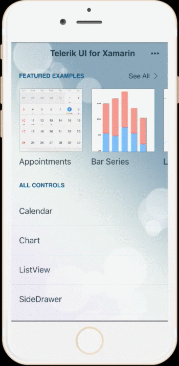
We know developers don’t always trust high-octane words, though, right? You can play around with the Telerik UI for Xamarin suite yourself and see if it fits your needs. You’re able to check out the performance and interactivity of each of the controls before deciding if it’s right for your Xamarin app. There are beautiful showcase apps that highlight UI for Xamarin controls for each mobile platform, along with the sample code to achieve the same results. Find the apps in respective app stores, including the iOS App Store and Google Play.
Getting Started
So, how do you incorporate Telerik UI for Xamarin in your Xamarin project? A simple trial download may be the easiest way to get started. Simply head to the download site and pull down the bits. Once downloaded, you’ll find examples, templates, and binaries specific to each platform as swell as shared ones.
If you have the luxury of starting work on greenfield projects, Telerik UI for Xamarin offers several handy project templates/wizards. The goal is to give developers a great starting point with their Xamarin projects, both on Visual Studio and Xamarin Studio.
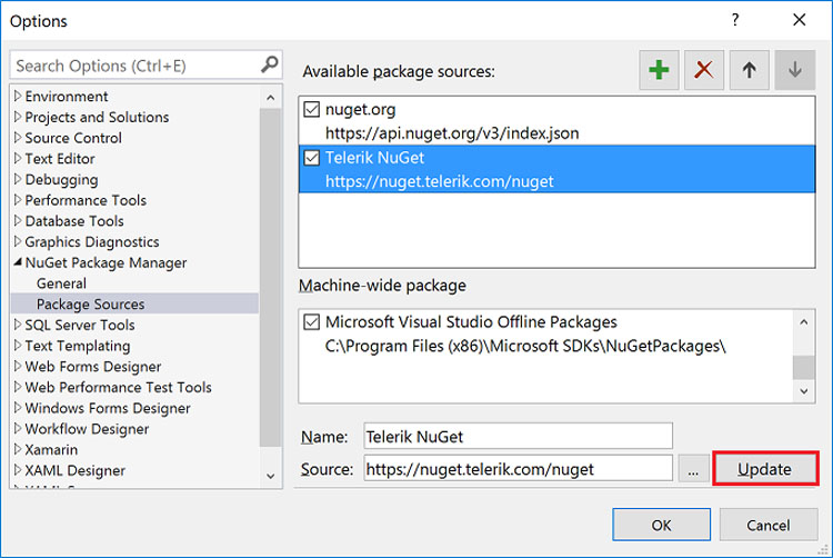
Be it on Windows or Mac, one of the easiest way for developers to integrate UI for Xamarin in their Xamarin projects is the Telerik NuGet Server. The first step is to configure your IDE’s Package Manager to point to the Telerik NuGet feed. This is in your Preferences/Options and works the same way in Visual Studio and Xamarin Studio. Simply set up a new NuGet source to point to the Telerik gallery at https://nuget.telerik.com/nuget, authenticate yourself for the first time, and done!
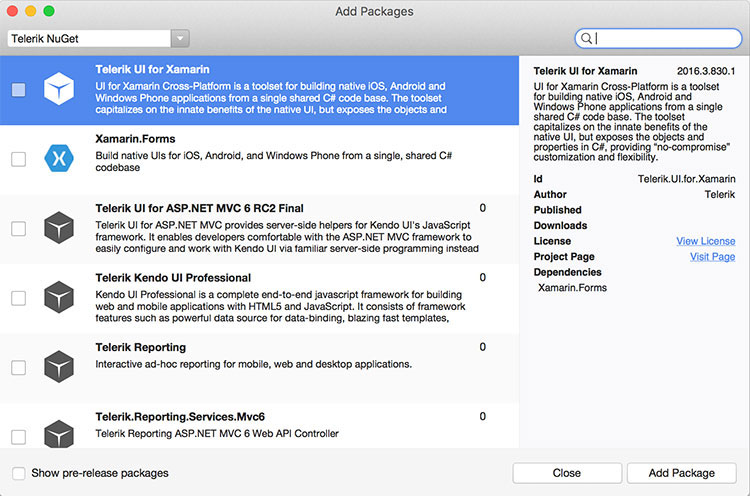
Here’s how you use NuGet to pull in UI for Xamarin bits into an existing project, shown here for Xamarin Studio for brevity, though Visual Studio has the same workflow. Once you pull in the Telerik UI for Xamarin package, NuGet does the rest of the magic; you’ll have the required UI for Xamarin references in your shared PCL as well as all the platform specific projects. One big advantage of the NuGet route is that not only do you get an easy way to pull in UI for Xamarin references into your existing project, you also get easy updates too.
Several of the UI for Xamarin controls gain their polish, behavior, and performance from the fact that they are truly native UI controls customizable for each platform. Accordingly, to render them from a Xamarin.Forms abstraction requires custom renderers. No worries, though, everything comes ready out-of-the-box, you just need to register the renderers in your app. The docs will show you how to register the renderers for each control when using them on iOS, Android, and UWP platforms. Here’s a sample of what you need when using the Telerik Calendar control in iOS apps. The following code goes in the AppDelegate.cs file in your iOS-specific project:
using System;
using System.Collections.Generic;
using System.Linq;
using Foundation;
using Xamarin.Forms;

[assembly: ExportRenderer(typeof(Telerik.XamarinForms.Input.RadCalendar), typeof(Telerik.XamarinForms.InputRenderer.iOS.CalendarRenderer))]

namespace MyApp.iOS
{
    [Register("AppDelegate")]
    public partial class AppDelegate : global::Xamarin.Forms.Platform.iOS.FormsApplicationDelegate
    {
        public override bool FinishedLaunching(UIApplication app, NSDictionary options)
        {
            global::Xamarin.Forms.Forms.Init();

            Telerik.XamarinForms.Common.iOS.TelerikForms.Init();
            LoadApplication(new App());

            return base.FinishedLaunching(app, options);
        }
    }
}
Once you have all of the bits referenced and renderers registered, you’re ready to roll with the Telerik Calendar control. Fire up any XAML view and this simple markup renders the Calendar for you:
... xmlns:TelerikInput="clr-namespace:Telerik.XamarinForms.Input;assembly=Telerik.XamarinForms.Input" ...
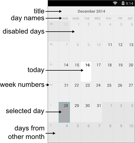
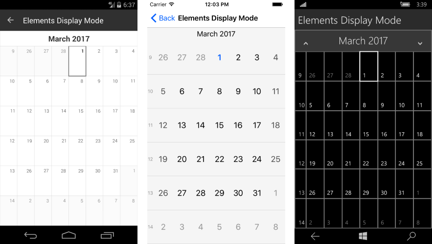
Calendar Visual Structure
The Telerik Calendar control is a calendar for sure, just rendered with painstaking accuracy for your app with a many customization options and catered to the unique UI paradigms of each mobile platform. Before we start tweaking things, it helps to see the overall, big-picture control—the simple rendering of the Telerik Calendar with all visual elements explained. The labels should be self-explanatory:
You also get some control to show or hide specific details to suit your needs. By default, the day names show up and the week numbers don’t, but here’s some code to flip both (along with the resulting calendar on each mobile platform):
var calendar = new RadCalendar();
calendar.WeekNumbersDisplayMode = DisplayMode.Show;
calendar.DayNamesDisplayMode = DisplayMode.Hide;
Calendar ViewMode
The Telerik Calendar has several supported *View Modes* that control how the calendar is initially rendered, namely:
MonthWeekYearMonthNamesYearNumbersFlow
Not every view mode is supported on all mobile platforms, with only iOS having the distinction of supporting them all. There are some methods exposed for changing up view modes programmatically, aside from via user action. Each of these return true if there is support or if navigation is possible, otherwise they return false:
TrySetViewMode: Sets the Calendar to a specific view modeTryNavigateToUpperView: Navigates calendar to upper view if possibleTryNavigateToLowerView: Navigates calendar to lower view if possible
The hierarchy of navigation among view levels is mobile platform-dependent, like so:
- iOS:
YearNumbers>Year>MonthNames>Month>Week - Android:
Year>Month>Week
Here’s some simple code to instantiate a calendar and set the view mode to year, all programmatically:
var calendar = new RadCalendar();
calendar.NativeControlLoaded += CalendarLoaded;

private void CalendarLoaded(object sender, EventArgs args)
{
    (sender as RadCalendar).TrySetViewMode(CalendarViewMode.Year);
}
Calendar Date Management
The Telerik Calendar exposes some properties that allow the developer programmatic flexibility to manipulate the calendar user experience:
DisplayDate: A date in the current viewMinDate: Gets/Sets the minimum date that could be displayed or selectedMaxDate: Gets/Sets the maximum date that could be displayed or selected
Each of the date properties can be set explicitly or relative to the current date, like so:
// XAML Markup
xmlns:TelerikInput="clr-namespace:Telerik.XamarinForms.Input;assembly=Telerik.XamarinForms.Input"


// Code Behind
MyCalendar.MinDate = DateTime.Today.AddMonths(-1);
MyCalendar.MaxDate = DateTime.Today.AddMonths(5);
MyCalendar.DisplayDate = DateTime.Today.AddMonths(2);
What do users want to do most from a Calendar? The ability to select dates, of course. The Telerik Calendar sports a simple date selection functionality, both through user interaction and programmatically. Date selections should be available as single, multiple, or a range of dates. Two key things make this possible:
SelectedDate: Gets/Sets currently selected dateSelectionChanged: Event raised when the selected date is changed
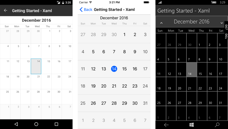
Here’s some code that sets up the calendar to display the default month view mode and selects a date programmatically:
RadCalendar calendar = new RadCalendar();
calendar.SelectedDate = new DateTime(2016, 12, 14);
Below is the result; notice the style differences in the calendar controls rendered across different mobile platforms.
Calendar Appointments
Any calendar UI needs to display appointments, it’s how you keep users engaged and productive. Appointment support in the Telerik Calendar begins with the Telerik.XamarinForms.IAppointment interface, which sports three basic members: StartDate, EndDate, and Title, but you should definitely consider adding more descriptors to your appointments as needed. A sample Appointment class implementing the interface is below:
public class Appointment : IAppointment
{
    public DateTime StartDate { get; set; }
    public DateTime EndDate {  get; set; }
    public string Title { get; set; }
    public bool IsAllDay { get; set; }
    public Color Color { get; set; }
}
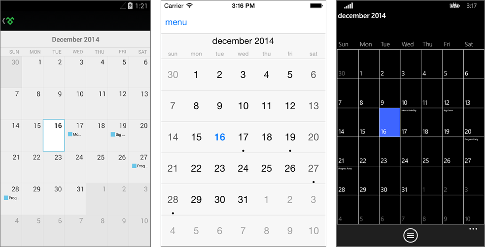
A collection of appointments, all stemming from an IAppointment interface implementation, can be fed to the Telerik Calendar control directly by simply using the AppointmentSource property, which can also be data bound. Here are some sample appointments being bound to the Calendar and the corresponding results in each platform:
calendar.AppointmentsSource = new List() {
    new Appointment() {
        StartDate = DateTime.Today.AddDays(1),
        EndDate = DateTime.Today.AddDays(2).AddTicks(-1),
        Title = "Mom's Birthday",
        Color = Color.Red },
    new Appointment() {
        StartDate = DateTime.Today.AddDays(3).AddHours(17),
        EndDate = DateTime.Today.AddDays(3).AddHours(22),
        Title = "Big Game",
        Color = Color.Green },
    new Appointment() {
        StartDate = DateTime.Today.AddDays(11).AddHours(20),
        EndDate = DateTime.Today.AddDays(12).AddHours(4),
        Title = "Progress Party",
        Color = Color.Red }
};
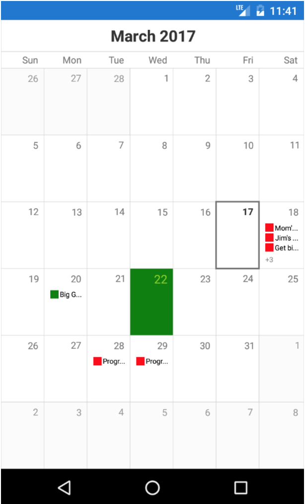
Here’s a quick look at how professional Telerik Calendar appointments can look like through the Telerik UI for Xamarin Examples app (find the app on the iOS App Store and Google Play):
Custom Calendar Cell Styling
Sure the Telerik Calendar has a polished UI, but there are times where you may want to customize its look and feel by manipulating the tiniest details and, in true developer-friendly form, the Telerik Calendar allows you to have custom styles for each cell.
You can set a property called SetStyleForCell to a custom function that can style individual Calendar cells. All cells share a common base class, the CalendarCell, with the following properties:
Text: Gets the text displayed in the cell.Type(CalendarCellType): Gets the type of the cell. The possible values are:Date: All cells that correspond to actual dates have this typeWeekNumber: Cells that hold week numbersDayName: Cells that hold the days of the week
Each cell can be styled using the CalendarCellStyle class, which has the following options:
BackgroundColorBorderColorBorderThicknessFontSizeFontWeightForegroundColor
Armed with cell styling flexibility, here’s how to color the first day of spring to be a green cell in the Calendar, for example:
var calendar = new RadCalendar();
calendar.SetStyleForCell = this.EvaluateCellStyle;

private CalendarCellStyle EvaluateCellStyle(CalendarCell cell)
{
    var springStyle = new CalendarCellStyle {
        BackgroundColor = Color.Green,
        FontSize = Device.OnPlatform(14, 30, 17),
        FontWeight = FontWeight.Normal,
        ForegroundColor = Color.FromRgb(139, 209, 0)
    };

    var dayCell = cell as CalendarDayCell;
    if (dayCell != null && dayCell.Date.Day == 22 && dayCell.Date.Month == 3)
    {
        return springStyle;
    }
    return null;
}
And the result:
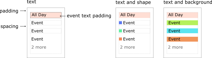
Another common customization opportunity may arise with Appointments, where you may have a need to custom-style appointments on a busy calendar. With the Telerik Calendar, you get an AppointmentStyle property which is of the CalendarAppointmentsStyle type. This allows for complete color-coded customization of appointments with text and shapes.
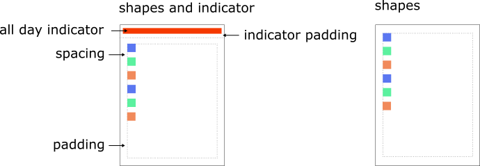
Here’s the visual structure of appointment styling in calendar cells; you can use text or shape or both.
Some of the styling opportunities with CalendarAppointmentsStyle come with the following properties:
DisplayMode: Defines how appointments are visualized. Values can beText,TextWithShape,TextWithBackground, andShape.Padding: Defines the padding of the rectangle that holds the events.Spacing: Defines the empty space between two appointments in the same date.ShapeType: Defines the shape representing an appointment. Values can beRectangle,Ellipse,TriangleUp,TriangleDown, andRhombus.AllDayIndicatorLocation: Defines the location where the all day indicators are visualized.
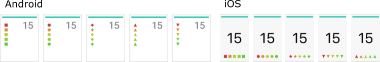
Some examples of shapes representing appointments can be visualized as below:
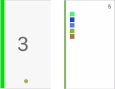
An example of an all-day appointment indicator is below. You get to control the location, width, and padding of how the indicator is rendered in the calendar cell:
Conclusion
With Xamarin.Forms democratizing cross-platform mobile development for .NET developers, you can be proud to choose the Xamarin technology stack… just don’t go reinventing the wheel with complex manually-built UI. Telerik UI for Xamarin is here to help, and the engineering efforts behind each control show in their performance and polish. When you need to support any type of calendars and events in your cross-platform mobile app, the Telerik Calendar stands ready out-of-the-box, with a myriad of customization options. Just look through the detailed docs when you’re ready and keep your app users productive with the right calendar support. Cheers and happy coding!