Xamarin.Forms has supported iOS, Android, and Windows for a long time. We’ve also added new platforms to keep up with the changing landscape, such as Tizen and macOS, with Linux and Windows WPF on the horizon. These platforms run on a wide variety of devices including phones, tablets, desktops, and TVs. This presents an interesting challenge for us as developers; how do we design an adaptive UI that intelligently scales and makes sense on each idiom it’s presented on?
Respond to Screen Size
By default, Xamarin.Forms Layouts and Controls are designed to be responsive and will often grow and shrink to take advantage of the available screen space. If more control is needed, the Xamarin.Forms Page class has a SizeChanged event we can use to determine the available screen-size at runtime. This event is raised when the Page is displayed, allowing us to adjust or change our Page’s UI based on the Width or Height of the screen.
public partial class MainPage : ContentPage
{
   public MainPage()
   {
      InitializeComponent();
      SizeChanged += MainPageSizeChanged;
   }

   void MainPageSizeChanged(object sender, EventArgs e)
   {
      imgMonkey.WidthRequest = Math.Min(this.Width, 400);
   }
}
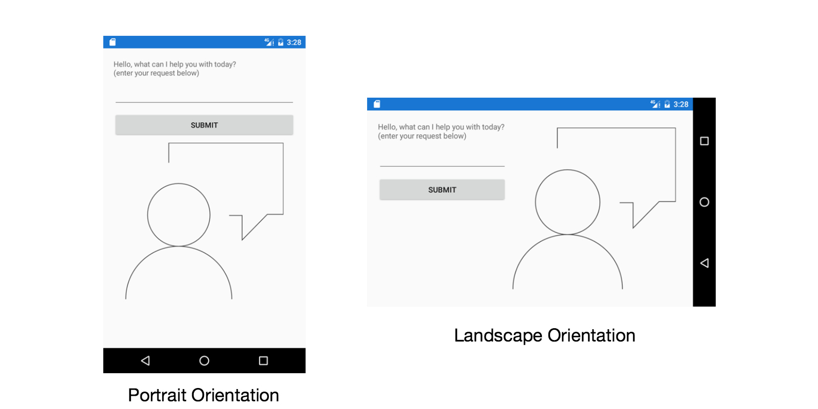
Respond to Orientation
We can use the SizeChanged event to respond to orientation changes. SizeChanged will be raised when the screen is rotated. We can determine the orientation by comparing the Page’s Width and Height properties.
public partial MainPage : ContentPage
{
    public MainPage()
    {
        InitializeComponent();
        SizeChanged += MainPageSizeChanged;
    }

    void MainPageSizeChanged(object sender, EventArgs e)
    {
        bool isPortrait = this.Height > this.Width;
        stackPanel.Orientation = (isPortrait ? StackOrientation.Horizontal : StackOrientation.Vertical);
    }
}

Respond to Device Type
We often think about responsive and adaptive in terms of screen size, but we also need to respond to how the user interacts with the device. For instance, we use touch on mobile devices, and a mouse with a keyboard on a desktop PC. Xamarin.Forms provides a static Idiom property on the Device class that we can use to check the device type. Devices are sorted into four categories: Phone, Tablet, Desktop, and TV.
switch (Device.Idiom)
{
    case TargetIdiom.Desktop:
    ...
    case TargetIdiom.Phone:
    ...
    case TargetIdiom.Tablet:
    ...
    case TargetIdiom.TV:
    ...
}
We can use Device.Idiom to change the UI we present. We have several options you can use depending on a number of changes you need to make.
For small changes, like adjusting button sizes, we update the controls and layouts directly.
if (Device.Idiom == TargetIdiom.Desktop)
{
    buttonAbout.HeightRequest = 25;
    buttonAbout.WidthRequest = 40;
}
else
{
    buttonAbout.HeightRequest = 40;
    buttonAbout.WidthRequest = 70;
}
When you need to add or remove portions of your UI, Xamarin.Forms provides a ContentView which allows us to create composite controls. We define portions of reusable UI with behavior, and then decide which composite controls to display based on the Idiom. You can think of a ContentView as a partial Xamarin.Forms Page.
void AddColorPicker ()
{
    IMyColorPicker colorPicker;

    if (Device.Idiom == TargetIdiom.Desktop)
        colorPicker = new ColorPickerMouseView();
    else
        colorPicker = new ColorPickerTouchView();

    colorPicker.VerticalOptions = LayoutOptions.Start;
    colorPicker.ColorChanged += ColorPickerColorChanged;

    mainLayout.Children.Add(colorPicker)
}

When your UI changes are significant between device types, you can create multiple pages. We use Device.Idiom to decide which page to display or you can even use ContentViews within these pages to avoid duplicate code.
And If you’re using MVVM, you can define a single View Model that is used for each version of your Page, further reducing repeated code!
ContentPage page;

if(Device.Idiom == TargetIdiom.Desktop)
    page = new DetailsDesktopPage(new MyDetailViewModel(...));
else if(Device.Idiom == TargetIdiom.TV)
    page = new DetailsTVPage(new MyDetailViewModel(...));
else //Phone or Tablet
    page = new DetailsMobilePage(new MyDetailViewModel(...));

Navigation.PushAsync(page);
If you want to learn more about adaptive UI design, you can find excellent documentation here and here.
Head to the Xamarin University website for more great Xamarin training, including free Self-Guided courses!

how can I do this in pure XAML to use previewer tools to modify the values without recompiling and redeploying the app all time until it looks good?