Quick Tips to get started with CollectionView! Below are some useful new features and best practices for creating powerful native mobile experiences.
A Few Quick Tips
Loading Infinitely More
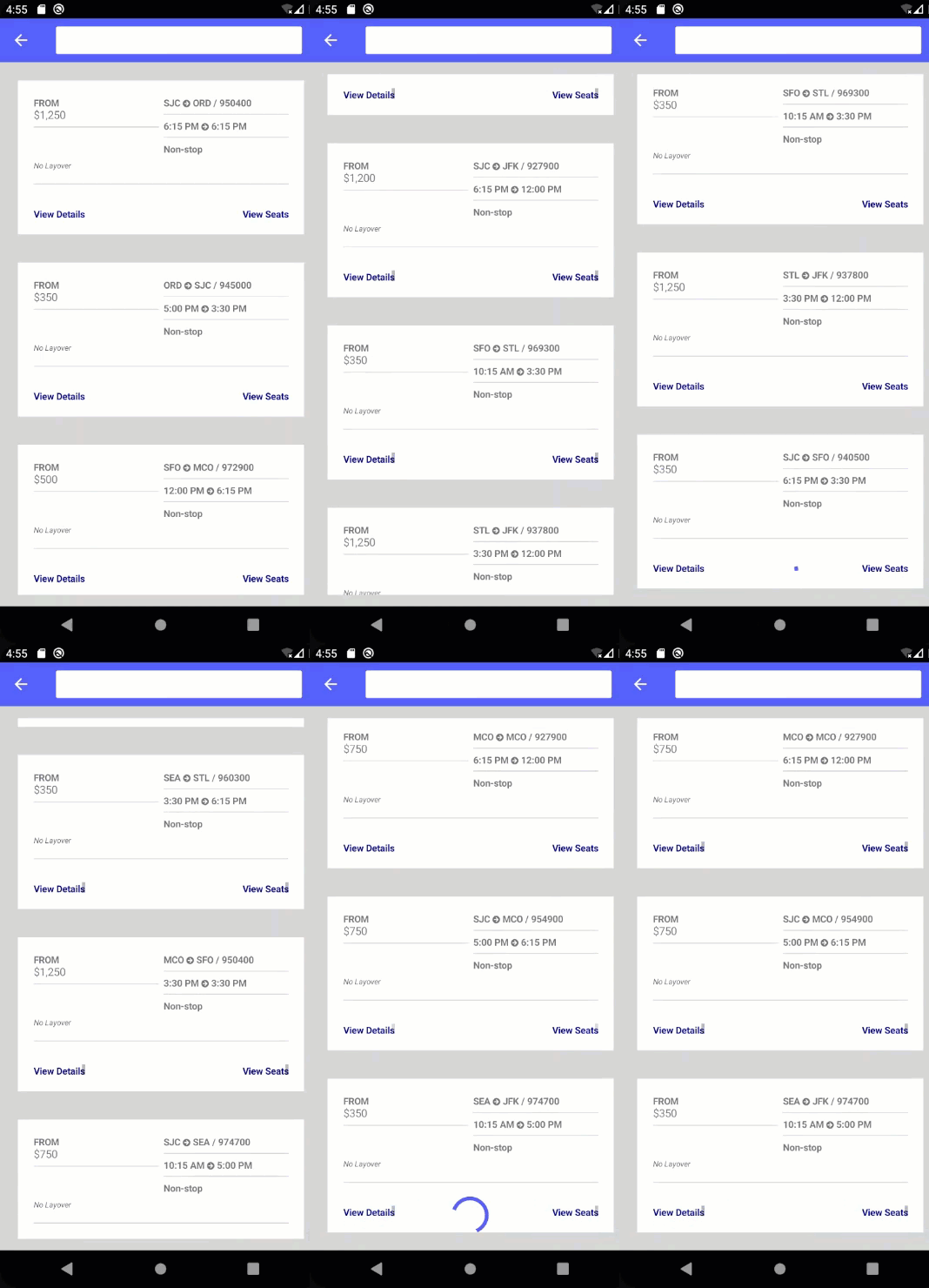
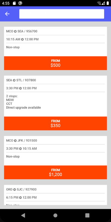
A few new properties are introduced on CollectionView that make it really simple to fetch more data as the user is scrolling. In this example, the mock data has a thousand items however I only want to initially load 20 results. If the user continues scrolling to the end, CollectionView will execute RemainingItemsThresholdReachedCommand to fetch additional data. This continues on and on until the user has fetched all the data available, or if you are a massive social network then perhaps “never”.
<CollectionView
  x:Name="ResultsList"
  ItemsSource="{Binding FlightsToDisplay}"
  ItemSizingStrategy="MeasureFirstItem"
  RemainingItemsThreshold="0"
  RemainingItemsThresholdReachedCommand="{Binding LoadMoreFlightsCommand}">
If you wish to start fetching additional data sometime before the user reaches the end of the collection, you can set the RemainingItemsThreshold to any positive number. When that number is reached, the command will be called.
Make it Snap
Sometimes you want to have items snap into position rather than scrolling freely. CollectionView provide a few properties to enable this behavior on any layout. Consider the example below:
<CollectionView>
    <CollectionView.ItemsLayout>
        <LinearItemsLayout Orientation="Horizontal"
                           SnapPointsType="MandatorySingle"
                           SnapPointsAlignment="Start"
                           ItemSpacing="10"/>
    </CollectionView.ItemsLayout>

Keep Them Separated
CollectionView avoids a few legacy concepts from ListView that added confusion and bogged down performance including ViewCell and item separators. Adding those lines between items in your list can be very convenient when you want them, but it’s not a concept included in the native controls.
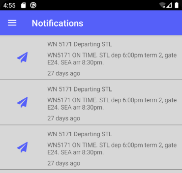
BoxView to create a horizontal line that spans the width of the template and provides a vertical margin for spacing.
<CollectionView.ItemTemplate>
  <DataTemplate>
      <Grid>
          <Grid.ColumnDefinitions>
              <ColumnDefinition Width="1*"/>
              <ColumnDefinition Width="3*"/>
          </Grid.ColumnDefinitions>

          <Grid.RowDefinitions>
              <RowDefinition Height="4"/>
              <RowDefinition Height="*"/>
              <RowDefinition Height="1"/>
          </Grid.RowDefinitions>

          <Image Grid.RowSpan="3" VerticalOptions="Center">
              <Image.Source>
                  <FontImageSource
                  FontFamily="{StaticResource FontAwesome}"
                  Glyph="{Binding Type}"
                  Color="{StaticResource PrimaryColor}"
                  Size="24"
                  />
              </Image.Source>
          </Image>

          <StackLayout
              Grid.Row="1"
                 Grid.Column="1">
          <Label
                 Text="{Binding Title}"
                 LineBreakMode="TailTruncation"/>
          <Label Text="{Binding Message}"
                 LineBreakMode="WordWrap"
                 MaxLines="2"/>
          <Label Text="{Binding PostedAgo}"/>
          </StackLayout>

          <!-- Separator -->
          <BoxView HeightRequest="1"
                   BackgroundColor="Black"
                   Grid.ColumnSpan="2"
                   Grid.Row="2"
                   VerticalOptions="End"/>
      </Grid>
  </DataTemplate>
</CollectionView.ItemTemplate>
Handling Item Taps
When you look at add gestures to your CollectionView you may be tempted to use the SelectionChanged event or SelectionChangedCommand on the control itself. You absolutely can make that work for handling a tap and navigating to another page, for example. This isn’t however the best use of those for this very common purpose. Those properties are for selecting one or more items in the collection to then take a further action on them such as deletion.
As much more direct approach is to add a TapGestureRecognizer to your ItemTemplate.
<CollectionView.ItemTemplate>
    <DataTemplate>
        <views:ResultViewA>
            <views:ResultViewA.GestureRecognizers>
                <TapGestureRecognizer
                    Command="{Binding
                        Source={RelativeSource
                        AncestorType={x:Type vm:FlightResultsViewModel}},
                            Path=GoToDetailsCommand}"
                    CommandParameter="{Binding .}"/>
            </views:ResultViewA.GestureRecognizers>
        </views:ResultViewA>
    </DataTemplate>
</CollectionView.ItemTemplate>
Keep in mind that when working in the ItemTemplate the BindingContext is the item itself and not that of the ContentPage. If your command exists on the item, then you’re all set. However if you wish to route this binding to a command on your ContentPage‘s view model as in this example you can use the newly supported RelativeSource.
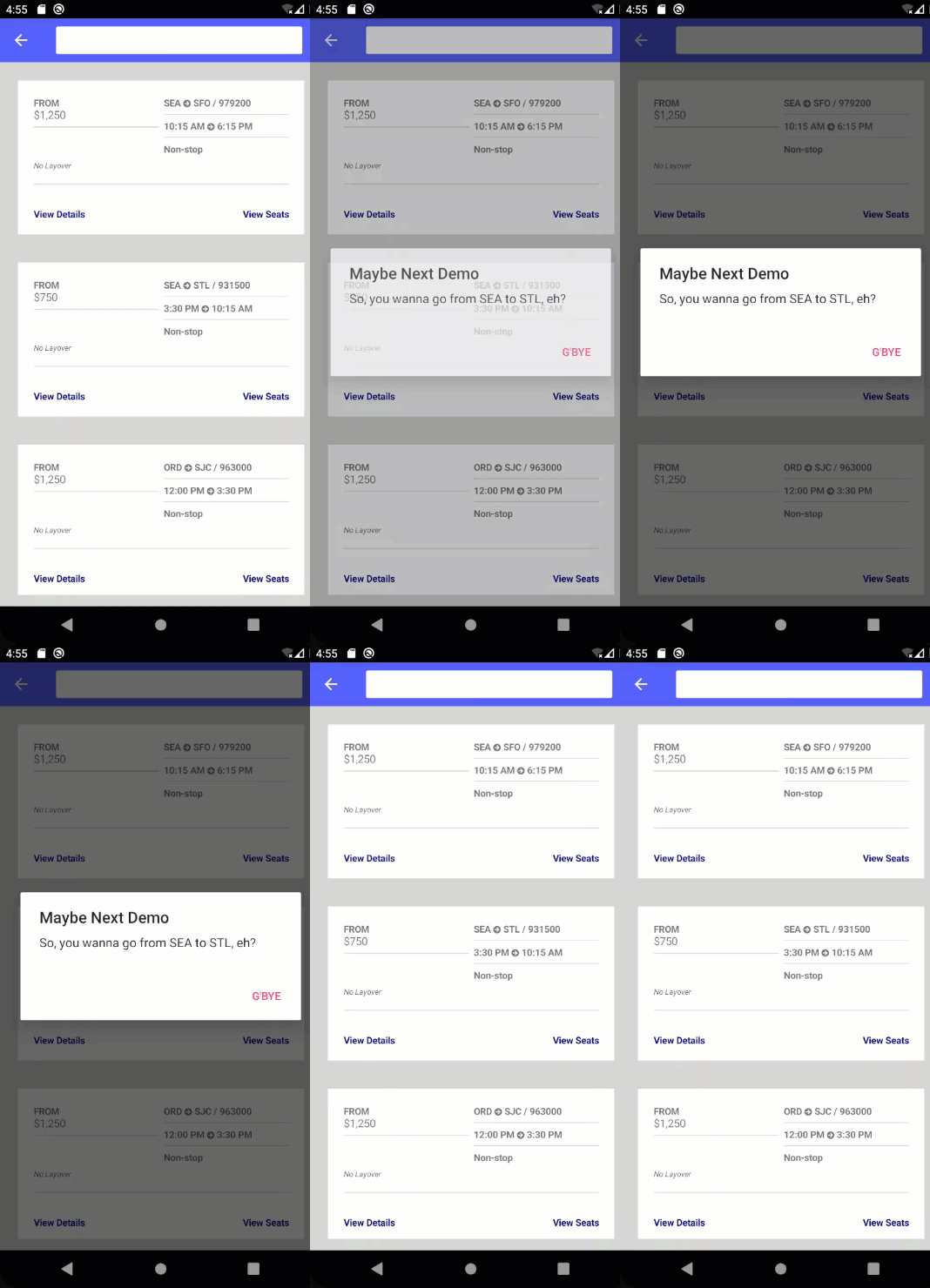
CommandParameter to the current binding context of the item, you’ll easily get the data item you are working with passed to the command.
Sizing for Performance
If you know all your items will be of the same size, you’ll get a performance benefit by setting the item sizing strategy up front to MeasureFirstItem. This way CollectionView will measure the first item alone, and cache that sizing for all items.
<CollectionView
  x:Name="ResultsList"
  ItemsSource="{Binding FlightsToDisplay}"
  ItemSizingStrategy="MeasureFirstItem"
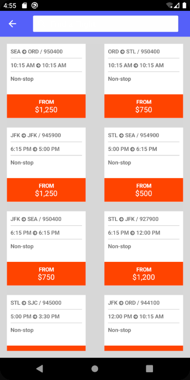
MeasureAllItems to measure each item and size them according to their content needs. In ListView this would be equivalent to setting the HasUnevenRows property to true.
Get More Quick Tips
CollectionView has much more to offer such as adding pull-to-refresh with the new Refresh View and additional layout options for horizontal scrolling, grids, and custom layouts. Check out these useful topics from our documentation and samples:
- Adding an EmptyView
- Selecting item(s)
- Grouping, Headers, and Footers
- Layouts
- Scrolling Options and Events
All code and screenshots above are from the FlyMe demo app that I created for Microsoft Ignite. Slides and video of the session are available here.


hi
Java.Lang.NullPointerException: ‘Attempt to invoke virtual method ‘void android.graphics.Rect.set(android.graphics.Rect)’ on a null object reference’
CollectionView Bored of this error
I’m displaying a simple list, but this error occurs while scrolling
plase show post
https://forums.xamarin.com/discussion/comment/406079#Comment_406079
Very useful tips, we expect more from you. thanks