With the release of Visual Studio 11 Beta back in February of this year, we introduced changes to the user experience based on two core design principles, the first being to give you more space for your content and the second being to draw more focus to that content. Since the debut of these changes there’s been significant community response and feedback. We’ve taken this feedback and based on what we heard have made a number of changes planned for Visual Studio 11 RC. I want to thank you for your continued feedback through this blog, and also through the various other community channels – please keep it coming.
The purpose of this post is to provide you with an update on the changes we’ve made since beta. I’ve also included a brief summary of the beta feedback that we’ve leveraged in making these updates.
Beta Feedback
We have been fortunate in getting a lot of actionable user feedback relating to the Visual Studio 11 Beta release. In sorting through the feedback we found it to be primarily focused on three aspects of the new themes.
- An overall desire for more visual “energy” and contrast
- Calls for a more balanced application of Metro styling
- A desire for greater icon clarity and differentiation through the use of color
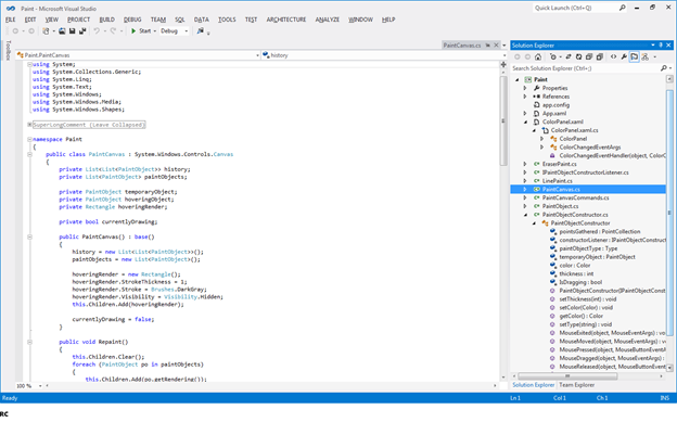
Here is a quick glimpse at the changes we’ve made from beta to RC in keeping with what we heard from you. Each of the changes reflected in these screenshots is called out in detail within the remainder of this post.
Increasing the Energy
For beta there has been a lot of feedback on the overall grayness of the experience. We heard your call for greater vitality in the user experience and have taken steps to both lighten and brighten the experience through the use of bolder theme accents and lighter background colors.
There are three main aspects of the design where we have increased the “energy” level of the Visual Studio 11 themes. The first is to lighten the grays used in the Visual Studio 11 light theme and window chrome to improve both the energy level and readability of the experience.
The second is to colorize the Status Bar. We are using the status bar color to add visual interest and functional value by communicating various IDE state changes such as when the IDE is in debug mode.
The third way in which we will be adding greater flavor to the themes in general is to make broader and slightly bolder use of our accent colors in areas like tool window headers and tab treatments.
Control Styling
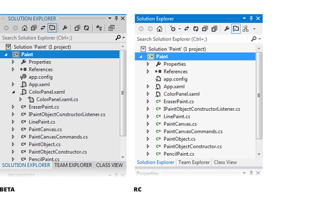
The feedback relating to the fit of Metro style elements in the new experience has fallen into three main buckets. The use of all caps for tool window titling is an area where we’ve heard your concerns. In line with our overall design principles for the release we’ve made lightweight changes that give structure and emphasis to screen areas like tool window title bars, auto-hidden tabs, tab groups, and separators that doesn’t require uppercasing the titles. As is reflected in the screenshots below we’ve removed all caps for tool window titles, auto-hidden tabs, and tab group members.
For RC the only UI area where we will be using All Caps titling is for top level menu titles.
Another area of requested change relating to user interface controls/chrome has been for us to improve the overall sense of Metro styling within the themes by drawing our own window chrome. By drawing our own window chrome we have succeeded in both making more efficient use of space and in increasing the overall sense of Metro styling.
The custom chrome and line work changes we’ve made together with reducing the number of default toolbars and toolbar icons combine to give you three extra visible lines of code in the editor compared to Visual Studio 10. As I noted at the beginning of the post the overall objective behind many of the Visual Studio 11 theme changes is to give you maximum real-estate for, and ability to focus on, your code.
A final area highlighted within your feedback was the desire to see us theme scrollbars and other UI elements so that they have a stronger Metro style feel. We are continuing to look into these requests and will keep you posted if there will be any additional modifications or updates.
Addressing Icon Usability Concerns
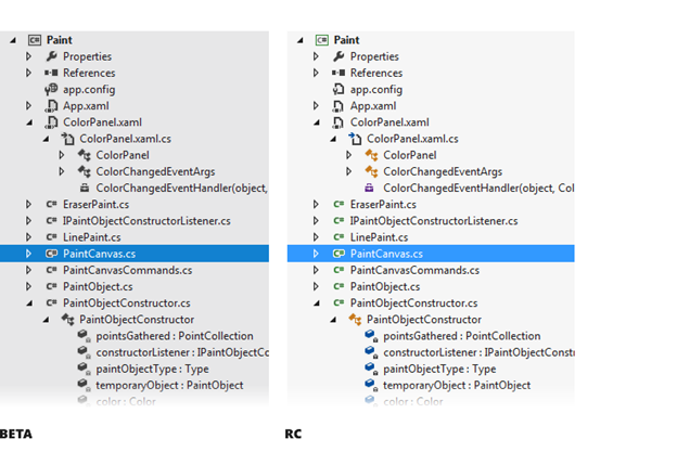
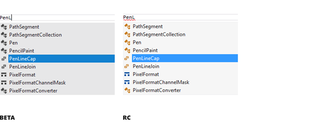
From Visual Studio 11 Beta we heard a lot of concern about the removal of color from icons negatively affecting product usability, specifically where color icons helped quickly distinguish between similar items. We have addressed this concern by systematically adding color back to select commands, IntelliSense, and Solution hierarchy icons.
Post-beta we have employed a simple rule set that combines icon selection heuristics for common actions and content conventions with a basic five color palette. When taken in conjunction with the flatter and simpler glyph style shapes of our Visual Studio 11 icons these rules give us a recipe for applying color in a very straightforward and consistent manner.
The first area where we’ve systematically reintroduced color into the icons is to add color to common action types (e.g. create/new, add/remove, start/stop, search, move/direction/connect). This helps add greater distinction to common action icons and in turn helps to breakup or chunk menus and toolbars into smaller more scan-able subgroups.
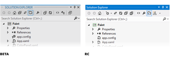
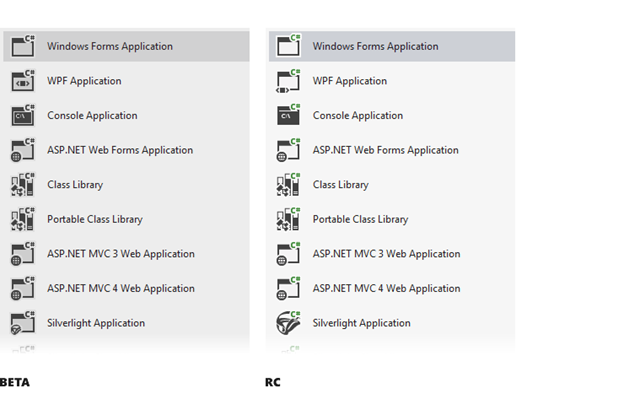
The second area where we’ve reintroduced color in icons is the Solution Explorer. Feedback from users, instrumentation data, and observational research all tell us that next to your content (i.e., the editor), the Solution Explorer is where you spend the most time. The desire for us to use color to differentiate icons within the Solution Explorer was a key point of emphasis within the beta feedback. We have reintroduced color selectively to be an aid that helps you quickly scan/differentiate one type of item from the next. We anticipate continuing to add and refine the use of color to this class of icons in Visual Studio 11.
A third area where we have reintroduced color to icons is to promote familiarity and differentiation within IntelliSense. The Beta feedback pointed out that using IntelliSense icons to guide selection happens both with minimal reflection and very frequently. For RC we have reintroduced familiar IntelliSense color cues to aid you in quickly getting back to your current efficiency levels and beyond.
In addition to the feedback regarding icon color we also received feedback that within the light theme the icons did not appear clear or crisp due to subtle outline that appeared around them. The outline exists to allow the same icon to work in the light, dark, or high contrast themes. Words like fuzzy were sometimes used to describe the fact that the outline around the icons and the light gray fill color within certain icons was visible within the light theme. This resulted in a lack of crispness and impacted icon discernibility. To address this we have adjusted the grays within the icons to eliminate any fuzziness or halo effect that existed within the Beta.
In addition to the above mentioned changes we will continue to evaluate the most critical and commonly used icons that the community identifies as needing to be more discernible. We welcome your feedback on this area, so please send any comments our way.
Bringing it All Together
As noted above the changes we’re introducing post-beta are designed to both address core areas of Beta feedback and to maintain alignment with our primary design objectives for the release. While I’ve talked about these changes primarily within the context of the lighter theme we are verifying that all changes also work well with the dark theme.
Now, I’m hoping you are all enthusiastic in wanting to share your feedback on these changes and if you feel these updates are ultimately steps in the right direction. We are eager to get these changes into your hands with RC. When RC is available please download the release, keep the comments coming, and let us know what you think.
 Monty Hammontree – Director of User Experience, Microsoft Developer Tools Division
Short Bio: Monty has been at Microsoft for ten years focusing primarily on developer tool experiences. He and his team provide product design and user research direction for the Visual Studio product family. He has 25 years of industry experience in product design and user research management.






0 comments