
Last week, we released Visual Studio 2019 version 16.1 Preview 2. If you have the latest update – awesome and thank you. If not, you can download it from the link above. Or, if you already have the Preview, just click the notification bell inside Visual Studio to update. This post discusses one of the most visible interface changes we’ve made in Visual Studio 2019 – the New Project Dialog.
Motivation
In Visual Studio 2019, one of our main objectives was to help you (both new and experienced developers) get to your code faster. You can read more about this journey in the blog post that discussed the new start window. One of the most common ways to start coding in Visual Studio is to create a new project.
-

- New Project Dialog in Visual Studio 2017
-

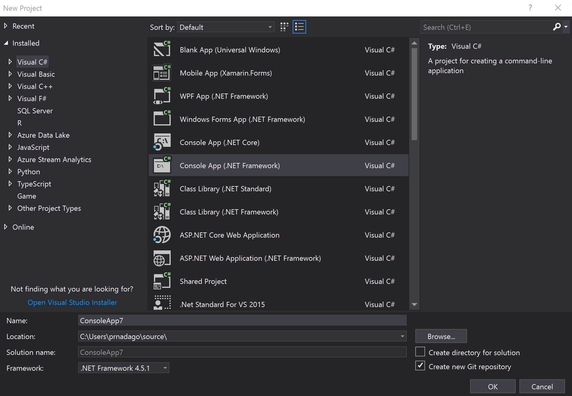
- New Project Dialog in Visual Studio 2019
The dialog hadn’t changed much since 2010, and the interaction model between folders and items has been in place since Visual Studio .NET back in 2002. We hadn’t put much time into the New Project Dialog because we believed it largely served its purpose. Until recently, we didn’t have the telemetry in place to be able to analyze how this dialog was used. Our initial hypothesis was that most of you interacted with the dialog rarely. And instead you spend much more time modifying projects you had previously created. After a bit of user research and analysis, we found that the latter holds true. But we were quite mistaken about the former. Many of you use the dialog to create new projects to try out new things or add on functionality to existing solutions a lot more often than we thought.
User research
We then dove deeper into the data, particularly looking at the usage patterns from new users of Visual Studio. We found that there was a surprisingly large drop-off in usage after launching Visual Studio to opening a project to start coding. That led us to the hypothesis that the New Project Dialog might be somehow inhibiting success with the tool. So, we expanded our user research and gathered that this dialog was presenting you with too many concepts, choices, and decisions. The process of getting started with your code wasn’t straightforward enough. The hierarchy of the nodes wasn’t consistent. When you installed several workloads you would see too many languages and technologies presented at the top level. Further down into the second and third level of nodes, the taxonomy became quite unmanageable with differences in naming conventions of categories.
When we asked participants in our usability studies to search for code scaffolding to get started with certain types of projects. We saw them click around through the top level nodes, and not click through the hierarchy. Sometimes they completely ignored the structure on the left and focused just on the default list of templates in front of them. What surprised us was that even for experienced developers, some of the options weren’t intuitive. Most couldn’t pinpoint the link to ‘Open Visual Studio Installer’ when the templates they were looking for weren’t available. They glazed over the search box without interacting with it. They seemed to completely ignore the recent templates list. And when they finally selected a template, they lacked confidence in their choice.
In addition, we learned that most of you think about your app type first but there are some who think about languages first when finding templates to start coding. It became clear that this mixed structure wasn’t intuitive for either use case. The barrier to the first actions within Visual Studio was too high. And this was a problem that small UI tweaks weren’t going to solve.
Design principles
During the design and development of Visual Studio 2019, we looked at usage across different areas of the project creation process and honed down on a core design goal –
“Get to code quickly with the minimum necessary scaffolding and help developers configure their application with the right settings”
Remove unnecessary choices
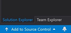
There were several options in the dialog box that we sought to remove as a way of simplifying the set of decisions you had to make. We first cleared out the rarely used toggles to sort templates and change icon size. The checkbox to create a git repository provided little value when creating a project. Our research told us that the right step for git init was either before project creation when you create the local folder or after project creation when you know you want to move ahead with the project. You can now do this in one click through the ‘Add to Source Control’ button in the bottom right of the status bar.
-

- Add to Source Control button
The last option to go was the ability to view and download online extension templates through the dialog. You can also do this through the Manage Extensions dialog in the Extensions menu. So, we eliminated the duplicate behavior to reduce cognitive load while looking for templates. After all that, our design looked something like this:
-

- Early prototype of simplified New Project Dialog
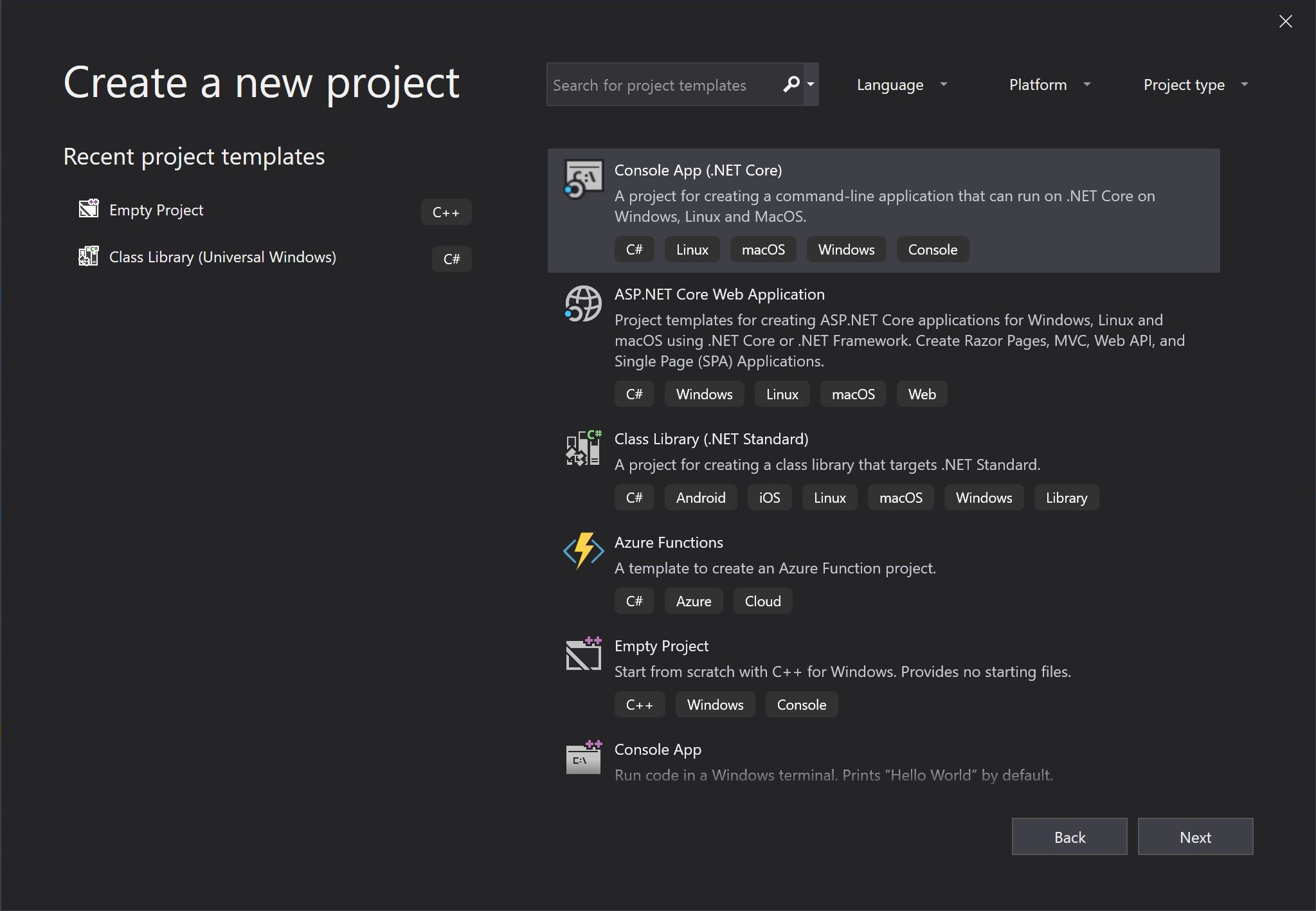
Search-first
But through design studies we found that this still wouldn’t lead to success. The node structure was still too convoluted to be understandable in early usage. We initially wanted to flatten the tree so that there was less digging and clicking to do. But we soon realized that with the overabundance of supported project types, it was an exercise in futility coming up with a single taxonomy that supported every single template. So, we decided to fundamentally shift the way users could discover templates. The search box had low usage in the old dialog box because its position made it a secondary function. But search is a prominent discoverability mechanism across the industry. So, we wanted to improve the way Visual Studio utilized search to help find what you need.
Our early studies saw participants gravitating towards the search box when we changed its position. But there was still a slight hesitation before typing something in – “what do I search for?”. This led to the realization that search cannot be a catch all, and there needs to be a little more guidance. We took the values we knew from the old dialog’s node structure and saw that they roughly fell into three categories – ‘languages’, ‘platforms’, and the more vague ‘project types’. So we introduced filters and tags as secondary mechanisms to support search. Browsing through the tags in the template list will help you discover the different capabilities of Visual Studio based on the tool-sets installed in your instance. Setting filters will allow you to narrow down the list to your preferred choices when starting with a new project.
One decision at a time
We also broke up the process into two separate screens. There is a single decision point on the first screen – select a template. And all the interface elements direct you to make that choice. The second screen is all about providing details about the project type you’ve selected. You can modify the values here or move through the project configuration screen without changing anything since all the recommended defaults are set for you. Some of the more complex project templates then open a third screen which has custom options specific to that project type.
Looking at the template list itself, we made a point to sort this list by our most recommended project templates for the workloads you have installed. So, the template that you should select if you aren’t exactly sure what to do would be the one placed higher in the list. We found that most of you don’t use more than 10 different types of templates, so we’ve made the recent templates list even more prominent than it was in Visual Studio 2017, so that you can get to your most common templates without having to search for them.
Looking forward
This is the first iteration of a new design paradigm we’re trying to adopt for Visual Studio. We’ve been measuring adoption and engagement since the launch of Visual Studio 2019 earlier this month and we’re happy to see a significant increase in success rate through the get to code journey. But at the same time, we acknowledge that the evolution of the experience isn’t over just yet. We’re continuing to listen to your feedback and learning from you to ensure success. We’re on the path to make improvements to search and filtering as they are now the key functionality to finding the right templates. In addition, we recently built in the ability to add tags to your own custom templates. If you’re a template author, find out more on how to update your templates in this blog post. We released this functionality as the result of your direct feedback, and we thank you for it. But we are looking to do better and could use more of your help. Please continue to share your feedback through the Visual Studio Developer Community.
PS: If the dialog would at least save the presets (and also actually show them*). This way my default C# / Windows / Desktop would be the default filter until I decide to switch it up and not having to set it every single time I create a console app to quickly test something.*Since when does a combobox not show the currently selected value? When I choose from the platform combobox the C# language, it still says “Platform:”
The latest version of Visual Studio does remember the filters between sessions. If it’s not in 16.2 already, then it is in the 16.3 Preview
Ugh, I hate this dialog. At work, we have a full installation with most options enabled. Which means there are dozens of available project types. Just to create a Full Framework C# Console App is a journey. Even when you type "console" in the search, the first hits are ".NET Core", "Node.js" and so on. And the icon is "C:\" which means half the time I create a VB.Net console app because the C is so prominent.The pre-selected tree from 2017 and earlier was much more comfortable because it set the focus in the last used area (e.g. C#)
I just came across the new project dialog. I have more than 20 years of experience using VS, but for the first time I am unable to create a new simple C++ Console App for Windows. I've been trying to find a way to create it and lost more than 10 minutes doing so. I tried searching for "Console" - lots of options appear, also tried tuning all those filters and simply could not find it.
Why do we have to rely on search/filters in the first place? The UI should always be straightforward. Filters are an *optional* feature when...
The new project dialog is awful in all meanings. It looks ugly (and doesn’t conform design of VS itself), and it is very unconvenient. Now it takes even more time to create a new project because all the basic settings are on different pages and require more actions to set them.
Don’t fix what is not broken.
The new dialog has a usability problem when changing projects.
Usually I close my projekt and go to some other window (cmd, github, whatever). After VS2019 has finished closing the project it will show the new project dialogue – and janks me back to this dialogue, no matter where else I have been.
Please stop janking away the window focus when showing the open/new project dialogue!! This is extremely annoying!!!
Thanks for this feedback. We’re tracking the suggestion to not automatically open the start window after closing a project/solution here – https://developercommunity.visualstudio.com/idea/534023/dont-automatically-reopen-start-window-after-closi.html
Please upvote and follow the ticket for updates!
Signed up just so I could post. This design is utterly useless.
So much negativity – do look at the positives. For example, the people who designed this dialog are demonstrably not good at their jobs, and yet they are still employed by one of the largest companies in the world. Doesn’t that give you hope? If they can be this bad and still get paid, employment should be straight-forward for those of us with a basic understanding of UIs, users etc.
Because of this bad dialog experience, I tried to open VS2019 4 times and then returned to VS2017.
Wow!! I’m totally impressed from what our (common) voice can do!! 🙂 The ‘old’ ‘New -> Project’ dialog is back – thanks to you guys (ok, I wrote my 2ct as well about this crippled ‘Redesigning the New Project Dialog’). And thanks to the MS-Team for listening (although it took quite while…)!!
I have the latest version VS 16.1.6: it is not back – still new rubbish dialog. What version are you looking at?
Switching to visual studio 2017