
Hello designers,
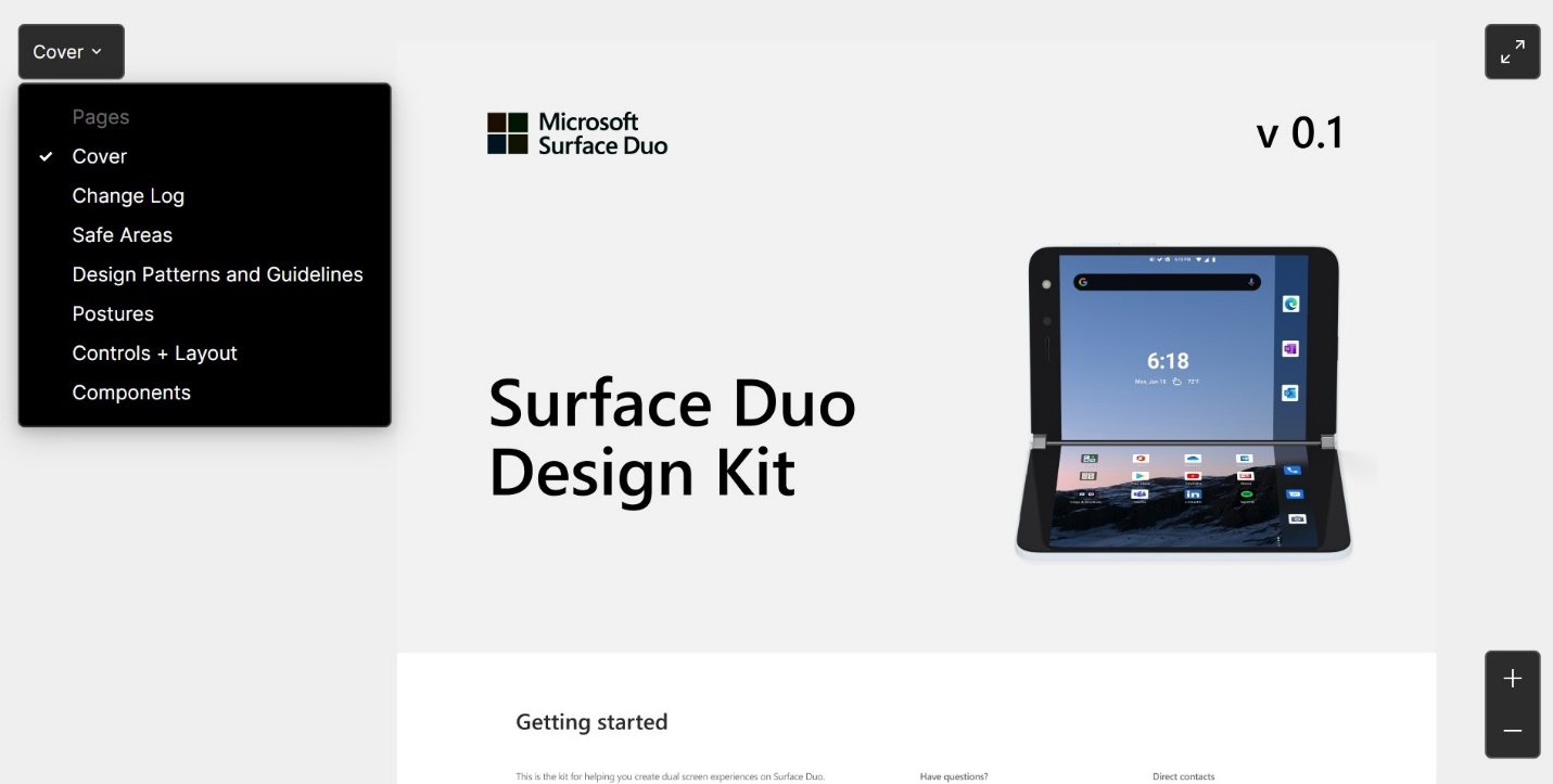
We’re excited to announce the v0.1 of our Design Kit for Microsoft Surface Duo. The kit details dual-screen capabilities and shows common use cases to help inspire your mobile app design. You can easily grab design elements and modify them as needed, giving you more time to create the best experience for your users.
This kit includes the following design elements:
This blog post provides details of what you can expect from the Design Kit that is published on the design and prototyping collaborative tool Figma, and how to leverage these resources for designing dual-screen apps. We will be expanding the Design Kit with more design content and guidance in the future.
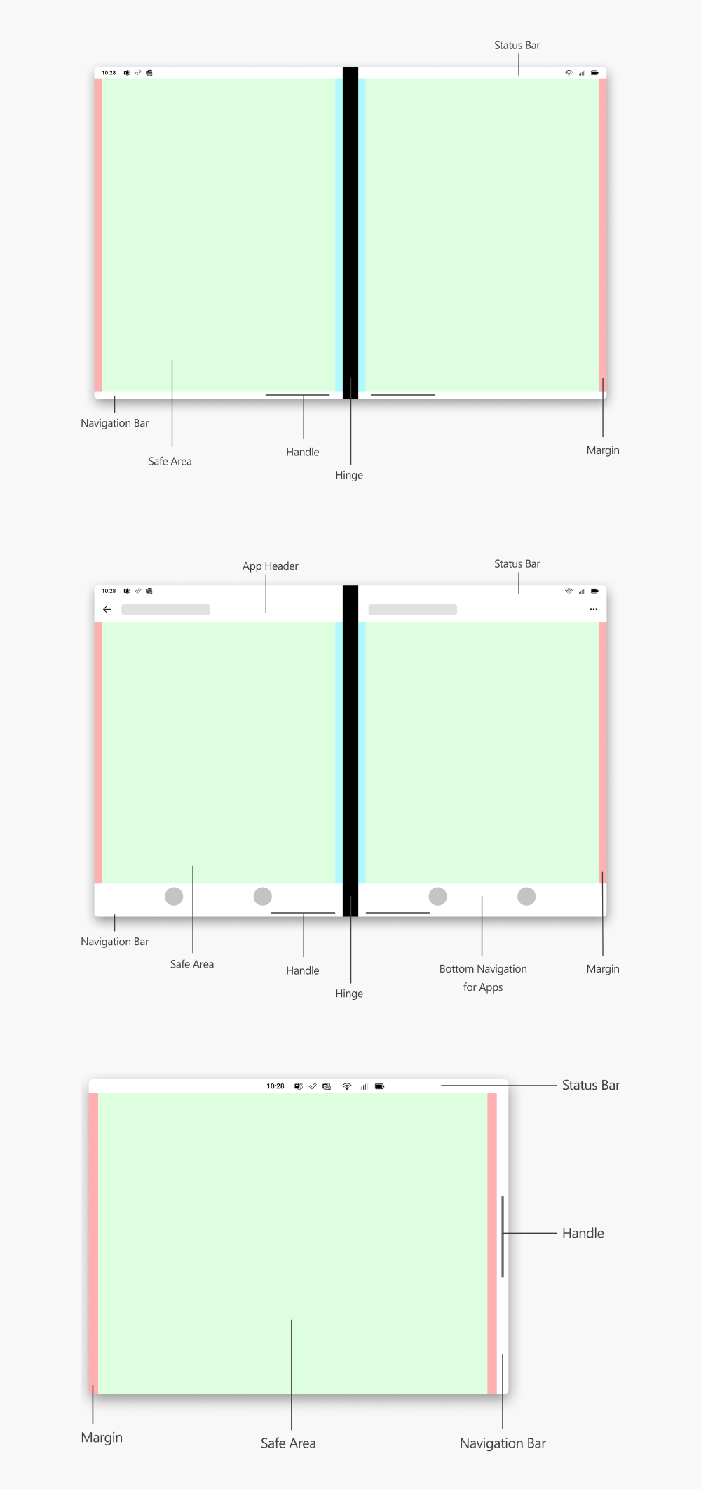
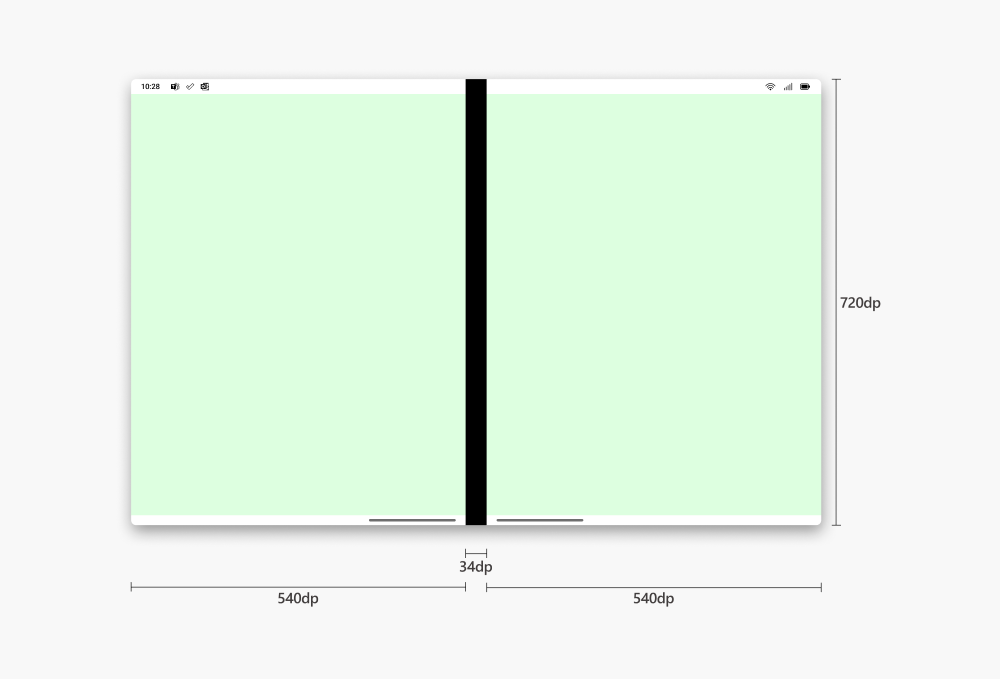
Safe areas
This page showcases safe areas and how to prevent content from underlapping the app header, navigation bar, tabs, and hinge.
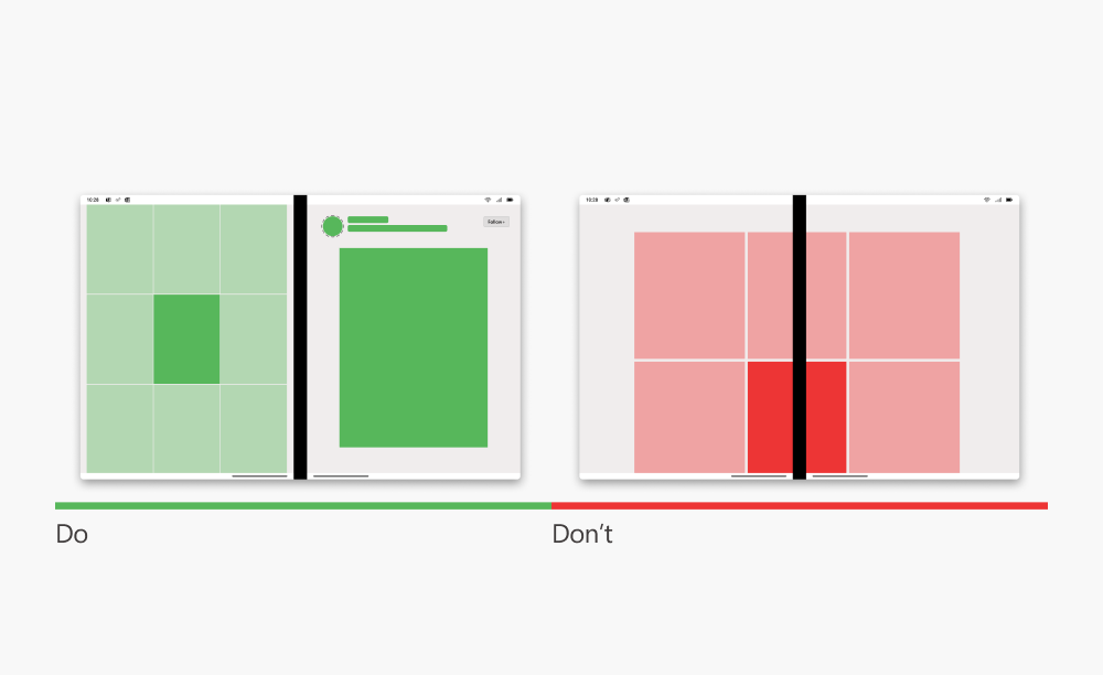
Design patterns and guidelines
Design patterns in the kit show the possibilities of dual-screen displays for different app scenarios and how all the pieces come together for a meaningful product experience.
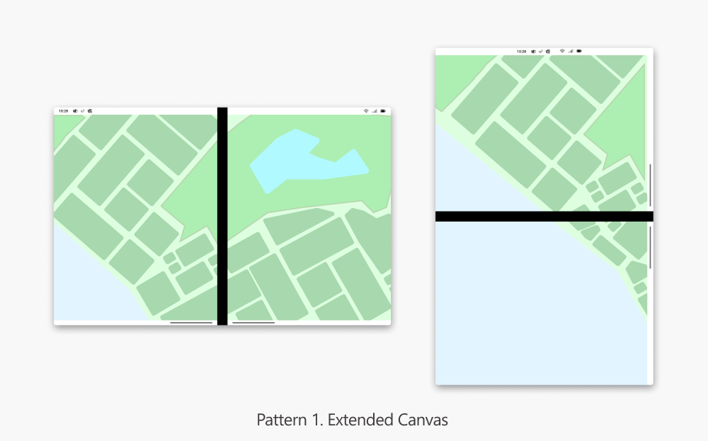

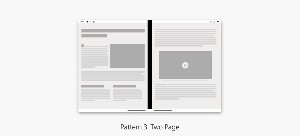
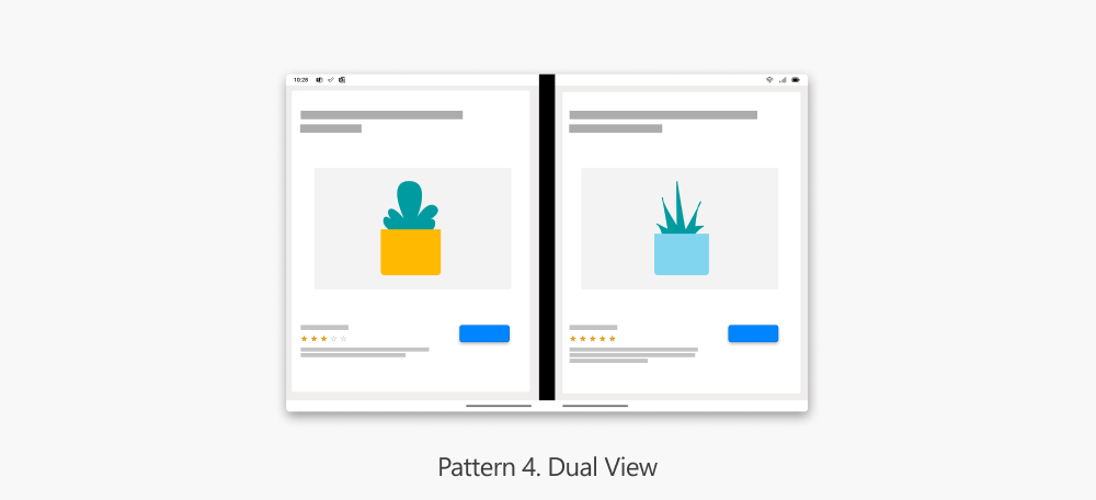
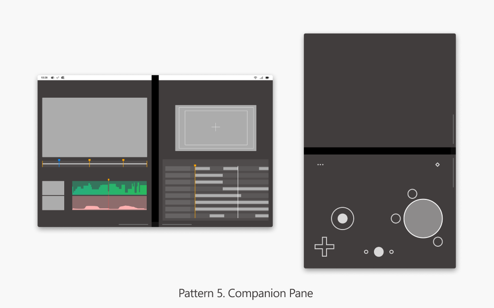
Following the design patterns are the scenarios guiding you the right way a pattern must be used. You might first want to identify which pattern would suit your app the best and then drill down into each of them by reviewing the do’s and don’ts.
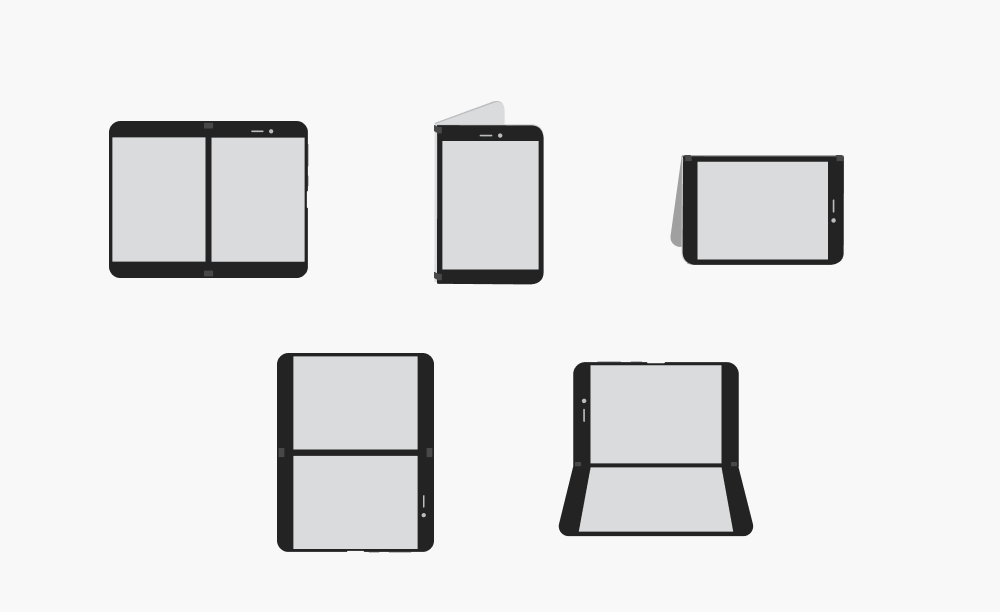
Postures
Dual-screen devices are available in a range of hardware and industrial design variations. The recently released Surface Duo, along with other planned devices, are intended to help define the category, but other devices might include larger displays or varying hinge designs. As you design your apps, keep in mind that you should avoid designing to the specifications of a particular device available today.
Controls and layouts
With a dual-screen form factor in mind, we made sure that you can design just the way you like using familiar controls and layouts. We also highlight details for you to be aware of when designing for dual-screen apps, such as the hinge and include layouts for designing on-the-go.
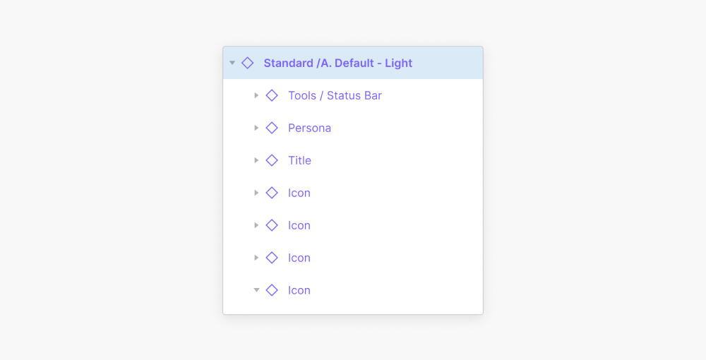
Components
Each component is built to be as flat as possible so they are easy to manage and work with. Some components have hidden layers you can toggle on/off to add variations without detaching.

Resources and Feedback
The Surface Duo Design Kit is available as part of Microsoft’s Figma profile.
You can find an overview of developing dual-screen user experiences in the introduction to dual-screen devices, including the five common patterns (extended canvas, list-detail, two page, dual view, and companion pane).
We would love to hear from you about your experiences designing dual-screen experiences for the Surface Duo. Please reach out using our feedback forum or find us on Twitter @surfaceduodev.
0 comments