
Earlier this year, I had the opportunity to work with a great team of interns to bring Microsoft News to the Microsoft Surface Duo. The interns are:
- Eric Sun – Western University
- Judy Zhong – University of Waterloo
- Sara Li – University of Calgary
- Eishan Lawrence – University of British Columbia
- Rithvik Alluri – University of British Columbia
- Kate Vlaar – University of Alberta
- Natalia Maximo – University of Ottawa.
Throughout the internship, the interns learned about Microsoft’s engineering process as well as Surface Duo and Android development. Now that the Surface Duo has been released, I’m happy to share the story of their hard work. Below is the blog post that they wrote to summarize the amazing work they have done:
From the printing press to digital applications, news consumption has undergone significant changes in the advent of technology. Today, we’re excited to lead the charge with a project to transform news reading for Microsoft’s new dual-screen device: Microsoft Surface Duo. Building on the Microsoft News Android app, we have enhanced the same premium content on a sleek dual-screen device.
In four months, a team of Garage Interns transformed Microsoft News for the Surface Duo – here’s how we did it.
Understanding existing features
In January, our group of seven interns got together for the first time to start working on this project. The team was new to Microsoft News, so our first task was getting familiar with the current Android experience, and paying close attention to the core features and functionality. From user interviews to analyzing existing telemetry, we identified these common actions and opportunities for growth:
- Reading articles
- Viewing photo slideshows
- Watching videos
- Browsing newsfeeds
- Sharing content
As a team, we knew that the Surface Duo app would have to maintain or enhance these core experiences to be successful. Performing this app audit grounded us and kept the team aligned on what newsreaders want to do in our app.
Enhancing core experiences
Content consumption is key to Microsoft News. To transform the app for the Surface Duo, we first prioritized the enhancement of all three types of content available in the app: articles, photo slideshows, and videos. We referenced this documentation page often in the early stages of our product planning. In this blog post, we’ll take a deep dive into article content.
On a single screen device, news reading has become a standardized experience across all news apps. In the current Android app, this is the pleasant experience that readers are accustomed to:
 Figure 1: Current Android app newsfeed
This fundamental functionality is a solid single screen experience, but the challenge for us was identifying what elements to embrace, and which to enhance for the Surface Duo.
Just looking at the newsfeed layout, the Surface Duo’s aspect ratio presented an opportunity to re-think the existing experience. Each Surface Duo screen is much wider than current smartphone screens, which provides increased screen real estate for all apps. With this in mind, we realized the horizontal menu that we’ve become accustomed to wouldn’t be suitable for the Surface Duo. This was further confirmed through user testing – your thumb can’t easily cover the full width of the screen. To adapt to the hardware, we opted for a vertical menu. This experience was much more ergonomic for our testers, so much so that we also implemented a switch for left or right menu preferences.
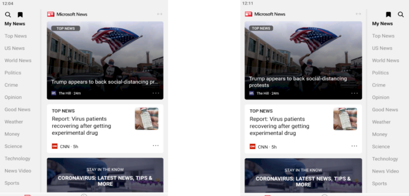
Figure 2: Redesigned Android app newsfeed (featuring left and right menu preferences)
Having tweaked the UI for our newsfeed, we moved on to the larger challenge of identifying screen pairings. The first decision we made was pairing our single screen article reader with the newsfeed on span.
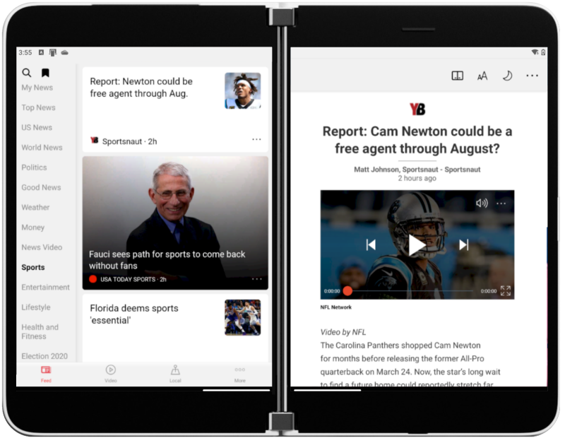
Figure 3: Android app newsfeed list-detail
As we discovered in our product research, readers frequently browse different feeds to find articles of interest. By merging these two screens and utilizing the seam as a natural separator, we brought the list-detail pattern to the newsfeed experience. With the newsfeed persisting on the left screen no matter which article was opened on the right, readers are able to stay grounded regarding their position in the feed.
This was a great start to lay out a new mental model in our app, but doesn’t affect the content consumption piece. Again, through the research and interviews done with existing app users, we identified another opportunity innate to article reading. Today, restricted to one screen, embedded links within articles overtake and hamper the news reading experience on click. We wanted to continue embracing our single article reader, but we also questioned: how might we use the second screen? This created a new set of design thinking tasks specific to articles. Within articles, how will external links and videos behave? We needed to consider the type of data our app displayed. After another session of brainstorming and validating our interactions with volunteers, we finalized our embedded link behavior:
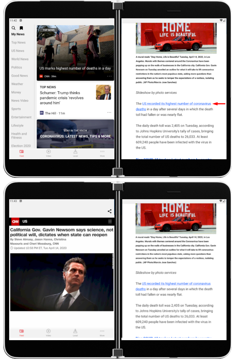
Figure 4: Current embedded link flow
In our app, embedded links open a web view on the opposite screen. This interaction enables readers to gain more information, while remaining in the context of the original article.
After embracing the solid foundation of the single screen article reader and fleshing out all interactions needed, we wondered how we could enhance article reading on the Surface Duo. Particularly in the spanned portrait mode, how we might provide continuous value to news readers? We had already utilized the seam as a separator for list-detail, but what other screen pairings made sense? At this point, we came up with the idea of spanning one article across both screens. By default, the experience translated directly from the current Android app resulted in the content stretching across both screens – and behind the hinge area.
Not the best reading experience. Particularly for news articles, letting the seam mask our content doesn’t make sense. We knew that with two large screens, the increased screen real estate and ability to drill deeper into an article would be incredibly valuable. This gave birth to what we call Book Mode:
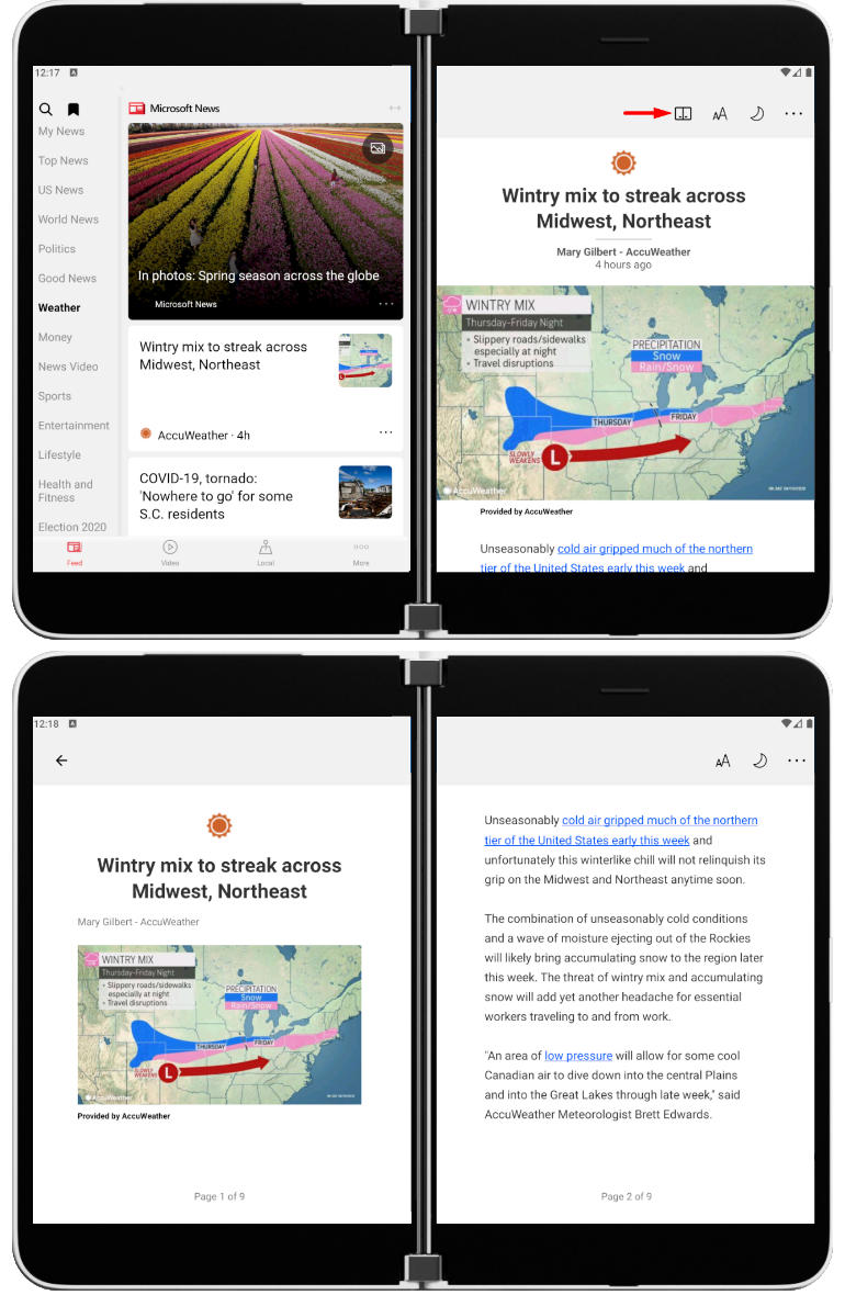
Figure 5: Book Mode
With one click on the Book Mode icon, any article will be spanned on to both screens, providing a reading experience reminiscent of a book. Our Book Mode allows for immersive reading and serves as a prime example of the benefits of the Surface Duo dual-screen experience. With beautifully paginated content, a page progress counter, and the same features carried over from the existing single screen article reader, Book Mode has become a fan favorite with our app testers.
Summary
We’ve learned valuable lessons throughout the course of our four months developing for the Surface Duo. Here are the key takeaways from this blog post:
- Know your strengths: Perform an app audit to identify core existing experiences.
- Embracing vs enhancing: What features can you bring in from the existing app?
- Consider your content: How can the Surface Duo better display your type of content?
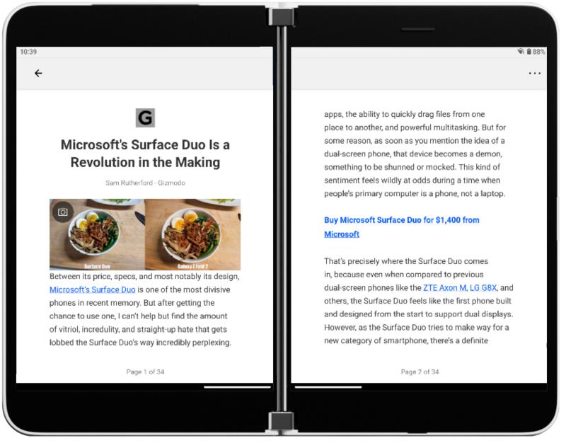
Figure 6: Reading an article in on the Surface Duo
Feedback
The Surface Duo Developer Experience team would love to hear your thoughts on the Surface Duo SDK and how you’re planning to enhance your apps for two screens.
Please reach to out to the team using the feedback forum or follow them on Twitter.
0 comments