
Hello designers!
This week we are happy to share a number of updates to the Microsoft Surface Duo Design Kit that was announced in January.
Design Kit updates
There have been several additions and updates since the last version on the Figma Design Kit:
- Now includes Surface Duo device frames (single and dual-screen) for you to design and prototype with ease.
- Updated guidelines for many of the design patterns.
- Adapted some of our components with the new interactive components feature from Figma.
One major update is the addition of interactive components that allow designers to create prototype interactions between variants in a component set. Interactive components are an extension of variants i.e, anywhere in the Design Kit when you come across a component set with dashed blue lines, during prototyping mode those components have specific behaviors.
Let’s consider a scenario while designing list of items inside an app. Adding a scrollbar component with interactions depict that the content is scrollable in your design mockup without having to design multiple screen states. Components like these come handy while prototyping and creating mockups for your applications.
While we are still expanding the Design Kit with more user feedback and features look out for more interactive components in the future to speed up your design process.
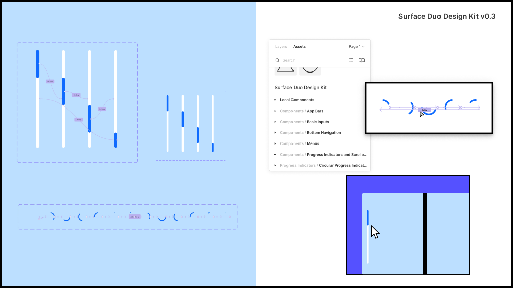
Figure 1: Interactive components for Surface Duo in Figma
The interactive components feature on Figma is currently in beta – check out the livestream to get started with interactive components. Follow the instructions to sign up for the beta and then play around with the interactive components in the Design Kit.
Design Kit version 0.3 is currently available for you to view and duplicate to your own workspace.
Design documentation updates
The design guidelines and tips are now also available as part of the dual-screen developer documentation:
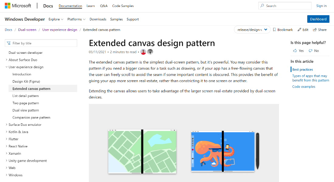
Figure 2: Design documentation
The design documentation has several advantages:
- Easily accessible and translated into other languages, including French and German.
- Contains best practices, dos and don’ts, and scenarios for where to use each design pattern.
- Includes links to relevant GitHub code samples.
- Lists types of applications that benefit from each design pattern.
The Figma Design Kit gets regular updates including additional resources such as components, templates and device frames, to help get started with designing and prototyping.
Video walkthrough
Here’s a video walkthrough of the Design Kit showing you how to leverage the assets to design for foldable/dual-screen Android apps:
Resources and feedback
Check out the Surface Duo developer documentation and past blog posts for links and details on all our samples. You can also find them summarized in the Microsoft Samples Browser, or explore on GitHub.
If you have any questions, or would like to tell us about your apps, use the feedback forum or message us on Twitter @surfaceduodev.
You can also live chat with us on Twitch on Friday, April 9th at 11am PDT, where you can ask questions about the Design Kit or any other aspect of developing dual-screen apps for the Surface Duo!
0 comments