
Hello designers!
We recently unveiled Design Kit v2.1 – a set of updates to the design system kit that enables you to create dual-screen and foldable experiences for Microsoft Surface Duo and Surface Duo 2 in Figma.
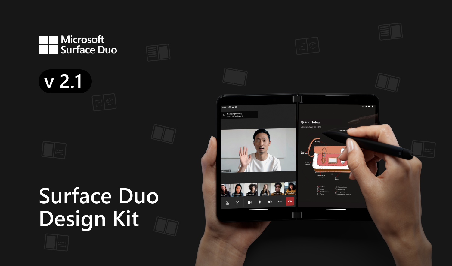
Figure 1: Design Kit v2.1 on Figma
Figma device frame
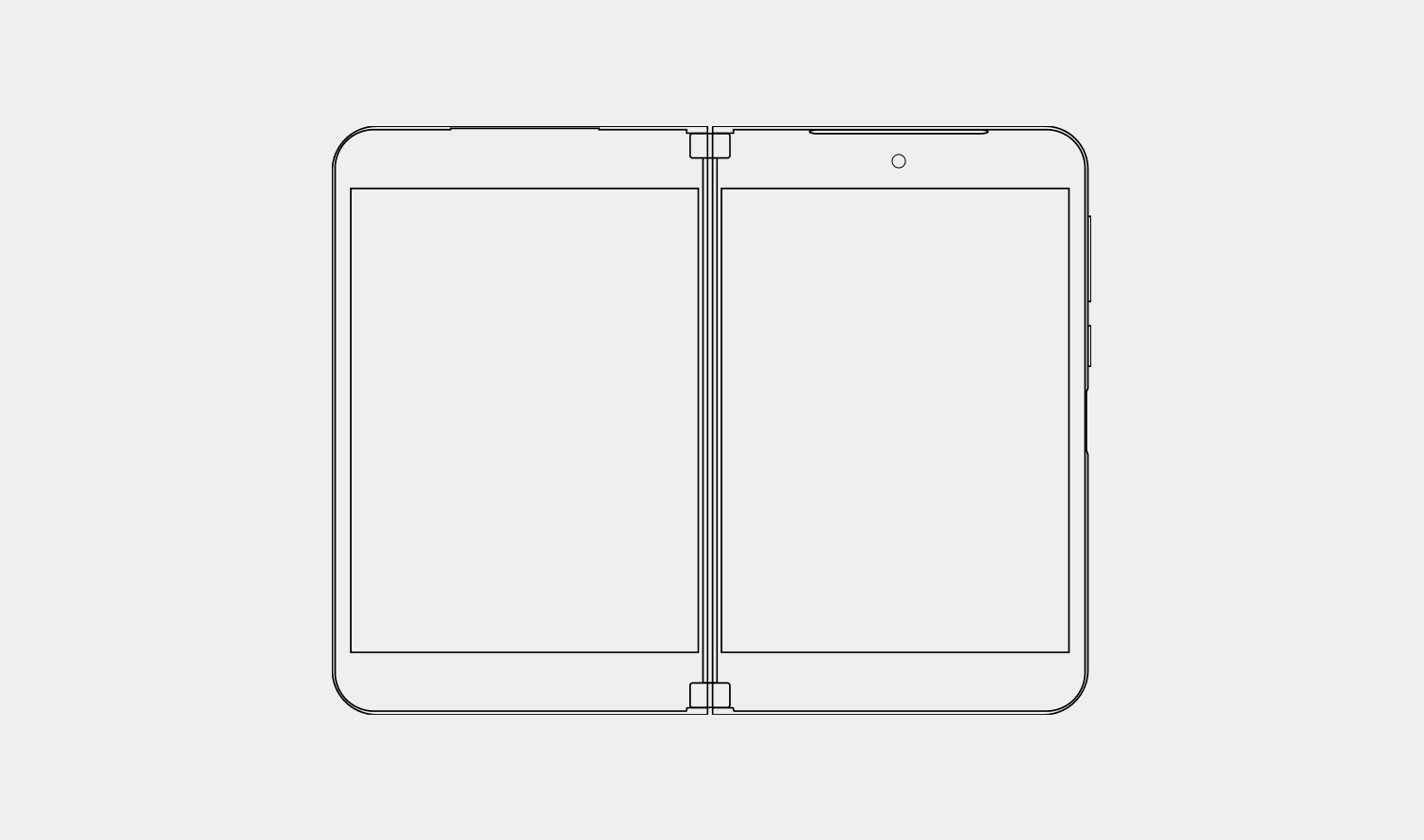
Figure 2: Figma device frames
Today you can start creating wireframes and mockups for Surface Duo and Surface Duo 2 by grabbing the Figma frame and placing your components inside them.
Visually you may notice that Surface Duo 2 has a taller frame height and slimmer hinge compared to Surface Duo since it rocks a new curved display when the device is spanned or maximized. Additionally, this curved display runs across the glance bar in the hinge allowing users to view notifications when the device is closed.
We’ve also included two new device frames for Surface Duo 2 in this update that includes glacier and obsidian color devices to bring a more realistic effect for your mockups and prototypes.
Layout, spacing, and accessibility
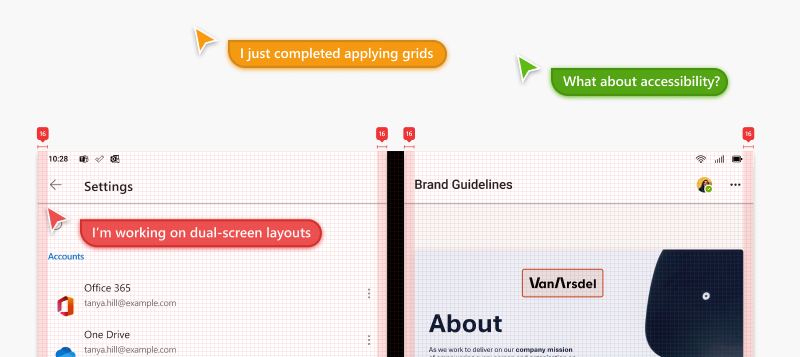
Figure 3: Layout, spacing and accessibility
Along with the Figma frames, we’ve also updated the Layout tab to support Surface Duo 2 with dimensional specifications to consider when designing for a folding form factor.
We’ve designed a sheet that details the spacing and red lines to follow in your apps. Additionally, the team at Microsoft Design has put together two accessibility plugins which are also linked in the Figma file. These plugins check the color contrast ratio of all visible text in a frame, annotates and provides feedback on whether it meets WCAG’s AA and/or AAA level compliance. It also includes color sliders that allow users to adjust the colors and understand how the corresponding contrast ratio changes in real-time.
Video and media guidelines
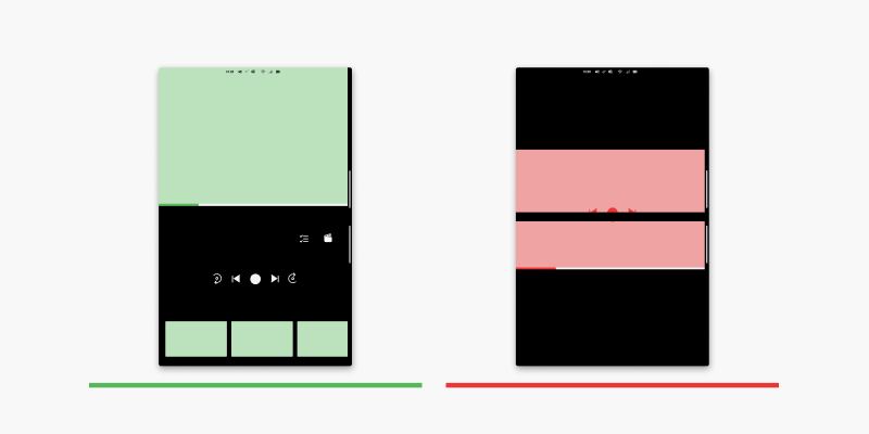
Figure 4: Video and media guidelines
To support app scenarios that utilize the media and video players, we’ve created guidelines to help and provide you with the best practices in the design kit as well.
In addition to those guidelines, the kit also highlights on orientation-based media layouts – i.e., portrait and landscape.
Components
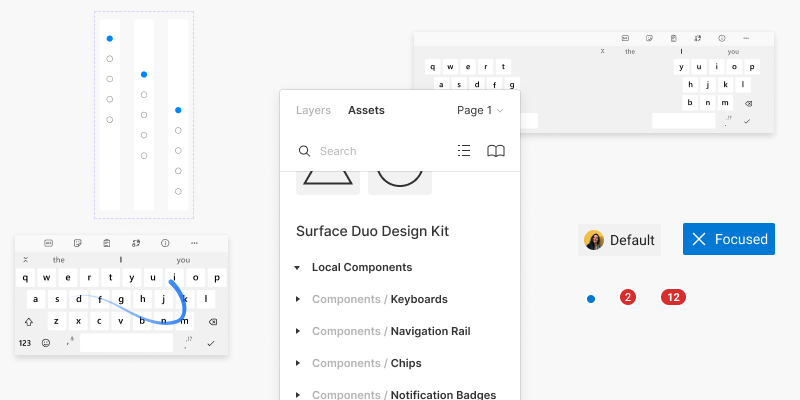
Figure 5: Figma components
Along with the guidelines and layouts, we’ve also updated several components in the Design Kit. Components like navigation rail, keyboards, chips, and app notification badges, that incorporates scenarios for unfolding states and folding states.
In addition to including the navigation rail component in the design kit, we’ve also made a navigation rail sample app that was mentioned in last week’s blog, showcasing the component that adapts to larger displays and how it transforms to a bottom navigation when the device is flipped or folded into a single screen.
Resources and feedback
The Surface Duo Design Kit is available on Figma at the Microsoft Design Page.
While we are expanding the Design Kit, we would love to hear from you about your experiences designing dual-screen experiences for Surface Duo. Please reach out using our feedback forum or find us on Twitter @surfaceduodev.
You can also live chat with us on Twitch on Friday, November 12th at 11am PST, where you can ask questions about the Inking, Design Kit or any other aspect of developing dual-screen apps for Surface Duo!
0 comments