Introducing the New NuGet.org Package Details Page
Today, we are excited to announce a massive makeover for the package details page on NuGet.org. We built NuGet.org to help .NET developers find packages that will accelerate their projects, and this latest update has changes meant to help package consumers and authors alike. The NuGet.org website design was last updated in 2017, which means it has been more than four years since we have had a new look! In preparation for several new features that are on the way to roll-out, our team has been working hard on a revamp of the NuGet.org package details page that is more useful for our community. The project was primarily driven by our awesome summer intern Sophia, who worked on both the design and implementation of the new page.
In August, we asked our users to try out the new look and tell us what they thought. We received over 700 responses, nearly all of them with additional details and verbatims. We are grateful for all the time you contributed towards making us a better package manager for you all. With that, our team wanted to take some time to share what we learned from you and what we are doing to address your feedback.
Why change the page?
In May 2021, embedded READMEs were rolled out as a feature on NuGet.org. Now package authors can upload their existing README files to NuGet.org, showing users valuable information about the package without having to do any additional work. This is just the first of several new features that will be made available on NuGet.org over the next year, from displaying information about a package’s supported frameworks on its details page to providing transparent quality scores for packages – more on these later.
With all this new valuable information to show, the previous package details page design would run out of space! The NuGet.org team decided to move the page towards a tab-based design which will provide ample room for new features and allow users to switch between pages.
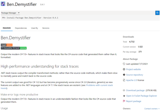
After dozens of iterations and changes based on back-and-forths with the community, our team finally landed on the final design below.
Survey feedback
Our team knew that a new design would be a huge change to the NuGet.org experience and we wanted to hear what our community had to say before we set anything in stone. In August, we launched a banner that displayed on the NuGet.org package details page for all users that announced changes and linked to a survey to leave feedback.
We received over 700 responses in the course of two weeks, the vast majority of them coming in with detailed responses. Not only did users give opinions on the new design, they told us about features and capabilities they wanted to see next on NuGet.org. Thank you to all of you who took the time to help us improve. We are actively learning and making changes to our plans based on your feedback.
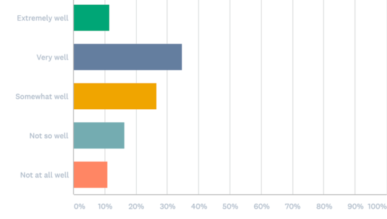
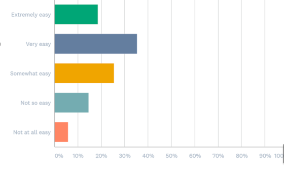
The first iteration of our new design saw generally positive reception, with users praising the new tabs and sidebar in particular. In addition they felt the new design looked cleaner and that information was easier to locate.
Some other verbatims can be seen below:
“”Package description is cleaner, more visible and is the first thing on which the eyes focus. In the old design description was a bit cluttered, overpowered by giant headings, tables, and other elements.”
“Right column data was cleaned up, looks great. I like seeing the popularity of the package at the very top.”
“I prefer the tab style for different sections ReadMe, Dependencies, Versions etc. since usually I only care about one of these tabs when I look at nuget page, and you don’t need to scroll past the bits you don’t care about.”
The overall usefulness of the redesign was also reflected in the multiple-choice questions on the survey, as seen in the graphs below of responses.
Overall, how well does the redesign meet your needs?
How easy was it to find what you were looking for on the redesign?
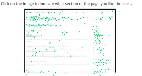
Other parts of the redesign received less positive feedback from the community.
You can see that the least liked part of the redesign was the new installation instructions. As part of this redesign, our team considered moving towards a sticky dropdown menu, which would save a user’s selection and scale even as we add more client instructions in the future.
Survey respondents did not like the new dropdown design, however. Some wanted to see all their options at a glance and others felt that the added click presented an extra barrier to users. Other concerns were about the amount of empty space and that the tabs should be more pronounced.
We also heard many other asks, which include but are certainly not limited to:
- Dark mode for nuget.org
- Show target framework compatibility information for packages
- Better statistics for package authors
Anything on your mind that you didn’t see above? Tell us about it in GitHub Discussions or hit us up on Twitter at @nuget.
Conclusion
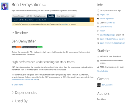
To sum up our long journey with this redesign, here is the page that we had to begin with:
This is the first redesign draft we previewed to customers to put our ideas to the test and get valuable community feedback:
Last but certainly not least, here is the final version of our redesign which includes edits based on all of your feedback:
We reverted installation instructions back to what they were like before. Though we eventually plan to improve this feature, we will only do so once we find a better option that does not impact the current user experience. We made the design tighter, with a tab design that stands out more on the page.
What’s next
As we mentioned before, we have a number of new features rolling out over the next few months. We’re working on a long awaited feature to NuGet.org – calculating and displaying all of a package’s compatible target frameworks – with the eventual goal of giving our users the ability to search by target frameworks.
We are listening to your feedback, and everything you tell us only makes this product better. You can guide what these features look like by reaching us with the ways below:
- Catch-up on the discussion about improving the NuGet.org package details
- Check out our documentation on submitting bugs and suggestions.
- Schedule a time to talk to NuGet.
- Reach out to us on Twitter – mention @nuget in your tweets.



 Light
Light Dark
Dark
1 comment
I like the new look but I think there is one thing that needs attention. Since the readme file is supported on NuGet now, all possible markdowns should be supported too. One thing that was too hard for me to set is the superscript in the readme. I am using GitHub as my project repository and the readme file has superscript Feb 28ᵗʰ in the content. It seems that the new NuGet design does not support it in the readme. It would be nice to have it added.
Here is the GitHub readme and this is the NuGet readme. In NuGet readme I had to use the symbol character for superscript which makes unwanted manual editing.