

The countdown is on. 🚀
Copilot UX components, rich, interactive experiences rendered directly in Microsoft 365 Copilot, are on track for general availability in October 2026, for all customers worldwide.
A few months ago, this was a brand-new public preview with a working name. Today it has its final name, it’s live in every tenant, you can try it in minutes with ready-made samples, and our hands-on preview program filled up faster than we ever expected. Thank you, your energy is carrying this across the finish line.
As always, this is a community-driven journey. Every GitHub issue, community call question, and sample you tried over the past weeks has shaped what ships in October.
Go beyond text with Copilot UX components
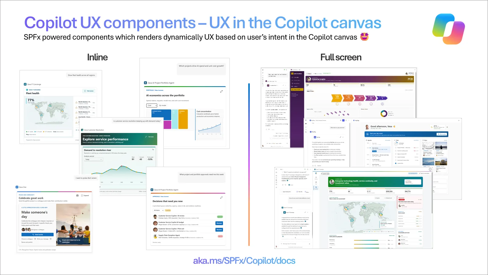
Imagine asking your agent about this quarter’s sales and getting back a live chart you can explore. Or asking for time off and getting a form where you review the dates and submit, in one step. No wall of text. No link out to another system. Just the right UI, right in the conversation.
That’s Copilot UX components. Your agent can render charts, maps, KPIs, forms, approvals, and live business data directly in the Microsoft 365 Copilot canvas, so users move from intent to action without leaving Copilot. Components render inline for quick, in-context interactions, or expand to full screen when the scenario needs more room.
Humans in the loop, by design
Agents are good at interpreting requests and proposing next steps: they analyze, reason, and work out what should happen next. But the moments that matter most in business processes, approving a request, confirming an order, correcting data before it’s submitted, need a person in control.
Copilot UX components give your agent a purpose-built UI for exactly those moments:
- Copilot understands the intent. The user asks in natural language, and the agent works out what’s needed.
- Your component shows the facts. Deterministic, accurate business data and choices, rendered by your code, not generated text.
- The human decides. The user reviews, adjusts, and confirms, and the action flows to your business systems through the APIs your solution calls.
AI for intent. UX for action. Humans in control.
That’s how agents move from impressive demos to trusted, everyday business processes.
Built on what you already know
- ✅ Automatic hosting in your Microsoft 365 tenant. Components deploy on the SPFx hosting model you already run and govern, no new infrastructure to operate, and no new place for your data to live.
- ✅ Built-in single sign-on and security. Client-side security uses the signed-in user’s permissions.
- ✅ Industry standards. React and standard JavaScript libraries, implementing the MCP Apps model, without the hosting and routing work that usually comes with it.
- ✅ Build once, deploy to many tenants. A component is a standard SPFx solution package, deploy it to your own tenant or to your customers’ tenants.
- ✅ Familiar tools. Starter templates (Minimal, No framework, or React) and the Copilot Workbench for local testing.
Build the experience, not the hosting infrastructure.
What will you build?
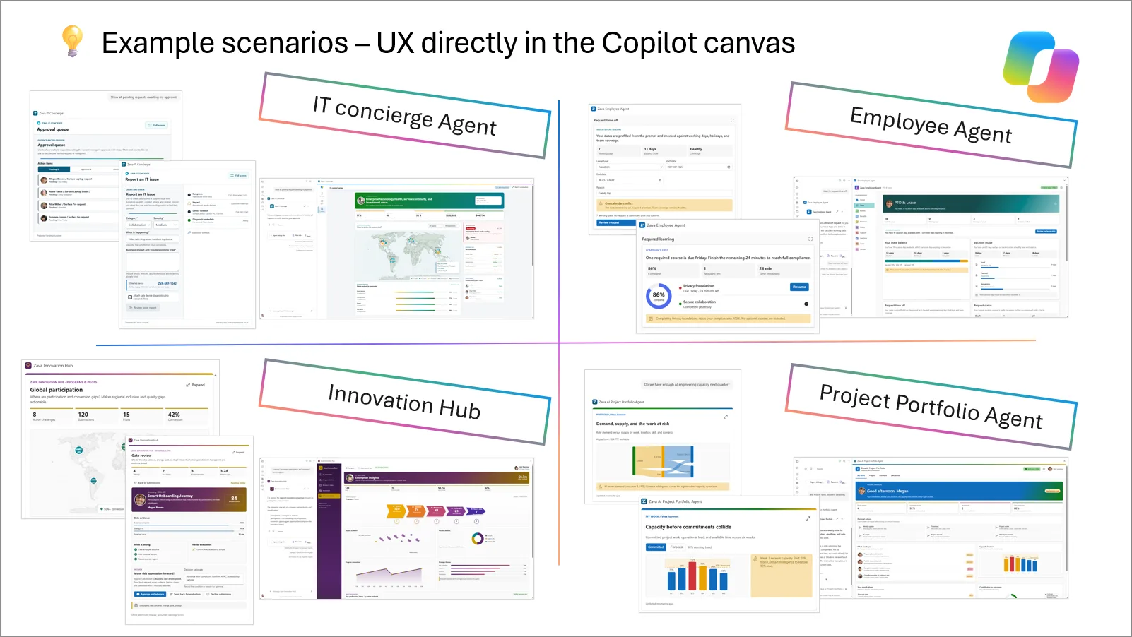
If a scenario lives in a web part or a portal page today, it can become a Copilot UX component that your users reach through an agent. A few ideas to get you started:
- Line-of-business data, sales dashboards, customer 360 views, stock levels, expenses, and pay slips
- Employee services, time off, help desk, travel booking, onboarding tasks, and recognition
- Personal dashboards, relevant news, latest tasks, and your day at a glance
- Governance and operations, site provisioning, policy checks, and site dashboards, with an admin confirming each step
General availability in October 2026, for all customers 🎉
Our target is to make Copilot UX components generally available in October 2026 for all customers, together with SharePoint Framework 1.24.
Until then, the public preview is open to everyone:
- Enabled worldwide, in every tenant, no special ring, sign-up, or allow-list needed.
- No Microsoft 365 Copilot license is required to develop or test during the public preview, and there are no consumption-based costs during the preview.
- Licensing for general availability is still to be confirmed. We know this matters for your planning, and we’ll share the details as soon as they’re final.
Try it in minutes, no build required
You don’t need to write a line of code to see Copilot UX components in action. Scenario samples include ready-to-deploy solution packages, demo data, and setup instructions, so you can try the experience in any Microsoft 365 tenant in minutes.
Ready to build your own? It takes four steps:
- Install the SPFx 1.24 preview:
npm install @microsoft/generator-sharepoint@next --global
- Scaffold a new Copilot UX component and pick a template, Minimal, No framework, or React.
- Run and test it locally in the Copilot Workbench.
- Deploy to your tenant and surface it in Copilot.
Everything you need:
See the business value
If you only have a few minutes, start here. This walkthrough shows Copilot UX components in an end-to-end business scenario, what the user sees, what it replaces, and why it matters. It’s built on the same public samples, so you can reproduce it in your own tenant and adapt it to your business.
It’s official: Copilot UX components
A quick note on naming. This capability was announced in June as SharePoint Copilot Apps, and in August we used Copilot Components as the working name. The final name is Copilot UX components, and that’s what you’ll see in the documentation, templates, and samples going forward. Nothing about the capability changes; if you come across older content using the previous names, it’s the same thing.
Preview program update: closed due to overwhelming interest 🙏
In the August update, we opened a hands-on preview program for customers and partners who wanted to build agents with Copilot UX components on top of their own business processes, working directly with our engineering and product teams.
The response was overwhelming. Interest from customers and partners around the world went far beyond what a hands-on program can support, so we’ve closed sign-ups. We’re now working with the selected participants on real business scenarios, and we’ll share what we learn, and hopefully some of their stories, along the way.
To everyone who signed up: thank you! If we couldn’t fit you into this round, you’re not blocked on anything. Copilot UX components are in your tenant today, the samples are public, and your feedback through GitHub and our community calls reaches the same engineering team.
SharePoint Framework 1.24, beta 5 is out, release candidate is next
In September, we shipped SPFx 1.24 beta 4 on September 17 and beta 5 on September 23. We had a small hiccup in beta 4, which was addressed with beta 5. The release candidate is next, followed by general availability in October.
Highlights already in the 1.24 preview:
- Predictable default display mode for components in the Copilot canvas
- No more version conflicts when updating a component, the Teams manifest hotfix version is bumped automatically
- Declarative agent manifest validation at build time, catch issues while you build, not at runtime in Copilot
- New components scaffolded with declarative agent manifest v1.8
See the SharePoint Framework 1.24 release notes for all the details.
React 18 and Node.js, platform updates
React 18 is part of SPFx 1.24
It’s been at the top of your list for a long time, and it’s here: the out-of-the-box React version for SPFx solutions is updated to React 18.x in SharePoint Framework 1.24. It’s available in the 1.24 preview today, and it ships with 1.24 general availability.
Please test your solutions now, this is exactly the kind of change where broad, real-world testing before GA makes the difference. We’re especially interested in:
- Anything that behaves differently under React 18’s stricter rendering behavior
- Build, bundling, or type-definition issues when upgrading an existing solution
- Third-party component libraries that don’t yet play well with React 18
Share what you find through the sp-dev-docs issue list.
Node.js 24 and Node.js 26 support is on the way
We’re also working on support for Node.js 24 and Node.js 26 for SPFx development. This is coming as part of the upcoming release candidate for SPFx 1.24 and will be included in the General Availability.
Roadmap
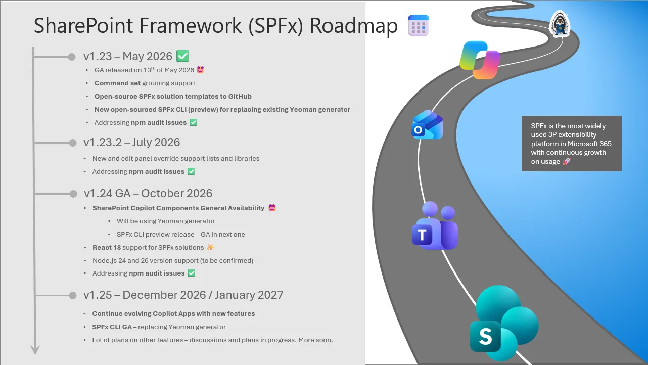
We continue to evolve towards a more predictable, quarterly-oriented release cycle, and we’ll keep the public roadmap updated as schedules and features firm up. Here is the current set of investments planned for upcoming SPFx releases:
Version 1.23.2 – June 2026 (shipped)
- Issue fixing and platform quality improvements
- Readiness for new and edit panel override support for lists and libraries
- Addressing any new npm audit vulnerability issues
Version 1.24 Beta 5 – September 2026 (shipped)
- Copilot UX components public preview update
- React 18 support for SPFx solutions
- Addressing findings from previous beta specifically on Copilot UX components
- Addressing any new npm audit vulnerability issues
Version 1.24 General Availability – October 2026
- Copilot UX components general availability
- React 18 support for SPFx solutions
- Node.js 24 and Node.js 26 support
- Addressing any new npm audit vulnerability issues
Version 1.25 – December 2026 / January 2027
- Further evolving the Copilot UX components model
- SPFx CLI general availability (GA) – includes updated open-source templates – replacing Yeoman generator from this version forward
- Navigation customizers – options to override navigation nodes and/or experiences with SPFx components – more details in work in progress
- Other potential areas and topics based on customer and partner feedback
- Addressing any new npm audit vulnerability issues
Roadmap items represent our current plans and may change as development progresses and customer feedback is incorporated. We will be updating you on the situation with the monthly updates.
Top of mind
These are the items that are top of mind for us, and which we want to address as soon as possible:
- Licensing for Copilot UX components at general availability. To be confirmed, we’ll share the details as soon as they’re final.
- Node.js 24 and Node.js 26 support. Landing in 1.24 GA.
- React 18 upgrade guidance. As solutions move to 1.24, we’ll publish guidance covering the common upgrade paths and known third-party library considerations.
- Copilot UX components in more places. Copilot in Teams, Cowork, Word, Excel, PowerPoint, and Outlook, so your components meet users wherever they work with Copilot.
We encourage you to keep sharing feedback to support our planning for the upcoming quarters. We already have an extensive list of ideas and enhancements in mind, and we’re always interested in your input.
What’s next?
We continue expanding the SharePoint platform to unlock more innovation across Microsoft 365:
- SharePoint Framework (SPFx) for building rich, AI-powered, and business-integrated solutions with custom user interfaces directly in Microsoft 365, now including Copilot UX components.
- SharePoint Embedded to bring SharePoint content into your own apps hosted outside of Microsoft 365, with your own user interface.
- Copilot and agents to create intelligent, adaptive experiences that access your content and business information efficiently, with Copilot UX components keeping people in the loop.
- Copilot in SharePoint, now generally available, with rollout starting September 30, 2026. Read more in “SharePoint AI innovations hit GA, powering new Copilot app and agents”.
We encourage you to explore these capabilities and see how they can help you build the next generation of solutions for your organization and customers.
If you’re planning to build experiences for Copilot, Microsoft 365 & Power Platform, we strongly recommend joining our community calls and the broader Copilot, Microsoft 365 and Power Platform Community activities, covering Microsoft 365 Copilot, Power Platform, SharePoint, Microsoft Teams, Copilot Studio, Microsoft Graph, Microsoft Viva, and more. You can find call details and community assets at https://aka.ms/community/home.
You might also be interested in our SharePoint partner showcase series, where we highlight solutions built with SharePoint. Each episode includes a video and a blog post with additional details. If you’re building something with SharePoint and would like to be featured, let us know through the sign-up form and we’ll contact you to schedule a recording.
Follow us on LinkedIn or X to stay up to date on Copilot, Microsoft 365 & Power Platform announcements.
Got feedback or input on this blog post? Leave a comment and we’ll get back to you.
We’ll be back with the next roadmap update at the end of October, hopefully celebrating the general availability of Copilot UX components together. 🎉
👋 Happy coding!


0 comments
Be the first to start the discussion.