
Updates (December 2020):
As of December 11th, 2020, the Microsoft Graph Toolkit team released version 2.0. You can now customize your components and apply dark theme by adding class=”mgt-dark” to your HTML. You can read more about this functionality here.
Author: Hugo Bernier, Microsoft Office Development MVP
Welcome to Day 4 of the Microsoft Graph Toolkit blog series!
As you have seen in our previous blog posts, Microsoft Graph Toolkit is designed to make it easy to access and work with Microsoft Graph with a collection of framework-agnostic reusable web components.
Not only are they easy to use, but they’re also designed to look and feel as if they’re out-of-the-box Microsoft 365 components. Your users will feel comfortable with the UI components they already know and love.
For example, these one of the images below is taken from SharePoint, while the other is using a custom web part using the Microsoft Graph Toolkit <mgt-person /> component. Can you tell them apart?

But what if you need to do something that doesn’t look like “out-of-the-box”? What if you need your custom application to stand out? Maybe you’re integrating this experience into an existing application with your own established visual style?
You’re in for a treat then: the Microsoft Graph Toolkit components are easy to customize!
In today’s post, we’ll show you how to customize the look and feel of the Microsoft Graph Toolkit components.
Using the Microsoft Graph Toolkit Playground
The Microsoft Graph Toolkit Playground is a great place to follow along with this post and start working with component customization. To use the playground, select a component from the list in the left navigation, then edit the HTML, JS, and/or CSS panes on the right. As you make changes, you should see a preview of the results.
Using Properties and Attributes
Most Microsoft Graph Toolkit components provide attributes and properties that you can use to change how the component will render.
For example, you can use the <mgt-people/> component default settings by simply using the HTML element as-is:
<mgt-people></mgt-people>…which will render the profile photos or initials of the first 3 people it finds, followed by a count indicating how many more people aren’t shown in the list:

But if you can override the default settings. For example, if we wanted to show a maximum of 10 people, we’d use the following HTML:
<mgt-people show-max="10"></mgt-people>
…which will render the following results:

The only thing I changed between the first and the second sample is that I set the show-max attribute to 10.
Luckily, you don’t have to guess which attributes are at your disposal, the Microsoft Graph Toolkit documentation tells you which attributes are at your disposal with every control.
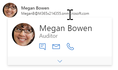
For example, the <mgt-person /> component’s default setting is to show only the person’s photo or initials:
<mgt-person person-query="me"></mgt-person>
Which produces this:

But if you look at the attributes and properties of the person component, you’ll see that we can specify view=”twoLines” to change the default settings. So, this:
<mgt-person person-query="me" view="twoLines"></mgt-person>
…will produce an image with the person’s name and email address:

You can also dynamically change these settings using code. For example, the following HTML and JavaScript will produce the same results as above:
HTML:
<mgt-person person-query="me"></mgt-person>
JavaScript:
let person = document.querySelector('mgt-person');
person.view = "twoLines";
You may have noticed that when I changed the settings using HTML only, I used the HTML attribute view=”twoLines”, whereas in JavaScript, I used the view property. You can control most components’ settings by specifying the attributes in HTML, or the properties in JavaScript or both, depending on what you’re trying to do.
Again, each component’s documentation page will give you the list of attributes and their matching properties, so you don’t have to guess.
Some components, like the <mgt-tasks /> also expose more properties that don’t have matching HTML attributes – partly because it wouldn’t make sense to do so using HTML attributes.
For example, using the <mgt-tasks /> component, you can filter which tasks you wish to show:
let taskView = document.querySelector('mgt-tasks');
taskView.taskFilter = task =>
  task.appliedCategories.category1 === true
  || task.appliedCategories.category2 === true
  || task.appliedCategories.category3 === true;
Which will show you any task that belongs to category 1, 2, or 3 (See Try-It-Out sample here), while the following code will show you only tasks that belong to categories 1, 2, and 3:
let taskView = document.querySelector('mgt-tasks');
taskView.taskFilter = task =>
  task.appliedCategories.category1 === true
  && task.appliedCategories.category2 === true
  && task.appliedCategories.category3 === true;
And if you wanted to filter any tasks where the title contains the word “Launch”, you’d use the following:
let taskView = document.querySelector('mgt-tasks');
taskView.taskFilter = task => task.title.indexOf('Launch') > -1;
Doing the same thing with HTML attributes would be exceedingly difficult to do. Trust me, I’ve tried.
Using Custom CSS Properties
So far, we’ve used the attributes and properties to change the default settings of components. But what if you really want to change how the Microsoft Graph Toolkit components look, you can also use custom CSS properties. Most component expose custom CSS properties that you can override using plain old CSS to completely customize their looks. For example, you can use the <mgt-person /> component to show a standard profile card when you mouse over the name using the following HTML:
<mgt-person
  person-query="me"
  view="twoLines"
  person-card="hover"></mgt-person>
Which produces the following:
But if you add the following CSS to your page:
mgt-person {
  --person-card-display-name-font-size: 40px;
  --person-card-display-name-color: #ffffff;
  --person-card-title-font-size: 20px;
  --person-card-title-color: #ffffff;
  --person-card-subtitle-font-size: 10px;
  --person-card-subtitle-color: #ffffff;
  --person-card-details-title-font-size: 10px;
  --person-card-details-title-color: #b3bf0a;
  --person-card-details-item-font-size: 20px;
  --person-card-details-item-color: #3abf0a;
  --person-card-background-color: #000000;
}
The same component will render the following:
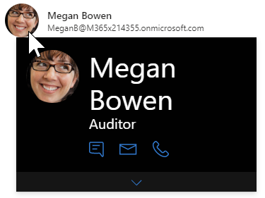
These customizable styles are called CSS custom properties because properties like –person-card-display-name-font-size don’t exist in standard CSS – they’re custom to the Microsoft Graph Toolkit component. (See this sample in Try-It-Out repo here.)
You can find the list of CSS custom properties on each component’s respective documentation.
Using specific CSS
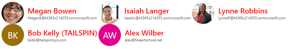
If you have multiple instances of a Microsoft Graph Toolkit component on a page and want to apply CSS custom properties on only one of them, you should use CSS selectors to control which instance will be modified.
For example, let’s pretend we have a bunch of person components on a page, as follows:
<div class="team-list">
  <mgt-person class="first" person-query="MeganB@M365x214355.onmicrosoft.com" view="twoLines"></mgt-person>
  <mgt-person class="second" person-query="IsaiahL@M365x214355.onmicrosoft.com" view="twoLines"></mgt-person>
  <mgt-person class="third" person-query="LynneR@M365x214355.onmicrosoft.com" view="twoLines"></mgt-person>
  <mgt-person class="fourth" person-query="bobk@tailspintoys.com" view="twoLines"l></mgt-person>
  <mgt-person class="fifth" person-query="alex@fineartschool.net" view="twoLines"></mgt-person>
</div>
If you define a CSS custom property as follows, you’ll affect every persona control on the page:
mgt-person {
  --color: red;
  --avatar-size: 72px;
  --font-size: 24px;
}
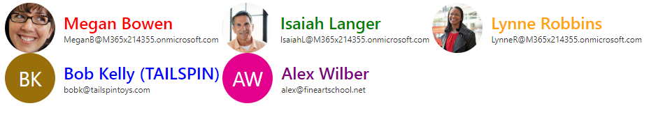
But if you use a CSS selector that is more specific, you can control which persona components are affected. For example, you could control individual styles by applying a custom CSS class name on each component and then applying the CSS custom properties on each component individually:
mgt-person.first {
  --color: red;
  --avatar-size: 72px;
  --font-size: 24px;
}

mgt-person.second {
  --color: green;
  --avatar-size: 72px;
  --font-size: 24px;
}

mgt-person.third {
  --color: orange;
  --avatar-size: 72px;
  --font-size: 24px;
}

mgt-person.fourth {
  --color: blue;
  --avatar-size: 72px;
  --font-size: 24px;
}

mgt-person.fifth {
  --color: purple;
  --avatar-size: 72px;
  --font-size: 24px;
}
Which renders each component with a different style: (See this sample in Try-It-Out repo here.)
Putting it all together
You can combine all the techniques we discussed in today’s post with along with regular HTML and CSS techniques to completely customize the look and feel of your components.
For example, if you wanted to display the same list of team members so that it looks like a bunch of polaroids on a page, you could use the following custom CSS (inspired from this page) :
.team-list mgt-person {
  --avatar-size: 72px;
  --font-size: 24px;
  width:300px;
  padding: 12px;
  transform: rotate(-2deg);
  transition: -webkit-transform .15s linear;
  box-shadow: 0 3px 6px rgba(0,0,0,.25);
  background-color:white;
  margin: 8px;
}

.team-list mgt-person:hover {
  -webkit-transform: scale(1.25);
  -moz-transform: scale(1.25);
  position: relative;
  z-index: 5;
  box-shadow: 0 3px 6px rgba(0,0,0,.5);
}

mgt-person.second, mgt-person.fourth {
  -webkit-transform: rotate(2deg);
  -moz-transform: rotate(2deg);
}

/* Don't rotate every third image, but offset its position */
mgt-person.third {
  -webkit-transform: none;
  -moz-transform: none;
  position: relative;
  top: -5px;
}

/* Rotate every fifth image by 5 degrees and offset it */
mgt-person.fifth {
  -webkit-transform: rotate(5deg);
  -moz-transform: rotate(5deg);
  position: relative;
  right: 5px;
}
Which produces the following results:
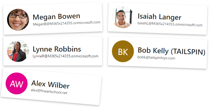
With a cool hover effect: (See this sample in Try-It-Out repo here.)

Conclusion
In this post, we’ve shown you how you can use attributes and properties to change the default settings of Microsoft Graph Toolkit components.
You should use attributes within your HTML, and properties within your code.
To completely change the look of a component, you can use the CSS custom properties within your CSS file (or <styles/> element).
But you can customize the components even more! In our next blog post, we’ll show you how you can use templating to override the content inside of a component.
Stay tuned for the next blog in our series! We will show you how to utilize templates to further customize toolkit component.
0 comments