Blazor 0.7.0 is now available! This release focuses on enabling component coordination across ancestor-descendent relationships. We've also added some improvements to the debugging experience.
Here's what's new in the Blazor 0.7.0 release:
- Cascading values and parameters
- Debugging improvements
A full list of the changes in this release can be found in the Blazor 0.7.0 release notes.
Get Blazor 0.7.0
Install the following:
- .NET Core 2.1 SDK (2.1.500 or later).
- Visual Studio 2017 (15.9 or later) with the ASP.NET and web development workload selected.
- The latest Blazor Language Services extension from the Visual Studio Marketplace.
-
The Blazor templates on the command-line:
dotnet new -i Microsoft.AspNetCore.Blazor.Templates
You can find getting started instructions, docs, and tutorials for Blazor at https://blazor.net.
Upgrade an existing project to Blazor 0.7.0
To upgrade a Blazor 0.6.0 project to 0.7.0:
- Install the prerequisites listed above.
-
Update the Blazor packages and .NET CLI tool references to 0.7.0. The upgraded Blazor project file should look like this:
<Project Sdk="Microsoft.NET.Sdk.Web">

<PropertyGroup>
    <TargetFramework>netstandard2.0</TargetFramework>
    <RunCommand>dotnet</RunCommand>
    <RunArguments>blazor serve</RunArguments>
    <LangVersion>7.3</LangVersion>
</PropertyGroup>

<ItemGroup>
    <PackageReference Include="Microsoft.AspNetCore.Blazor.Browser" Version="0.7.0" />
    <PackageReference Include="Microsoft.AspNetCore.Blazor.Build" Version="0.7.0" />
    <DotNetCliToolReference Include="Microsoft.AspNetCore.Blazor.Cli" Version="0.7.0" />
</ItemGroup>

</Project>
That's it! You're now ready to try out the latest Blazor features.
Cascading values and parameters
Blazor components can accept parameters that can be used to flow data into a component and impact the component's rendering. Parameter values are provided from parent component to child component. Sometimes, however, it's inconvenient to flow data from an ancestor component to a descendent component, especially when there are many layers in between. Cascading values and parameters solve this problem by providing a convenient way for an ancestor component to provide a value that is then available to all descendent components. They also provide a great way for components to coordinate.
For example, if you wanted to provide some theme information for a specific part of your app you could flow the relevant styles and classes from component to component, but this would be tedious and cumbersome. Instead, a common ancestor component can provide the theme information as a cascading value that descendents can accept as a cascading parameter and then consume as needed.
Let's say the following ThemeInfo class specifies all of the theme information that you want to flow down the component hierarchy so that all of the buttons within that part of your app share the same look and feel:
public class ThemeInfo
{
    public string ButtonClass { get; set; }
}
An ancestor component can provide a cascading value using the CascadingValue component. The CascadingValue component wraps a subtree of the component hierarchy and specifies a single value that will be available to all components within that subtree. For example, we could specify the theme info in our application layout as a cascading parameter for all components that make up the layout body like this:
@inherits BlazorLayoutComponent

<div class="sidebar">
    <NavMenu />
</div>

<div class="main">
    <div class="top-row px-4">
        <a href="http://blazor.net" target="_blank" class="ml-md-auto">About</a>
    </div>

    <CascadingValue Value="@theme">
        <div class="content px-4">
            @Body
        </div>
    </CascadingValue>
</div>

@functions {
    ThemeInfo theme = new ThemeInfo { ButtonClass = "btn-success" };
}
To make use of cascading values, components can declare cascading parameters using the [CascadingParameter] attribute. Cascading values are bound to cascading parameters by type. In the following example the Counter component is modified to have a cascading parameter that binds to the ThemeInfo cascading value, which is then used to set the class for the button.
@page "/counter"

<h1>Counter</h1>

<p>Current count: @currentCount</p>

<button class="btn @ThemeInfo.ButtonClass" onclick="@IncrementCount">Click me</button>

@functions {
    int currentCount = 0;

    [CascadingParameter] protected ThemeInfo ThemeInfo { get; set; }

    void IncrementCount()
    {
        currentCount++;
    }
}
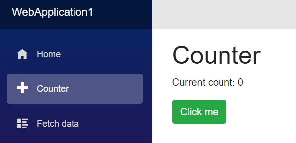
When we run the app we can see that the new style is applied:

Cascading parameters also enable components to collaborate across the component hierarchy. For example, let's say you have a TabSet component that contains a number of Tab components, like this:
<TabSet>
    <Tab Title="First tab">
        <h4>First tab</h4>
        This is the first tab.
    </Tab>

    @if (showSecondTab)
    {
        <Tab Title="Second">
            <h4>Second tab</h4>
            You can toggle me.
        </Tab>
    }

    <Tab Title="Third">
        <h4>Third tab</h4>

        <label>
            <input type="checkbox" bind=@showSecondTab />
            Toggle second tab
        </label>
    </Tab>
</TabSet>
In this example the child Tab components are not explicitly passed as parameters to the TabSet. Instead they are simply part of the child content of the TabSet. But the TabSet still needs to know about each Tab so that it can render the headers and the active tab. To enable this coordination without requiring any specific wire up from the user, the TabSet component can provide itself as a cascading value that can then be picked up by the descendent Tab components:
In TabSet.cshtml
<!-- Display the tab headers -->
<CascadingValue Value=this>
    <ul class="nav nav-tabs">
        @ChildContent
    </ul>
</CascadingValue>
This allows the descendent Tab components to capture the containing TabSet as a cascading parameter, so they can add themselves to the TabSet and coordinate on which Tab is active:
In Tab.cshtml
[CascadingParameter] TabSet ContainerTabSet { get; set; }
Check out the full TabSet sample here.
Debugging improvements
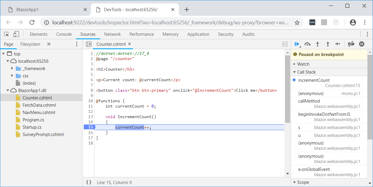
In Blazor 0.5.0 we added some very preliminary support for debugging client-side Blazor apps in the browser. While this initial debugging support demonstrated that debugging .NET apps in the browser was possible, it was still a pretty rough experience. Blazor 0.7.0 picks up the latest runtime updates, which includes some fixes that makes the debugging experience more reliable. You can now more reliably set and remove breakpoints, and the reliability of step debugging has been improved.

Give feedback
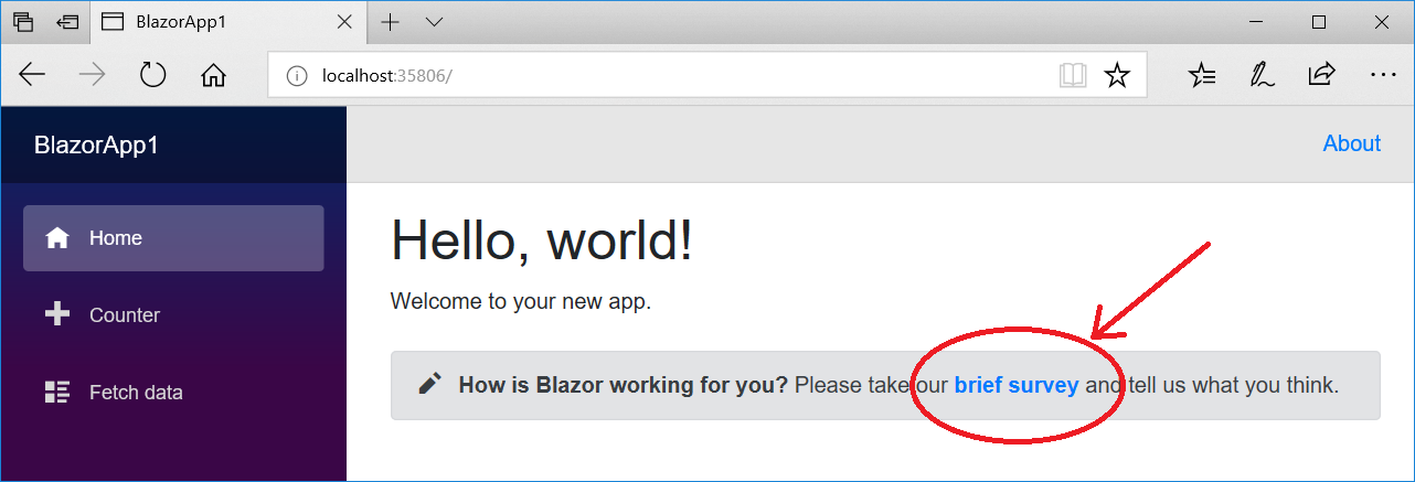
We hope you enjoy this latest preview release of Blazor. As with previous releases, your feedback is important to us. If you run into issues or have questions while trying out Blazor, file issues on GitHub. You can also chat with us and the Blazor community on Gitter if you get stuck or to share how Blazor is working for you. After you've tried out Blazor for a while please let us know what you think by taking our in-product survey. Click the survey link shown on the app home page when running one of the Blazor project templates:

Thanks for trying out Blazor!

0 comments