Hello, Dev Blogs community!
We’re excited to announce ‘Dev Blogs Evolution,’ a major upgrade you’ve already been experiencing for the past two weeks. This project is our first major upgrade to the whole platform. Our goal is to make it streamlined and modern, discoverable, and easier to engage with. This upgrade is shaped by valuable feedback from both you, our readers, and authors.
A modern, simplified layout
The first thing you’ll notice is the wider content area. We’ve embraced a cleaner, simpler design that improves readability. Reading and navigating should feel smoother and more intuitive. The subtle use of color gives the platform a modern touch while keeping the focus on content.
Enhanced content discovery
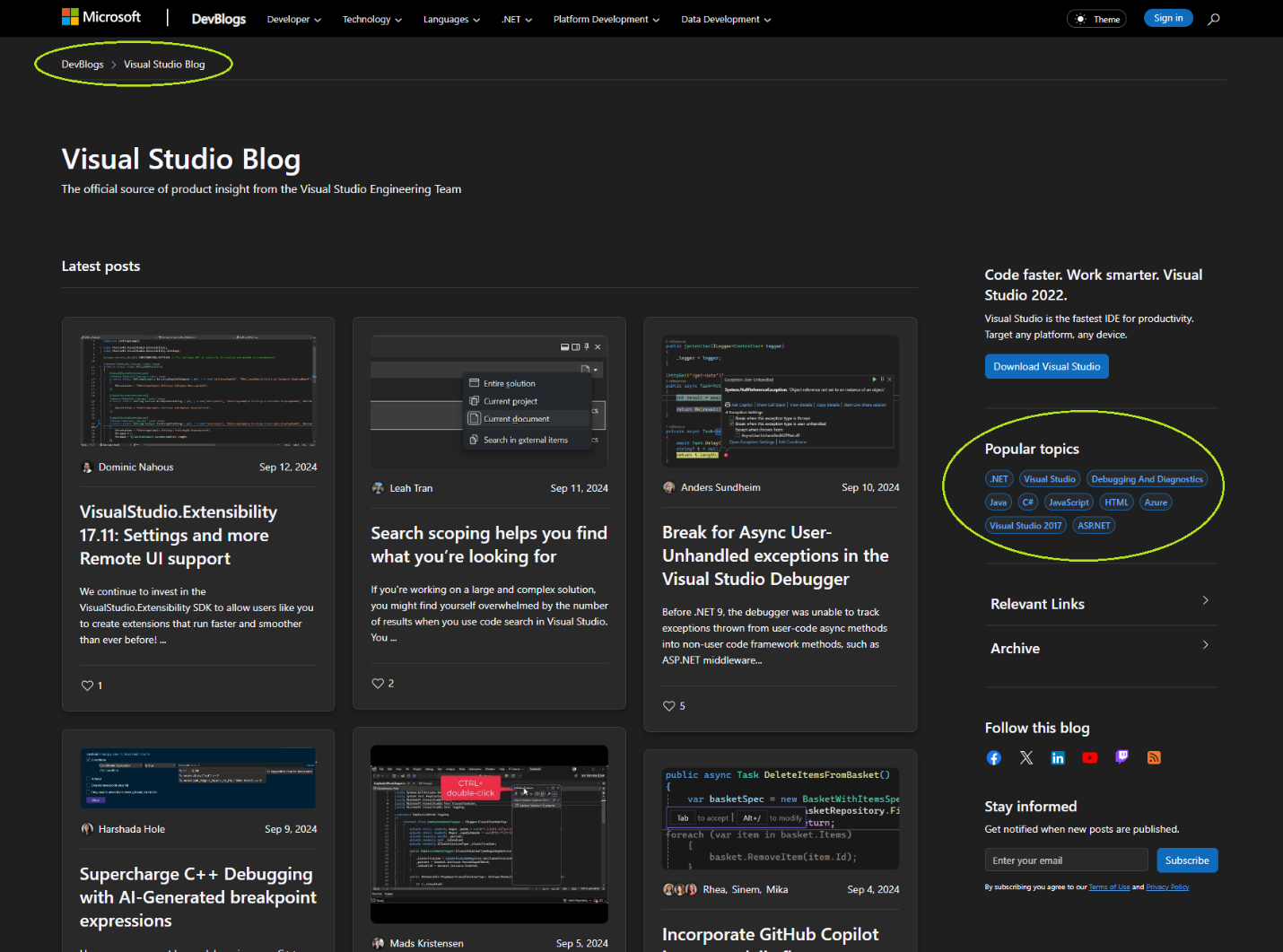
We’ve introduced a breadcrumb trail at the top left of the page to help you keep track of where you are and easily navigate back to the blog home page. Breadcrumbs show on all pages.
On individual posts, the right-side pane now features a table of contents so you can easily jump to any section. This change, requested by many of you, is especially useful for longer posts like Stephen Toub’s excellent ‘Performance Improvements in .NET 9’. Below the table of contents, you’ll find the ‘Read Next’ section, which offers recommendations for related posts that may interest you.
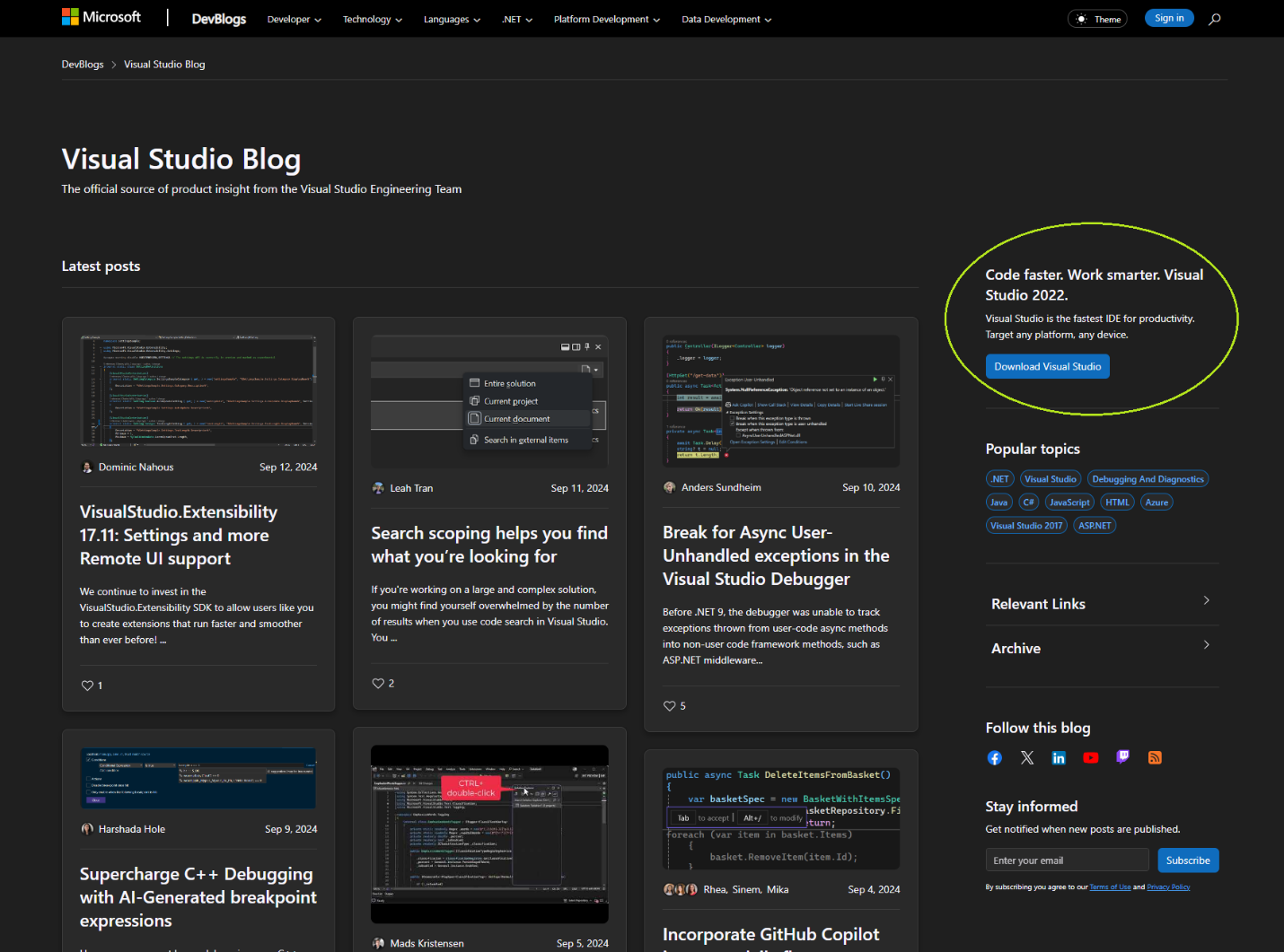
On the blog home page, we have revamped how related content is displayed. Now, in the new right-hand pane, you’ll find sections like Popular Topics, Archive of all posts, and other relevant information that can vary by blog.

We’ve also added the ability to place Calls to Action (CTAs) on key pages, giving blog owners more flexibility in guiding their readers toward next steps, whether it’s downloading a product, signing up for a newsletter, or attending an event.

You might also find a blog with a specific featured post highlighted at the top of all posts.
Improved engagement and socialization
Engagement is now easier — liking, commenting, and sharing tools are now grouped in the left-hand pane, keeping them both within reach and out of the way of your reading experience.
On these individual post pages, you will also find your preferred social media platform where you can follow this blog along with the ability to sign up for email alert when new posts are published. Both options can be found right below comments.

From blog home pages, you can easily follow the blog on other social media platforms where they have a presence or sign up to receive an email when new posts get published.

The commenting interface not only got a facelift but a functionality lift too. One of the long-standing asks has been to change the sort order of comments. With this upgrade you can choose to sort comments by newest, oldest, or see the most popular comments first. We have also added tags to easily identify when a comment is from the post author, or if a comment has been edited.

Stay in the know
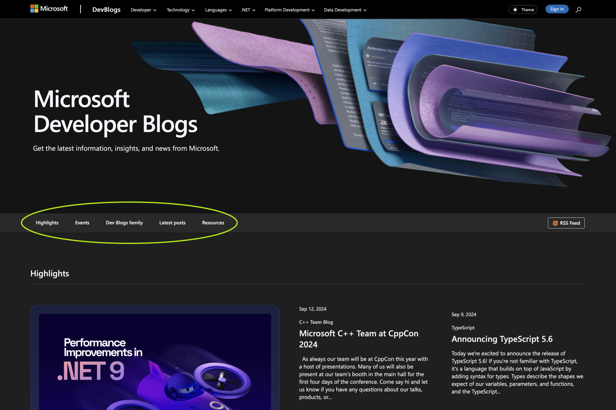
On the Dev Blogs’ page, we’ve introduced a Highlights section to showcase significant content, such as product launches, or even introduce you to new blogs. The Events section allows upcoming events to shine, making it easy for you to keep up with the latest events and highlights all in one place. Previously, blogs and resources were compressed into a narrow pane. Now, we’ve given them more space and they each have their own section.
We understand that some of you might want to jump right to the meat that is the latest posts. The sticky navigation at the top of this page makes it easy to jump between sections as you browse this page.

We’re just getting started!
With Dev Blogs Evolution, we’re taking the first step toward making this platform simpler, more modern, and more engaging for you. Whether you’re a reader, an author, or both, we hope you’ll love these changes as much as we enjoyed building them for you.
While a lot of you like what you see and how things function, and we’ve got many positive reviews, there are two very specific areas that seem to have hit a point of dissatisfaction.
- The new highlights and events sections that appear above the latest posts on the devblogs.microsoft.com landing page takes up too much space, leading to scrolling to get to the list of posts.
The landing page was upgraded so we can have a space to share important highlights that readers may have missed. Highlights will update ~every 2 weeks. When we don’t have anything to highlight or any event to invite you to join, these sections will disappear and push the rest of the page into view. These elements are temporary residents on this page. If you are not interested in highlights or events, skip past them by clicking on the latest posts in this navigation which shows right below the hero and stays sticky as you scroll the page.

- The layout listing posts in a masonry / waterfall structure appears to be in random order, is confusing, and difficult to follow.
Although the latest posts are still ordered by publish date from top to bottom, the layout moves down in a block instead of a list.
That said, thank you for sharing your thoughts. Your feedback is incredibly valuable and greatly appreciated. We are committed to addressing your concerns promptly and have many improvements already planned. Keep an eye out for updates coming soon, and please continue to provide feedback as we evolve the platform based on your needs. Thank you for being a part of the Dev Blogs community, and we look forward to seeing how you engage with the new platform!
Please take our 3-minute survey to share your thoughts.
The Dev Blogs Platform Team


Why don’t all of the blog sites have a “leave a comment” entry
e.g.
https://devblogs.microsoft.com/visualstudio/next-gen-code-coverage-in-visual-studio-enhanced-c-support-and-security/
Has no ability to leave a comment, yet I need to add a comment, since the author has left no indication of what version number/build this new feature is available in. I need to send a comment to the author to update the blog. Blogs with no feedback/comments, are much less useful than those with – and make me wonder if the author welcomes feedback (sometimes I suspect not)
Love lots of the comments here. Wanted to add one more tiny suggestion: the "Latest posts" link should use an actual HTML anchor so that we can bookmark it and go directly to that location in the page. Something like devblogs.microsoft.com/#latest-posts.This is an ask for daily/frequent readers like myself, who have to load the page and click "Latest posts" each time to scroll past the top filler.
Edit: I just realized this already exists. However, clicking on the "Latest posts" link seems to trigger code that cancels the navigation event in favor of smooth scrolling so the URL never...
Yes, I am glad you found the direct link – https://devblogs.microsoft.com/#latest-posts.
Another thing: maybe it’s just me, but I **HATE** that I have to login with Microsoft/Facebook/Google, using OAuth. I’d rather keep accounts completely separated. That is, I’d like to be able to create an account (with username and password), save it into my password manager, and call it a day. It happens so many times that I’d like to comment on something but this thing blocks me, and I end up not posting anything.
Another thing that I’d change is the order that blogs are displayed in: in the new front page you have a 2×5 grid, which is pretty limited. Do you really want to show Brian Harry’s Blog (last updated in 2018) and .NET Parallel Programming (last updated in 2015) there? At the same time, Raymond Chen’s blog, which is updated daily, is “hidden”, on the second page.
Thank you Fabio for that feedback. We will update the blogs order to better reflect the top blogs.
Hello Fabio,
We have updated the layout of Dev Blogs main home page, and also changed the masonry layout to a uniform grid with the option to switch to a list view.
Check my 2 posts on these changes
– https://devblogs.microsoft.com/devblogs-news/new-devblogs-layout-choose-your-view-grid-or-list/
– https://devblogs.microsoft.com/devblogs-news/dev-blogs-home-page-layout-simplified/
The home pages look nice, but way too much scrolling needed. The home page for https://devblogs.microsoft.com/ has, on my screen, only 5 items visible without scrolling down.
I’d like a simple list view.
Hello Richard,
We have updated the layout of Dev Blogs main home page, and also changed the masonry layout to a uniform grid with the option to switch to a list view.
Check my 2 posts on these changes
– https://devblogs.microsoft.com/devblogs-news/new-devblogs-layout-choose-your-view-grid-or-list/
– https://devblogs.microsoft.com/devblogs-news/dev-blogs-home-page-layout-simplified/
Visually, the refresh looks good, but functionality wise it could do with some improvements.
Things I like:
• Table of contents in posts (especially handy for Stephen Toub's posts!)
• Clean and simple theme
• Breadcrumb bar
Things I don't like:
• The banner when you land on the home page is WAY too big. I just want to read the latest blog posts, and I have to scroll almost half way down the page just to get the content! Ideally, what I'd like to see when I land on the home page is to be able to see (without scrolling) at...
Hi Daniel,
I am glad to hear some aspects of the redesign are helpful. For the parts that don’t work well we are exploring alternate designs and hope to address the feedback soon.
Hello Daniel,
I hope you noticed the changes when you came back to DevBlogs this week. We have updated the layout of Dev Blogs main home page, and also changed the masonry layout to a uniform grid with the option to switch to a list view.
Check my 2 posts on these changes
– https://devblogs.microsoft.com/devblogs-news/new-devblogs-layout-choose-your-view-grid-or-list/
– https://devblogs.microsoft.com/devblogs-news/dev-blogs-home-page-layout-simplified/
Hello,
Can external .NET Developers publish blog posts through this mechanism?
If so, that would be super convenient.
Hi Dennis,
Devblogs.microsoft.com is a blogging platform for teams across Microsoft used for product announcements, feature deep dives, events, and more. It isn’t a general blogging platform and there are no plans to make it one. That said some teams do feature posts from external community members. If you are engaged with the .NET team, I would reach out to them about their practice.
I'm very much not a fan of the redesign.
I don't like the banner at the top of the page being so large. Sure, you need to let people who have only just arrived know what the page is for, and the banner isn't ugly in itself. But does it need to take up so much screen space? I can barely see anything (useful or otherwise) without having to scroll. Compare this new layout to the old layout (from web.archive.org). And that's on a 4:3 screen - it's even worse on a 16:9. Yes, the old version had a fairly large...
HI Richard,
Thank you for sharing your feedback and concern in detail. We have updated the layout of Dev Blogs main home page, and also changed the masonry layout to a uniform grid with the option to switch to a list view. I hope these changes address your concerns and make posts easier to access and read.
Check my 2 posts on these changes
– https://devblogs.microsoft.com/devblogs-news/new-devblogs-layout-choose-your-view-grid-or-list/
– https://devblogs.microsoft.com/devblogs-news/dev-blogs-home-page-layout-simplified/
hmm, it looks nice. My first experience of card layout is good, I think now it’s faster to find my favorite content and I think it would be much better with “Auto load more via scrolling“. great job!
Thank you Hamed!
The old layout was more streamlined.
Thank you for sharing your feedback on the layout. We are exploring modifications that will help make it easier to focus on and follow the posts.
The update is visually weird. The previous version, the reading page area in white was separated from the background so it was easier to focus eyes and read. Now with the same background for the article and the rest, it takes some effort to adjust eyes.
Hi Torgeir, Vaclav,
We have updated the layout of Dev Blogs main home page, and also changed the masonry layout to a uniform grid with the option to switch to a list view. I hope these changes address your concerns and make the posts easier to navigate to.
Check my 2 posts on these changes
– https://devblogs.microsoft.com/devblogs-news/new-devblogs-layout-choose-your-view-grid-or-list/
– https://devblogs.microsoft.com/devblogs-news/dev-blogs-home-page-layout-simplified/