
Visualize Your Data with Charts, Graphs, and Xamarin.Forms
 There’s even more to Xamarin.Forms than the 40+ pages, layouts, and controls that make it fast and easy to build native apps while sharing 90%+ code across platforms. With Xamarin.Forms’ custom renderer capability, you can extend Xamarin.Forms to gain access to every native control in iOS, Android, and Windows and even create your own custom controls. In addition to the ever-growing Xamarin.Forms ecosystem of open source Plugins, we also announced partnerships with leading control vendors at Xamarin Evolve 2014, bringing their 140+ components to Xamarin.Forms (check out a recap here). Recently, for instance, I found myself in need of a beautiful cross-platform chart control for Meetup Manager and Syncfusion Essential Studio was a perfect match.
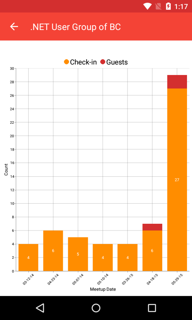
Syncfusion Essential Studio not only provides the charts that I need for Meetup Manager, but also a range of other components, such as Gauges, Barcodes, PDF readers, Notifications, and more. Today, I’m going to focus on the Essential Chart’s Stacking Column Series, which allows me to include a nice visual chart for group organizers and show them their group’s check-in performance over time.
Forming Data Structure
For background, Meetup Manager enables user group leaders to check their members in at events and add any unregistered guests that might show up. With this in mind, I created a simple data structure that I could bind to the chart with check-ins, guest check-ins, and the data to display:
public class DataPoint
{
  public string Date { get; set; }
  public int CheckIns { get; set; }
  public int Guests { get; set; }
}
Since I’ll be using data binding for the chart, I added an ObservableCollection of DataPoints. In my XAML page, I need to create a new instance of StatsViewModel and set it to the page’s BindingContext. This will enable the chart to see the new collection.
public class StatsViewModel
{
  public ObservableCollection<DataPoint> CheckInData { get; set; }
  public StatsViewModel()
  {
    CheckInData = new ObservableCollection<DataPoint>();
  }
}
Getting Started with Syncfusion
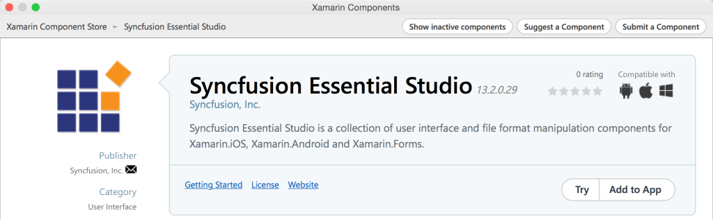
With my data structure and view model in place, it’s time to actually add the chart to the statistics page. Simply head over to the Xamarin Component Store and download the free trial of Syncfusion Essential Studio. You can also browse the Component Store straight from Xamarin Studio or Visual Studio to add Essential Studio directly to your iOS and Android apps.
After downloading the Component, you’ll want to ensure the following references have been added to each project and add a bit of initialization code.
iOS lib/ios-unified/Syncfusion.SfChart.iOS.dll lib/ios-unified/Syncfusion.SfChart.XForms.dll lib/ios-unified/Syncfusion.SfChart.XForms.iOS.dll
Add new SfChartRenderer(); in the AppDelegate.cs after Forms.Init();.
Android lib/android/Syncfusion.SfChart.Android.dll lib/android/Syncfusion.SfChart.XForms.dll lib/android/Syncfusion.SfChart.XForms.Android.dll
Add new SfChartRenderer(); in the MainActivity.cs after Forms.Init (this, bundle);.
Portable Class Library lib/pcl/Syncfusion.SfChart.XForms.dll
Finally, I can add the base of the chart to my Xamarin.Forms statistics XAML page by adding a new xmlns to point to the Syncfusion library. This enables Xamarin.Forms to locate the custom controls library.
xmlns:chart="clr-namespace:Syncfusion.SfChart.XForms;assembly=Syncfusion.SfChart.XForms"
I reference the base of the chart inside the XAML page’s Content:
<chart:SfChart x:Name="Chart">
</chart>
Notice the chart prefix that comes from the xmlns specified earlier.
Building the Chart Components
With the base of the chart in place, we can now integrate our data and generate a display, but first we need to wire up and add a few key components under the root of the chart.
Primary Axis
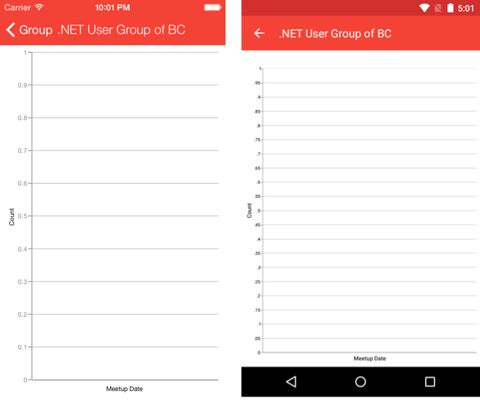
This axis runs along the bottom of the chart and, for Meetup Manager, will display the dates for each event. We can select from several axis choices that tell the chart how to render the data. I have selected the CategoryAxis, used to display a string, and I rotated it -45 degrees to give my chart a nice slope.
<chart:SfChart.PrimaryAxis>
  <chart:CategoryAxis LabelRotationAngle = "-45">
    <chart:CategoryAxis.Title>
      <chart:ChartAxisTitle Text ="Meetup Date"/>
    </chart:CategoryAxis.Title>
  </chart:CategoryAxis>
</chart:SfChart.PrimaryAxis>
Secondary Axis
Along the left hand side, I want to display the number of check-ins per event. By specifying a NumericalAxis, the chart will automatically calculate numeric intervals for the data.
<chart:SfChart.SecondaryAxis>
  <chart:NumericalAxis>
    <chart:NumericalAxis.Title>
      <chart:ChartAxisTitle Text ="Count"/>
    </chart:NumericalAxis.Title>
  </chart:NumericalAxis>
</chart:SfChart.SecondaryAxis>
Even without any data tied in, we have a nice base chart view in place:
Series
To feed the meetup data to the chart, it’s necessary to supply a data “Series” that can be associated with the PrimaryAxis and SecondaryAxis. We can visualize the data in various ways, including: Line, Spline, Column, Range Column, Scatter, Area, Spline Area, Bar, Pie, Doughnut, Bubble, Stacking Bar, Stacking Area, and so on. For this graph, I opted for the Stacking Column Series, which will stack two sets of data in a single column, representing both check-ins and guests.
<chart:SfChart.Series>
  <chart:StackingColumnSeries
      ItemsSource="{Binding CheckInData}"
      XBindingPath="Date"
      YBindingPath="CheckIns"
      Label="Check-in"
      DataMarkerPosition = "Center"
      EnableDataPointSelection = "false"
      Color="#FF8D00">
    <chart:StackingColumnSeries.DataMarker>
      <chart:ChartDataMarker>
        <chart:ChartDataMarker.LabelStyle>
          <chart:DataMarkerLabelStyle LabelPosition = "Center"/>
        </chart:ChartDataMarker.LabelStyle>
      </chart:ChartDataMarker>
    </chart:StackingColumnSeries.DataMarker>
  </chart:StackingColumnSeries>
  <chart:StackingColumnSeries
      ItemsSource="{Binding CheckInData}"
      XBindingPath="Date"
      YBindingPath="Guests"
      Label="Guests"
      EnableDataPointSelection = "false"
      Color="#D32F2F"/>
</chart:SfChart.Series>
For both StackingColumnSeries, I am binding to the CheckInData ObservableCollection and setting the XBindingPath to Date; the difference is the YBindingPath property for either the check-in or RSVP to display. I have also spruced up the colors and added a marker label for the first column series.
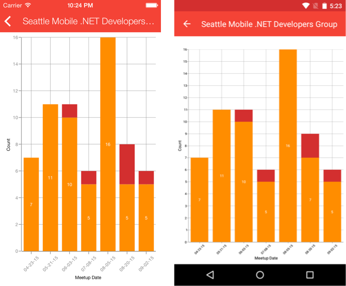
Legend and Scrolling
Adding a legend at the top of the chart helps users understand what the chart colors represent. The label specified on the series will display next to a color indicator.
<chart:SfChart.Legend>
  <chart:ChartLegend/>
</chart:SfChart.Legend>
Lastly, I know that there are a lot of events that could happen in the lifespan of a user group, so I only want to display a few columns and then enable scrolling. By specifying a bit of XAML for chart behaviors, I can tell the chart to pan when the user touches it.
<chart:SfChart.ChartBehaviors>
  <chart:ChartZoomPanBehavior EnablePanning="true" EnableDoubleTap="false"/>
</chart:SfChart.ChartBehaviors>
The final step is to calculate the “ZoomFactor”. The ZoomFactor is used to control how much data should be displayed on the graph when it is rendered. This is calculated as a double between 0 and 1 (as a percentage). So, if we had 20 entries and wanted to show half of them and the other half as pannable, then the ZoomFactor would be .5. This can be calculated with a few lines of code in the code behind after loading the data and even optimized by incorporating max columns for either the phone or tablet form factor and device operating system.
var max = Device.Idiom == TargetIdiom.Phone ? 7.0 : 14.0;

var factor = max / (double)viewModel.CheckInData.Count;
if (factor > 1.0)
  factor = 1.0;
else if (factor < .1)
  factor = .1;

Chart.PrimaryAxis.ZoomFactor = factor;

Learn More
This is just a small peek at the many controls that make up Syncfusion Essential Studio. To get started, head over to the Xamarin Component Store and read Essential Studio’s full Getting Started Guide for iOS, Android, and Xamarin.Forms, and start your free 30-day trial at Syncfusion.com. As always, you can download the full source code for Meetup Manager on my GitHub to try it out for yourself.
 Light
Light Dark
Dark
0 comments