
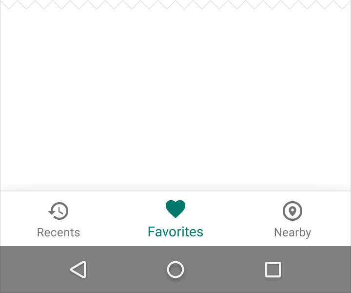
Exploring Android’s Bottom Navigation View
The debate over whether tabs should go on the top or the bottom of a screen has raged for nearly a decade. Android has always preferred to use tabs as a filtering mechanism on the top of a page, while iOS has used bottom tabs as the main source of navigation. Now, with the addition of the Bottom Navigation View in the Support Design library, Android developers have the choice of where their main navigation comes from in their applications.
Bottom navigation bars make it easy for your users to navigate through your top-level views with a single tap, compared the the navigation drawer that flies out from the side and has been a standard when there are a lot of different sections to an app. Today, I’ll walk through when it’s best to use bottom navigation in your app, how to implement it, and how to customize it to your liking.
The core experience of bottom navigation is designed for use on mobile phone devices that allows users to swap between pages easily. Some questions for if you should use bottom navigation are:
- Does your app have 3–5 top-level pages?
- Do your top-level pages need direct access?
If your application has more than five pages, it’s best to stick with the navigation drawer; if you have less than three, stick with standard top tabs.
Getting Started with Bottom Navigation View
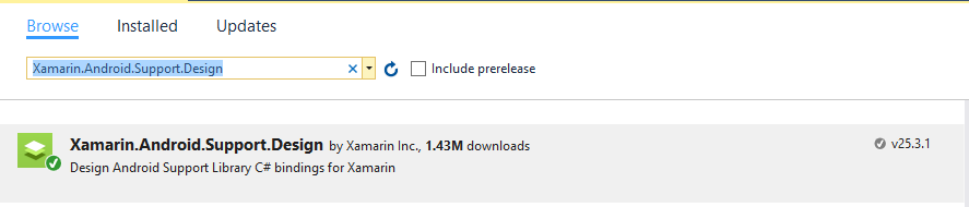
To get started with the new Bottom Navigation View, we’ll want to make sure that we have our Android application updated with an AppCompat Activity and upgraded to the latest Support Libraries. With that, we can now install the Xamarin.Android.Support.Design NuGet package (current version 25.3.1) into our Android project at our set up.
Adding Tab/Menu Items
We must define the items that will be displayed before we add the BottomNavigationView control. This is controlled similarly to the NavigationDrawer, with a menu defined in xml. We can create a new menu folder in the Resources directory and add a new xml file. I created bottom_navigation_main.xml in Resources/menu/ and downloaded a few tab icons from the Android Asset Studio, which are 24dp x 24dp.
<?xml version="1.0" encoding="utf-8"?>
<menu xmlns:android="http://schemas.android.com/apk/res/android"
    xmlns:app="http://schemas.android.com/apk/res-auto">
  <item
      android:id="@+id/menu_home"
      android:enabled="true"
      android:icon="@drawable/ic_action_home"
      android:title="@string/tab1_title"
      app:showAsAction="ifRoom" />

  <item
      android:id="@+id/menu_audio"
      android:enabled="true"
      android:icon="@drawable/ic_action_audiotrack"
      android:title="@string/tab2_title"
      app:showAsAction="ifRoom" />

  <item
      android:id="@+id/menu_video"
      android:enabled="true"
      android:icon="@drawable/ic_action_videocam"
      android:title="@string/tab3_title"
      app:showAsAction="ifRoom" />
</menu>
Adding a Bottom Navigation View
Bottom navigation works by replacing fragments when one of the items is selected. This means that our Android xml should also have a FrameLayout to swap in and out the fragments that will be displayed. Our xml will look something like this in its basic form:
 <RelativeLayout
    xmlns:android="http://schemas.android.com/apk/res/android"
    xmlns:app="http://schemas.android.com/apk/res-auto"
    android:id="@+id/activity_main"
    android:layout_width="match_parent"
    android:layout_height="match_parent">
    <FrameLayout
        android:id="@+id/content_frame"
        android:layout_width="match_parent"
        android:layout_height="match_parent"
        android:layout_above="@+id/bottom_navigation"/>
    <android.support.design.widget.BottomNavigationView
      android:id="@+id/bottom_navigation"
      android:layout_width="match_parent"
      android:layout_height="56dp"
      android:layout_gravity="start"
      android:layout_alignParentBottom="true"
      android:background="@android:color/white"
      app:elevation="16dp"
      app:menu="@menu/bottom_navigation_main" />
      <!-- Note: background color is required to get elevation -->
  </RelativeLayout>
We can define an elevation so the bottom navigation is lifted off the page with a nice drop shadow, and we define our items in the navigation view with the menu property that is referencing the menu we created earlier.
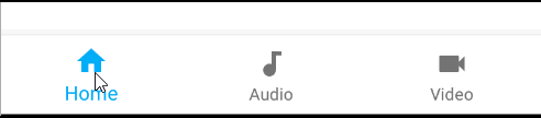
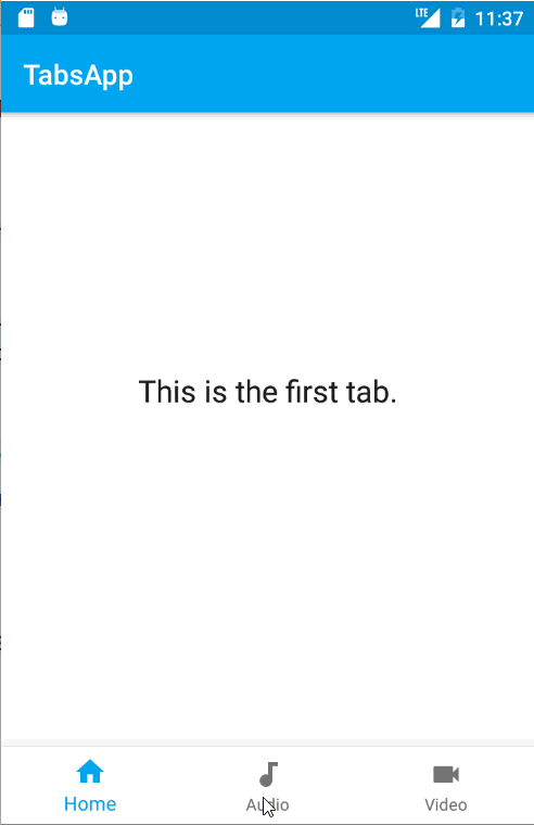
As we can see, the default will automatically apply our primary color and gray out the deselected items.
Handling Click Events
Now it’s time for us to actually handle the click events and set our content. In this example, I have three different fragments that simply load an Android xml file that displays the current index it’s on. We can create a simple method to replace the current fragment based on the ID that was set in the menu xml in our Main Activity:
void LoadFragment(int id)
{
    Android.Support.V4.App.Fragment fragment = null;
    switch (id)
    {
        case Resource.Id.menu_home:
            fragment = Fragment1.NewInstance();
            break;
        case Resource.Id.menu_audio:
            fragment = Fragment2.NewInstance();
            break;
        case Resource.Id.menu_video:
            fragment = Fragment3.NewInstance();
            break;
    }

    if (fragment == null)
        return;

    SupportFragmentManager.BeginTransaction()
        .Replace(Resource.Id.content_frame, fragment)
        .Commit();
}
Now we can load our xml, find the BottomNavigationView, and register for a NavigationItemSelected event:
BottomNavigationView bottomNavigation;
protected override void OnCreate(Bundle bundle)
{
    base.OnCreate(bundle);
    SetContentView(Resource.Layout.main);
    var toolbar = FindViewById<Android.Support.V7.Widget.Toolbar>(Resource.Id.toolbar);
    if (toolbar != null)
    {
        SetSupportActionBar(toolbar);
        SupportActionBar.SetDisplayHomeAsUpEnabled(false);
        SupportActionBar.SetHomeButtonEnabled(false);
    }

    bottomNavigation = FindViewById<BottomNavigationView>(Resource.Id.bottom_navigation);

    bottomNavigation.NavigationItemSelected += BottomNavigation_NavigationItemSelected;

    // Load the first fragment on creation
    LoadFragment(Resource.Id.menu_home);
}

private void BottomNavigation_NavigationItemSelected(object sender, BottomNavigationView.NavigationItemSelectedEventArgs e)
{
    LoadFragment(e.Item.ItemId);
}
Adding Color
Google’s recommendation is to simply use the default white or black background color and primary tint of icons if your app is using default themes and your Toolbar is already tinted. If you wish to set the color of the bottom navigation, then it’s recommended to make the icon and text of the current action black or white. There are two additional properties, app:itemIconTint and app:itemTextColor, that can be set to handle this. Setting them directly to a specific color is what you probably think you want to do, but an immediate issue will present itself where it also sets the deselected state to the same color. For instance, if I set these three properties:
android:background="@color/primary"
app:itemIconTint="@android:color/white"
app:itemTextColor="@android:color/white"

To fix this, we just have to create a selector defined in our drawable folder that will set the color based on the state in a new xml file; I called mine nav_item_colors.xml:
<selector xmlns:android="http://schemas.android.com/apk/res/android">
  <item android:state_checked="true" android:color="@android:color/white" />
  <item android:color="#80FFFFFF"  />
</selector>
Now, back in our BottomNavigationView, we can use the new selector colors:
android:background="@color/primary"
app:itemIconTint="@drawable/nav_item_colors"
app:itemTextColor="@drawable/nav_item_colors"

Absolutely lovely!
Learn More
To learn more about bottom navigation in Android, be sure to read through the Material Design Guidelines for all the “dos and don’ts” of using it. You can also grab a full sample and other samples of navigation from my GitHub repo.
 Light
Light Dark
Dark
2 comments
Hi, James, I’m big fan of you and your work!I just wanna know if you you have or maybe can help me with a little example of a bottom navigation bar but in Xamarin.Forms?I’m trying to make it with Custom Renderers but I don’t no if maybe are another way maybe more simple.thanks a million!!
Hello @Andres Montoya C
My question is when we navigate from tabbed page to another page bottom tabbed menu is showing how we do that bottom tabbed menu not show when we navigation from one page to another.
Thanks