
Bringing Xamarin.Forms Apps to Tablets
When I was developing My Shoppe, a pre-built app template for shops, I only focused on the look and feel for the phone form factor, since I knew that I could add optimizations to the app to spruce it up for tablet owners later. Xamarin.Forms makes it simple to detect what type of device my users are running and provides a few nice helper methods to extend the app for a better tablet experience. Here are a few tips to get you started with optimizing your Xamarin.Forms apps for these larger form factors.
Adding Tablet Support
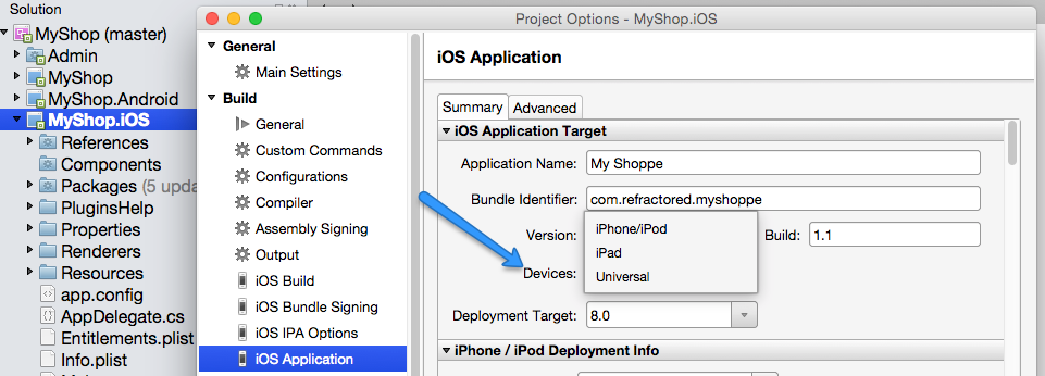
The first thing to do is ensure that tablet support is enabled for the app, which each platform handles a little bit differently. On iOS, it’s simple to adjust what type of devices an app can be run on: simply click on the properties for the iOS project and under iOS Application is a setting called Devices. This controls the final output of the app for either iPhone/iPod, iPad, or Universal. For My Shoppe, I switched from iPhone/iPod over to Universal to ensure the app has a proper phone and tablet form factor when running on either of the devices instead of a 2x zoom button when running the app on the iPad.
Android handles tablet support a little differently since Android works with pixels in correlation to densities, and any app can be scaled correctly up to a larger screen. There are a few different options that can be added to the Android manifest to filter the app out of Google Play. By default, there are no adjustments that need to get My Shoppe running on tablets correctly.
Optimizing with Device.Idiom
Simply enabling tablet support isn’t enough, and I wanted to finely-tune specific areas of the app to make using My Shoppe on tablets an excellent user experience. Xamarin.Forms provides many different ways to add platform-specific tweaks to layouts through different properties the Device class exposes. You may already be familiar with Device.OS or Device.OnPlatform that can be used to add OS level tweaks, but we can use Device.Idiom to detect if the current device is a phone or tablet. When building a layout for tablet, I often like to switch StackLayouts from vertical to horizontal and display different images when my users are on a tablet. This can be accomplished easily:
if (Device.Idiom == TargetIdiom.Phone)
{
    MyStack.Orientation = StackOrientation.Vertical;
    HeroImage.Source = ImageSource.FromFile("hero.jpg");
}
else
{
    MyStack.Orientation = StackOrientation.Horizontal;
    HeroImage.Source = ImageSource.FromFile("herotablet.jpg");
}
In My Shoppe, I performed these optimizations to take advantage of the additional screen size, and in all of my grid layouts I added additional padding and spacing directly in my XAML:
Leverage MasterDetailPage
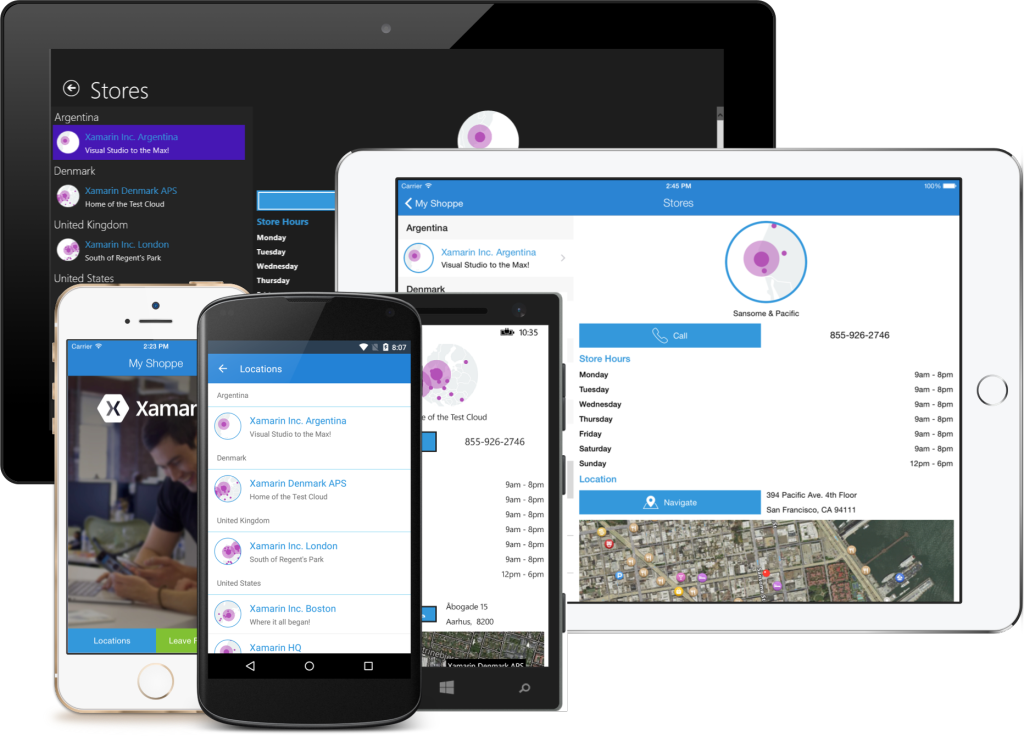
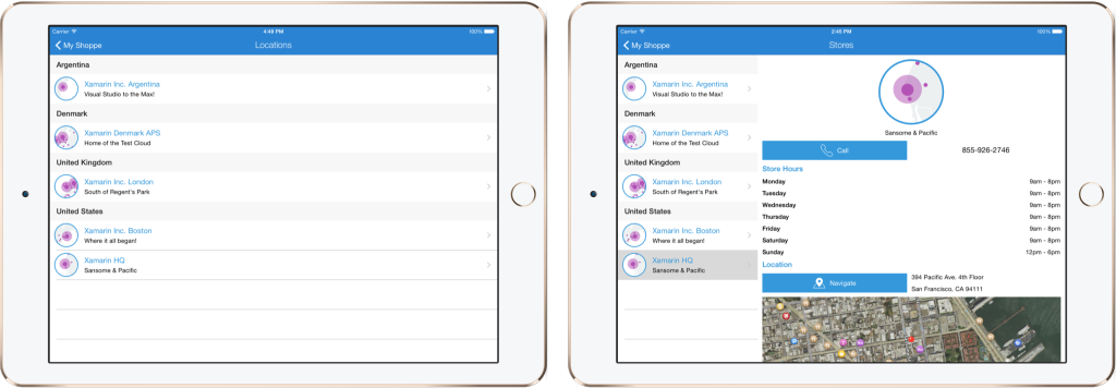
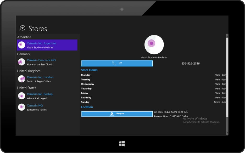
Simple platform tweaks are great and can go a long way, but there’s certainly more that can be done to optimize the UX on tablets. I decided that users would see a different page based on the type of device they were using when they tap to see all shop locations. On a phone, the flow wouldn’t change, as a full list of locations would appear and they could drill down to details. On tablets, I decided to navigate to a MasterDetailPage that has a full flyout menu where the locations could be listed and the shop details would be displayed side by side. I accomplished this by re-directing the app to different screens based on the Idiom that was detected. I was still able to leverage all of the existing code in the Store list page by propagating the click event up to the MasterDetailPage to swap out the Detailed information.
Propagate the event
On my original StoresPage I added a new Action that could be used to propagate the event to the MasterDetailPage:
public partial class StoresPage : ContentPage
{
  public Action ItemSelected { get; set; }
  public StoresPage ()
  {
    InitializeComponent ();

    //Fill in Binding Context...

    //Handle item selected to navigate to new page or propagate event
    StoreList.ItemSelected += async (sender, e) =>
    {
      if(StoreList.SelectedItem == null)
        return;
      var store = e.SelectedItem as Store;
      if (ItemSelected == null)
      {
        await Navigation.PushAsync(new StorePage(store));
        StoreList.SelectedItem = null;
      }
      else
      {
        ItemSelected.Invoke(store);
      }
    };
  }
}
New Tablet Page
I created a new MasterDetailPage that set the StoresPage to the Master and a temporary Detail page asking the user to select a shop. Next, I simply subscribed to the ItemSelected action and swapped out the Detail page:
public class StoresTabletPage : MasterDetailPage
{
  public StoresTabletPage()
  {
    Title = "Stores";
    Master = new StoresPage();
    Detail = new ContentPage
    {
      Content = new StackLayout
      {
        VerticalOptions = LayoutOptions.Center,
        HorizontalOptions = LayoutOptions.Center,
        Children =
        {
          new Label { Text = "Select a Shop", FontSize = Device.GetNamedSize(NamedSize.Large, typeof(Label)) }
        }
      }
    };

    //Subscribe to ItemSelected changes and update Detail Page
    ((StoresPage)Master).ItemSelected = (store) =>
    {
      Detail = new StorePage(store);
      if(Device.OS != TargetPlatform.Windows)
        IsPresented = false;
     };

   IsPresented = true;
 }
}
Updating the Workflow
With the new tablet optimized section of the app ready, all I needed to do was update my Home page to navigate to a different page based on the Idiom:
ButtonFindStore.Clicked += async (sender, e) =>
{
  if (Device.Idiom == TargetIdiom.Tablet || Device.Idiom == TargetIdiom.Desktop)
    await Navigation.PushAsync(new StoresTabletPage());
  else
    await Navigation.PushAsync(new StoresPage());
};
Adding Windows Support
My Shoppe also launched on Windows Phone, but Windows Phone is just for phones, so there are no changes that I had to make to that project. Since Xamarin.Forms now supports Windows apps, this is another tablet and desktop form factor that My Shoppe could be extended to. The setup process was just to follow the step-by-step documentation to add the Windows project. After I had the project set up, I only had to install a handful of Plugins for Xamarin, which I use to tap into native capabilities from shared code and add a few Xamarin.Forms custom controls, such as Image Circles. With all the NuGets and project setup in place, My Shoppe was now on Windows desktops and tablets!
Bring Your Xamarin.Forms Apps to Tablets
Optimizations such as these can greatly enhance your users’ experiences in your apps and are very simple implement with the built-in tools included in Xamarin.Forms. Be sure to read through the Working with Platform Tweaks documentation to find additional ways of optimizing your Xamarin.Forms apps, and don’t forget to grab the My Shoppe source code with these tweaks, now available on GitHub.
 Light
Light Dark
Dark
0 comments