
Android Tips: Hello Toolbar, Goodbye Action Bar
It seems like just yesterday that Google introduced the Action Bar for Android. It jump started a revolution for the Android user interface and made developer’s lives easier by providing a great way to provide menu options, tabs, and more for their users. With Android 5.0 Lollipop, all of this is about to change once again with the introduction of the Android Toolbar.
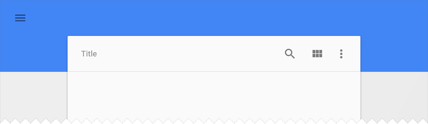
You can think of the Toolbar as the Action Bar’s bigger sibling that has grown up and is free to roam around the house by itself. It’s a generalization of the Action Bar that isn’t bound to an Activity’s window decor, can be placed anywhere in the user interface, and can even be designated as the Action Bar replacement for an Activity. It’s highly customizable, which means you can add navigation buttons, branded logos, titles, subtitle, action menu items, or even your own custom views.
For this sample, I am going to focus on the Android 5.0 (v21) Toolbar. The same can be achieved using the new Support Library v7 AppCompat, which features a backwards compatible Toolbar and is available as a NuGet package.
Applying Your Theme
We will start by applying the Material theme to our Android application, but we will now set two special attributes android:windowNoTitle and android:windowActionBar to tell Android we will be using a Toolbar instead of the Action Bar.
<style name="MyTheme" parent="@android:style/Theme.Material.Light.DarkActionBar">
    <item name="android:windowNoTitle">true</item>
    <!--We will be using the toolbar so no need to show ActionBar-->
    <item name="android:windowActionBar">false</item>
    <!-- Set theme colors from http://www.google.com/design/spec/style/color.html#color-color-palette-->
    <!-- colorPrimary is used for the default action bar background -->
    <item name="android:colorPrimary">#2196F3</item>
    <!-- colorPrimaryDark is used for the status bar -->
    <item name="android:colorPrimaryDark">#1976D2</item>
    <!-- colorAccent is used as the default value for colorControlActivated
         which is used to tint widgets -->
    <item name="android:colorAccent">#FF4081</item>
  	<!-- You can also set colorControlNormal, colorControlActivated
         colorControlHighlight and colorSwitchThumbNormal. -->
  </style>
If you want to learn more about the new themes, be sure to read my Introduction to Material Design blog post and watch my and Jérémie Laval’s sessions from Xamarin Evolve 2014 on Material Design.
Replacing the Action Bar
With our theme attributes set, we can now create our first layout. The Toolbar can be found in your Android Designer’s toolbox, from which you can simply drag and drop it at the top of your layout. Often you will want to use a RelativeLayout to specify that your Toolbar is at the very top.
<Toolbar xmlns:android="http://schemas.android.com/apk/res/android"
    android:id="@+id/toolbar"
    android:layout_width="match_parent"
    android:layout_height="wrap_content"
    android:minHeight="?android:attr/actionBarSize"
    android:background="?android:attr/colorPrimary" />
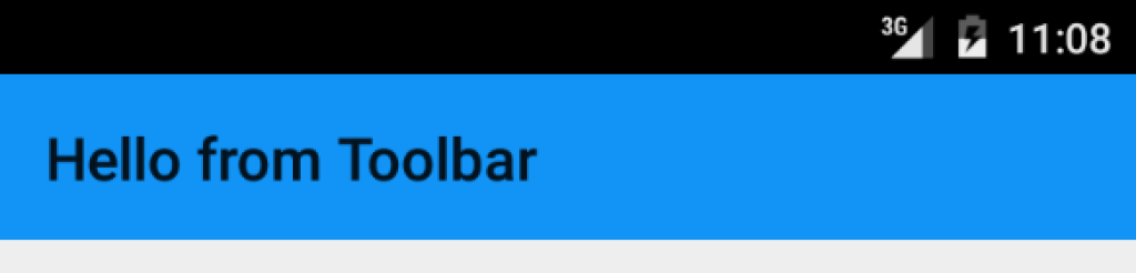
Now in your OnCreate method of your activity, you will need to find your Toolbar. To have it mimic the old ActionBar, you can set a new method call SetActionBar(Toolbar toolbar);.
protected override void OnCreate (Bundle bundle)
{
  base.OnCreate (bundle);
  SetContentView (Resource.Layout.Main);
  var toolbar = FindViewById<Toolbar> (Resource.Id.toolbar);
  //Toolbar will now take on default Action Bar characteristics
  SetActionBar (toolbar);
  //You can now use and reference the ActionBar
  ActionBar.Title = "Hello from Toolbar";
}
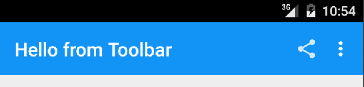
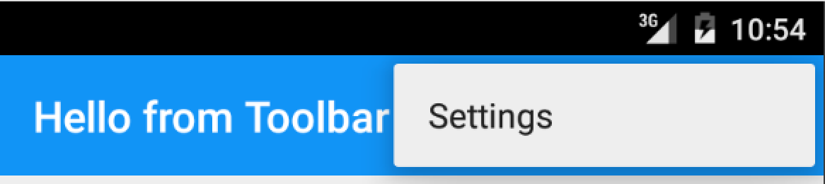
This is the easiest way to transition from the ActionBar to the new Toolbar, as all of your existing Action Bar menus will automatically work if you are inflating them in your OnCreateOptionsMenu method.
Applying Themes
Since the Toolbar is independent, it can also be themed independently as well. The android:theme is the main theme of the bar, and android:popupTheme is the theme to apply to menu item pop ups. If you are using a light theme, or want the look of a dark Action Bar, you can apply two themes directly on the Toolbar, which would look like this:
<Toolbar xmlns:android="http://schemas.android.com/apk/res/android"
    android:id="@+id/toolbar"
    android:layout_width="match_parent"
    android:layout_height="wrap_content"
    android:minHeight="?android:attr/actionBarSize"
    android:background="?android:attr/colorPrimary"
    android:theme="@android:style/ThemeOverlay.Material.Dark.ActionBar"
    android:popupTheme="@android:style/ThemeOverlay.Material.Light" />
Custom Action Bars
As I mentioned earlier, the real reason to upgrade to the new Toolbar is that it has complete freedom to be placed where you want it and is fully customizable; it can even have a completely separate action menu that you can manage. Let’s say you want to put a Toolbar at the bottom of your screen and theme it in an accent color. You would simply add another Toolbar widget to the bottom and apply a different theme to it:
<RelativeLayout xmlns:android="http://schemas.android.com/apk/res/android"
    android:layout_width="fill_parent"
    android:layout_height="fill_parent">
    <!--First Toolbar goes here-->
    <LinearLayout
        android:orientation="vertical"
        android:layout_width="fill_parent"
        android:layout_height="fill_parent"
        android:layout_below="@id/toolbar">
        <!--Other widgets-->
        <!--Custom second toolbar at the bottom with an accent color for the background.
            Additionally, you can set any custom property and make the height larger or smaller.-->
        <Toolbar
            android:id="@+id/toolbar_bottom"
            android:minHeight="?android:attr/actionBarSize"
            android:background="?android:attr/colorAccent"
            android:theme="@android:style/ThemeOverlay.Material.Dark.ActionBar"
            android:popupTheme="@android:style/ThemeOverlay.Material.Light"
            android:layout_width="match_parent"
            android:layout_height="wrap_content" />
    </LinearLayout>
</RelativeLayout>
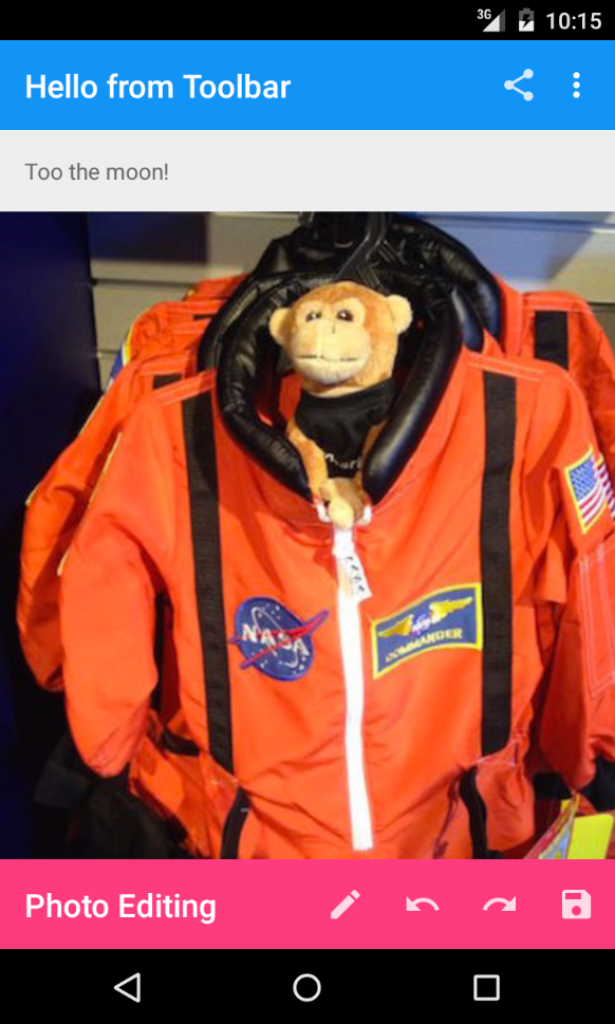
Back in the Activity, the last step is to find this new Toolbar. Once found, we will not set it as an Action Bar, but instead we’ll inflate a separate menu and implement a new click handler when the users interact with it.
var toolbarBottom = FindViewById<Toolbar> (Resource.Id.toolbar_bottom);
toolbarBottom.Title = "Photo Editing";
toolbarBottom.InflateMenu (Resource.Menu.photo_edit);
//Add menu click handler
toolbarBottom.MenuItemClick += (sender, e) => {
  Toast.MakeText(this, "Bottom toolbar pressed: " + e.Item.TitleFormatted, ToastLength.Short).Show();
};
Going Further
The new Android Toolbar allows for a highly customizable developer experience that we never had access to with the standard Action Bar. You can grab the source code for this example and try out other Android L features on our Samples Gallery.
Backwards Compatibility
Looking to add support for Material Design and the new Toolbar to your app on older versions of Android? See our full blog post on how to add the new Android Support Library v7 AppCompat to your Xamarin.Android app. You can find a full AppCompat Toolbar sample in our gallery.
 Light
Light Dark
Dark
0 comments