
Android Tips: Hello Material Design v7 AppCompat
 Android 5.0 Lollipop introduced a complete refresh, known as Material Design, to the Android user interface, which generated rapid adoption throughout the development community. Until Google introduced revision 21 of the Android Support v7 AppCompat library, Material Design themes, controls, and features were utilized only if you wanted to target devices running API 21.
We recently took a look at how this library gives developers an opportunity to add the ActionBar to applications targeting older devices all the way back to API 7. However, now you can use this updated library to add Material Design to any of your applications and use new controls like the new Toolbar, which replaces the ActionBar. Let’s see how easy it is to get started with the new Support Library v7 AppCompat by updating our Toolbar example.
Getting Started
To start integrating AppCompat into your Android project you will want to install the Support Library v7 AppCompat from the Component Store or directly from NuGet. This will also install the Support v4 Library, which is required because it provides controls that help maintain backwards compatibility.

Since you will now be able to target older versions of Android, you will want to adjust your Minimum and Target Android version under Android Application in the project options.

Updating to Material Theme
There are many differences to the actual resources that are embedded into your app when you use the AppCompat library. This means that the actual themes and attributes are completely different between normal Material and AppCompat themes. You will find three new themes that you can inherit from:
Dark: Theme.AppCompat Light: Theme.AppCompat.Light Light with Dark ActionBar: Theme.AppCompat.Light.DarkActionBar

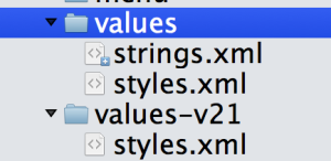 To use one of these themes, you’ll want to create two folders under your Resources folder named
 values and values-v21 where you will create a styles.xml where you can customize your applications theme. In our values/styles.xml you will create the base theme of your application and then set custom attributes. You will see that these attributes are different than using the standard Material Theme since they have dropped the android: prefix as they are now part of your application.
values/styles.xml
<resources>
  <style name="MyTheme" parent="MyTheme.Base">
  </style>
  <!-- Base theme applied no matter what API -->
  <style name="MyTheme.Base" parent="Theme.AppCompat.Light.DarkActionBar">
    <!--If you are using revision 22.1 please use just windowNoTitle. Without android:-->
    <item name="windowNoTitle">true</item>
    <!--We will be using the toolbar so no need to show ActionBar-->
    <item name="windowActionBar">false</item>
    <!-- Set theme colors from http://www.google.com/design/spec/style/color.html#color-color-palette-->
    <!-- colorPrimary is used for the default action bar background -->
    <item name="colorPrimary">#2196F3</item>
    <!-- colorPrimaryDark is used for the status bar -->
    <item name="colorPrimaryDark">#1976D2</item>
    <!-- colorAccent is used as the default value for colorControlActivated
         which is used to tint widgets -->
    <item name="colorAccent">#FF4081</item>
     <!-- You can also set colorControlNormal, colorControlActivated
         colorControlHighlight and colorSwitchThumbNormal. -->
  </style>
</resources>
Then, inside of your values-v21/styles.xml, you’ll set a few more custom attributes that can take advantage of transitions on devices running Lollipop:
<resources>
  <!--
        Base application theme for API 21+. This theme replaces
        MyTheme from resources/values/styles.xml on API 21+ devices.
    -->
  <style name="MyTheme" parent="MyTheme.Base">
    <item name="android:windowContentTransitions">true</item>
    <item name="android:windowAllowEnterTransitionOverlap">true</item>
    <item name="android:windowAllowReturnTransitionOverlap">true</item>
    <item name="android:windowSharedElementEnterTransition">@android:transition/move</item>
    <item name="android:windowSharedElementExitTransition">@android:transition/move</item>
  </style>
</resources>
The last step is to open your AndroidManifest.xml under the Properties folder and add reference to your new theme under the application node with android:theme="@style/MyTheme".
Integrate Toolbar
Previously, we saw how to integrate the new Toolbar into your application. The core of that remains the same, except that you will now directly reference the new Toolbar widget from the Support Library. If you haven’t already create a new Android Layout file under Resources/Layout/toolbar.axml:
<?xml version="1.0" encoding="utf-8"?>
<android.support.v7.widget.Toolbar
    xmlns:android="http://schemas.android.com/apk/res/android"
    xmlns:app="http://schemas.android.com/apk/res-auto"
    android:id="@+id/toolbar"
    android:layout_width="match_parent"
    android:layout_height="wrap_content"
    android:minHeight="?attr/actionBarSize"
    android:background="?attr/colorPrimary"
    android:theme="@style/ThemeOverlay.AppCompat.Dark.ActionBar"
    app:popupTheme="@style/ThemeOverlay.AppCompat.Light" />
Note here the use of custom themes directly for the Toolbar and the use of custom attributes. These are a change form the normal use of the Toolbar when not using AppCompat. With our Toolbar setup we can now integrate it into our layouts by user the include node to place the Toolbar where you want.
<?xml version="1.0" encoding="utf-8"?>
<RelativeLayout xmlns:android="http://schemas.android.com/apk/res/android"
    xmlns:local="http://schemas.android.com/apk/res-auto"
    android:layout_width="fill_parent"
    android:layout_height="fill_parent">
    <include
        android:id="@+id/toolbar"
        layout="@layout/toolbar" />
    <LinearLayout
        android:orientation="vertical"
        android:layout_width="fill_parent"
        android:layout_height="fill_parent"
        android:id="@+id/main_content"
        android:layout_below="@id/toolbar">
    </LinearLayout>
</RelativeLayout>
Update that Activity
The core of any Android application are Activities. When you start using AppCompat, you simply need to update your activities inheritance. From:
public class MainActivity : Activity
To:
public class MainActivity : ActionBarActivity
You can now setup your Activity to set the SupportActionBar with the new Toolbar that you have embedded into your layout. I prefer to use an alias to ensure the correct Toolbar is always referenced:
using Toolbar = Android.Support.V7.Widget.Toolbar;
Then you simply need to find the Toolbar, set it, and access it in your OnCreate:
protected override void OnCreate (Bundle bundle)
{
base.OnCreate (bundle);
// Set our view from the "main" layout resource
SetContentView (Resource.Layout.main);
var toolbar = FindViewById<Toolbar> (Resource.Id.toolbar);
//Toolbar will now take on default actionbar characteristics
SetSupportActionBar (toolbar);
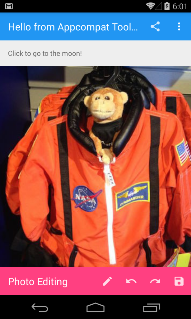
SupportActionBar.Title = "Hello from Appcompat Toolbar";
//..
}
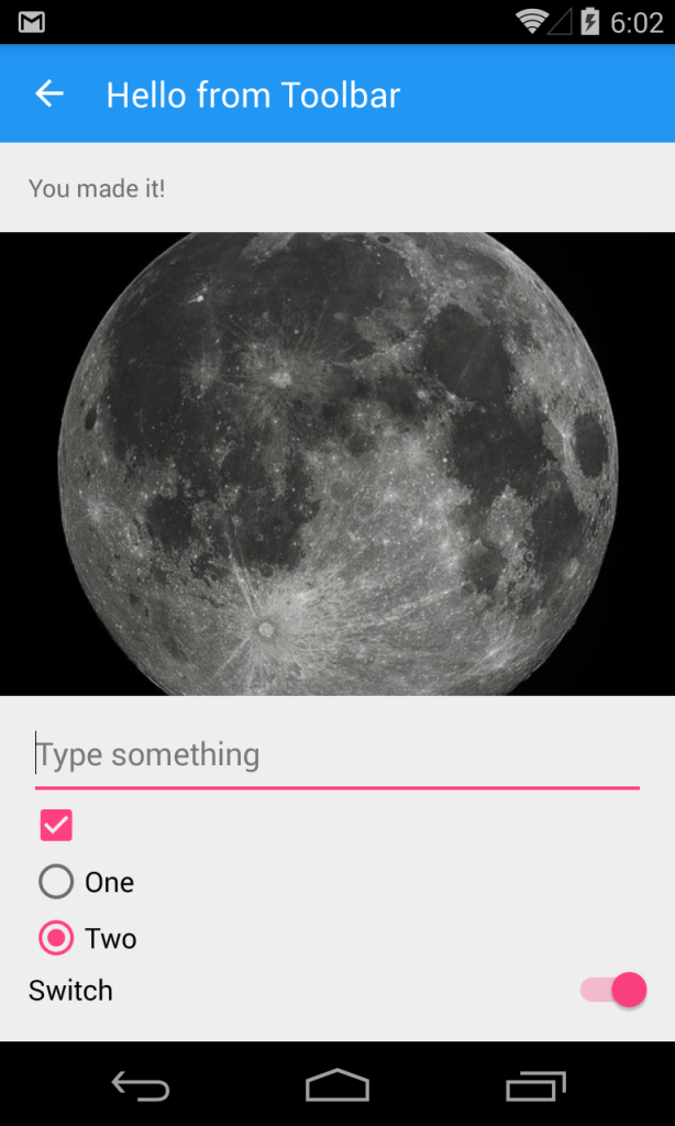
There you have it, you can now run your newly Material Themed Android application on devices that aren’t running Lollipop!
Learn More
You can get the full source code for this project in the Support v7 Sample gallery. There you will also find other awesome examples of more Support v7 libraries such as CardView, RecyclerView, and Palette. During Evolve 2014, Jérémie Laval and I gave two talks on Material Design from Concept to Implementation. (Part 1 and Part 2) that are available to watch now.
Discuss this post in the Xamarin forums.
 Light
Light Dark
Dark
0 comments