
Jetpack Compose foldable and dual-screen development
Hi Android developers,
We talked about using Jetpack Compose, the new Android UI toolkit for Microsoft Surface Duo development in a previous blog post. Now, Jetpack Compose is in beta. Combined with the use of Jetpack Window Manager, Jetpack Compose is more flexible for developing apps for dual-screen devices and even easier to extend to other foldable devices. You can check out the new dual-screen Codelab for using Jetpack Window Manager to learn more. Today, we would like to showcase some examples of dual-screen development using Jetpack Compose in different use cases.
When building or migrating applications for foldable and dual-screen devices, how to best leverage the dual-screen on these new form factors from a design perspective can be a challenge. We introduced five app design patterns which can be used in some common scenarios to help you expand your imagination.
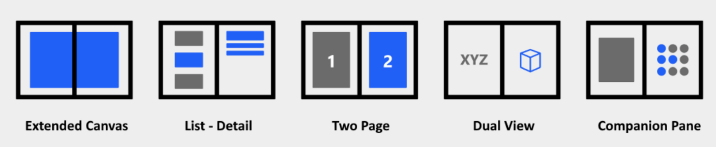
Figure 1: dual-screen app patterns
Extended Canvas
The Extended Canvas pattern is the simplest but still a powerful dual-screen pattern, which can be used in an application requiring a bigger canvas, such as a map, spreadsheet, or drawing. In an application with this pattern, zooming and dragging features are normally expected. In Jetpack Compose, the implementation of gestures is quite different from the traditional way in that no listener is required.
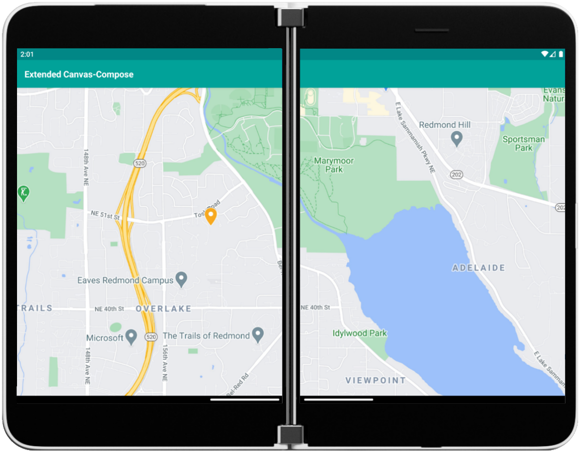
Figure 2: Extended Canvas Compose code sample
In the Extended Canvas Compose Sample, transformable modifier is used to detect panning and zooming changes. Additionally, PointerInputScope with the helper function detectDragGestures is used to control the whole zooming and dragging flow so we can handle zooming and dragging at the same time.
Modifier.graphicsLayer(
        scaleX = maxOf(minScale, minOf(maxScale, scale)),
        scaleY = maxOf(minScale, minOf(maxScale, scale)),
    )
    .offset { IntOffset(offset.x.roundToInt(), offset.y.roundToInt()) }
    .transformable(state = state)
    .pointerInput(Unit) {
        detectDragGestures(
            onDrag = { _, dragAmount ->
                offset = offset.plus(dragAmount)
            }
        )
    }
List-Detail
The List-Detail pattern includes a list view and a detailed view for content. When an item in the list is selected, the details pane is updated. This pattern is ideal for a wider viewing area and is frequently used for email, image gallery, address books, and so on.

Figure 3: List-Detail Compose code sample
As we mentioned in the previous blog post, to layout two views to fit a dual-screen (left/right) configuration, using the weight modifier inside RowScope is an easy solution to accomplish this. As you can see, the value of the weight modifier is set to 1 for both of the two child elements, which means the parent Row will be divided in half which aligns the two columns equally within the same space.
Row(
    modifier = Modifier.fillMaxSize(),
    horizontalArrangement = Arrangement.spacedBy(20.dp)
) {
    ListViewSpanned(
        modifier = Modifier
            .fillMaxHeight()
            .weight(1f)
    )
    DetailView(
        modifier = Modifier
            .fillMaxHeight()
            .weight(1f)
    )
}
When we build an application for foldable or dual-screen devices, single-screen scenario should always be kept in mind. For the application with a List-Detail pattern, the single-screen mode should provide a navigation between the list view and detail view. The Navigation component provides support for Jetpack Compose applications with the following dependencies.
dependencies {
      implementation "androidx.navigation:navigation-compose:1.0.0-alpha09"
  }
In the ListDetail Compose Sample, two route strings, list and detail, are created inside NavHost to define the path to two composable, which are the two views showing at the same time when in dual-screen mode.
val navController = rememberNavController()
NavHost(
    navController = navController,
    startDestination = "list"
) {
    composable("list") {
        ListViewUnspanned(
            navController = navController
        )
    }
    composable("detail") {
        DetailViewUnspanned(
            modifier = Modifier.fillMaxSize(),
            navController = navController
        )
    }
}
Two Page
The Two Page pattern provides a book-like paging experience, which is perfect for a reading application. There is no official ViewPager component in Jetpack Compose currently. So, we borrow the Pager implementation in the Jetpack Compose official sample JetCaster, and modify it to accommodate the dual-screen scenario inside the Two Page Compose Sample as shown below.
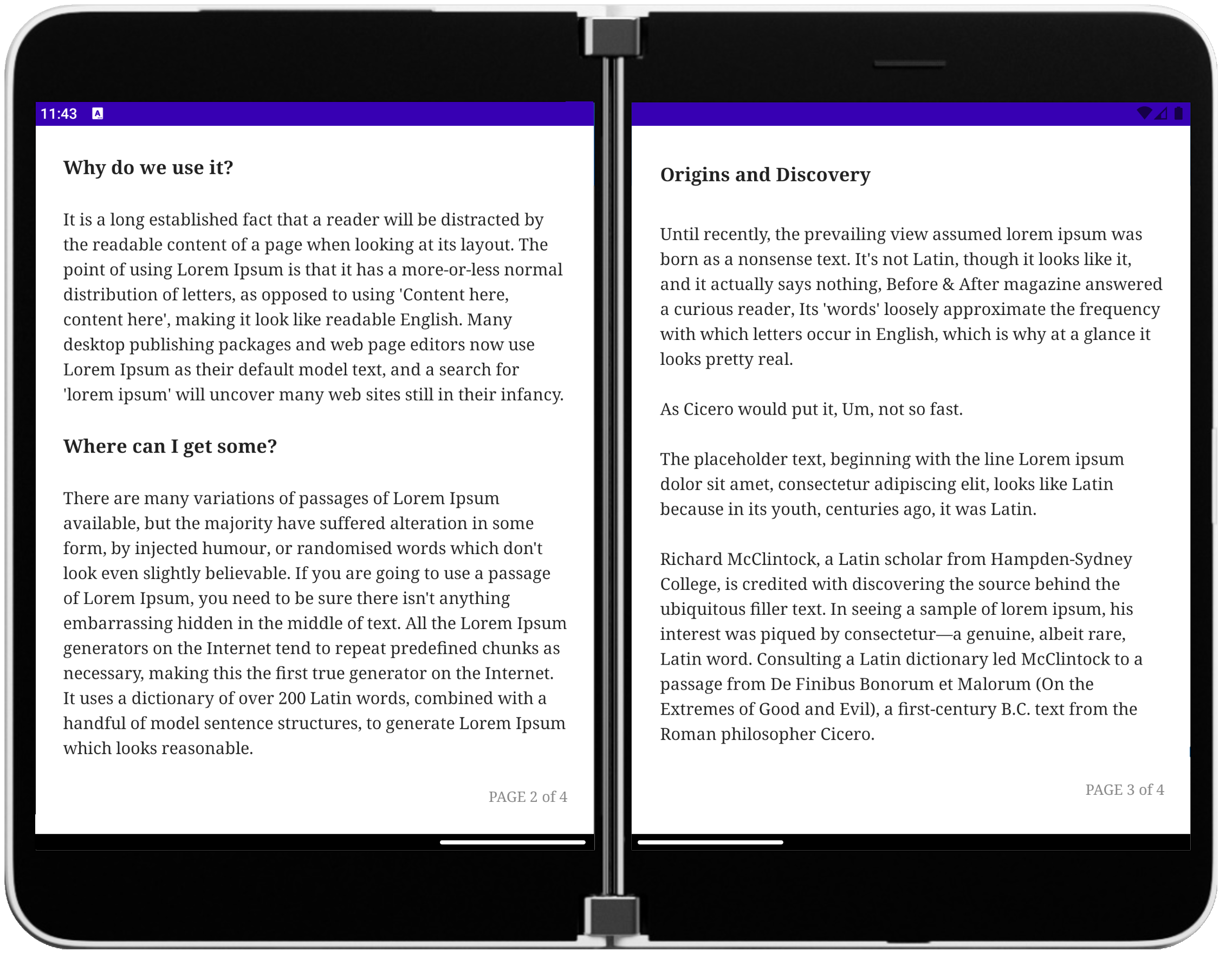
Figure 4: Two Page Compose code sample
We introduce a new property isDualMode to identify whether the application is in dual-screen mode or single-screen mode. Since we would open the two pages at the same time in dual-screen mode, we can stop scrolling when the paging reaches the second to last page.
var isDualMode: Boolean = false // support dual-screen mode
suspend fun snapToOffset(offset: Float) {
    val max = if (currentPage == minPage) 0f else 1f
    val lastPage = if (isDualMode) maxPage - 1 else maxPage
    var min = if (currentPage == lastPage) 0f else -1f

    _currentPageOffset.snapTo(offset.coerceIn(min, max))
}
We also need to adjust the layout to fit two screens with the hinge/seam in between, if available. We can obtain the hinge size from FoldingFeature inside Jetpack Window Manager, then pass it as a new parameter pagePadding into ViewPager we create.
var padding = if (currentPage < page && state.isDualMode) pagePadding else 0
val xItemOffset = ((page + offset - currentPage) * placeable.width + padding).roundToInt()
placeable.place(
    x = xItemOffset,
    y = yCenterOffset
)
Dual View
The Dual View pattern can be used to compare two versions of the same type of content side-by-side, like two images, lists, or documents. In the Dual View Compose Sample, we layout a list view and a map view together, like what we did in the List-Detail Compose sample above.
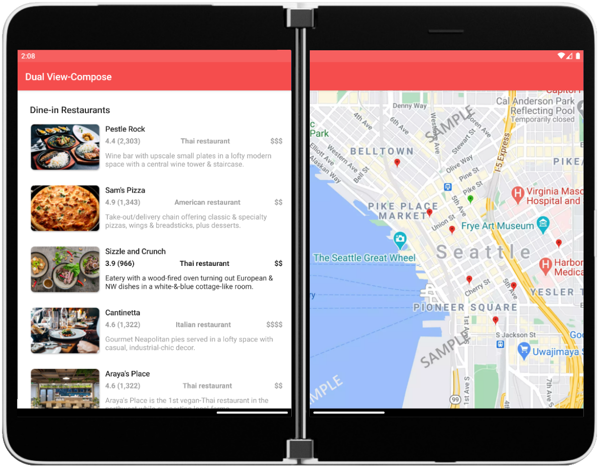
Figure 5: Dual View Compose code sample
The zooming and dragging is also provided for the map view here, the same as the Extended Canvas Compose sample. But we also need to make sure that the map view doesn’t cross the hinge from the right screen to the left screen and cover the list view when zooming or panning. To achieve this, the map view is put in a Box with clipToBounds modifier.
Box(modifier = modifier.then(Modifier.clipToBounds())) {
    scalableImageView(imageId = selectedMapId, isWide = isWide)
}
For the single screen mode of Dual View, a List/Map button in the top bar is created to switch between these two types of content with NavController.
TopAppBar(
    title = {
        Text(text = stringResource(R.string.app_name)
    },
    actions = {
        IconButton(
            onClick = {
                navController.popBackStack()
            }
        ) {
            Icon(painter = painterResource(id = R.drawable.ic_list))
        }
    }
)
Companion Pane
The Companion Pane pattern provides primary/secondary pane when the app is spanned to dual-screen. Media editing or game controls applications can benefit from this pattern. In the Companion Pane Compose Sample, there are four different containers built to hold four different layouts based on the device orientation and state:
- single portrait mode
- single landscape mode
- dual portrait mode
- dual landscape mode
For dual portrait mode (left/right), the weight modifier inside RowScope is used in the same way as in the List-Detail Compose sample. ColumnScope also provides a weight modifier, which can be used for dual landscape mode (top/bottom).
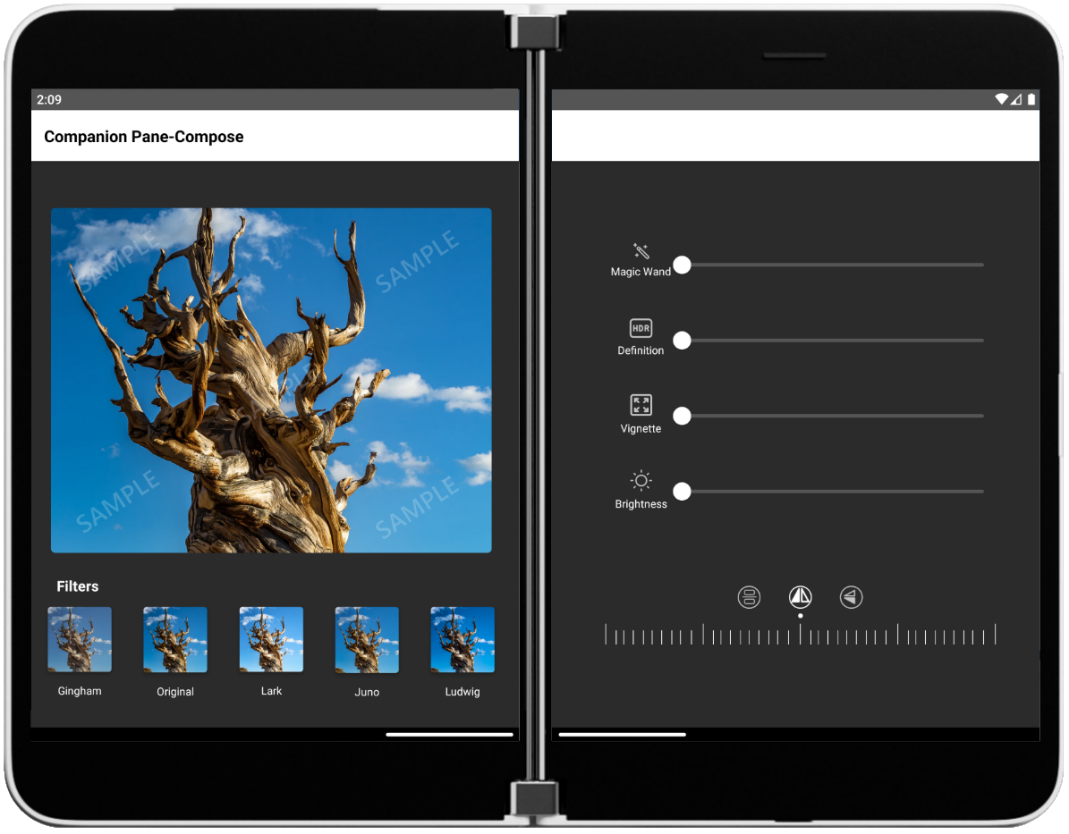
Figure 6: Companion Pane Compose code sample-dual portrait mode
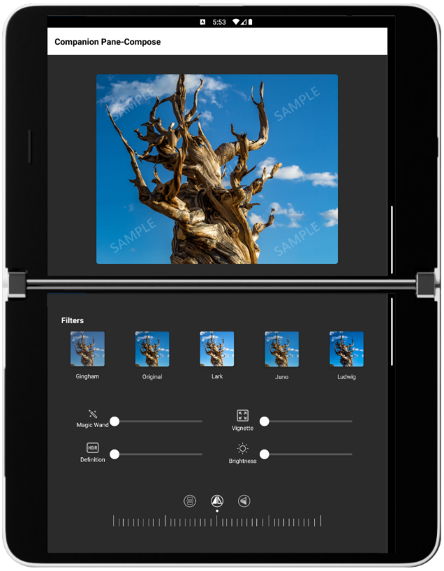
Figure 7: Companion Pane Compose code sample-dual landscape mode
As an image editing sample application, Slider is a very common component. In Jetpack Compose, with MutableState, it is very easy to detect and reflect the value of a selection change.
fun SliderControl(modifier: Modifier) {
    var sliderPosition by remember { mutableStateOf(0f) }
    Slider(
        value = sliderPosition,
        onValueChange = { sliderPosition = it },
        valueRange = 0f..100f,
        colors = SliderDefaults.colors(
            thumbColor = Color.White,
            activeTrackColor = Color.White,
            inactiveTrackColor = Gray
        ),
    modifier = modifier
    )
}
Resources and feedback
The source code here is available on GitHub; we’d love to hear your feedback or contributions to the project. You can also find them summarized in the Microsoft Samples Browser.
Check out the Surface Duo developer documentation and past blog posts for links and details on all our samples.
If you have any questions, or would like to tell us about your apps, use the feedback forum or message us on Twitter @surfaceduodev.
You can also chat with us on Twitch on Friday, March 26th at 11am PDT, where you can ask questions about Jetpack Compose or any other aspect of developing dual-screen apps for the Surface Duo!
 Light
Light Dark
Dark
0 comments