
Drag and drop library for Jetpack Compose
Hello Compose developers!
This week, we are excited to announce the release of DragAndDrop, a new utility library that will help you easily add interactive drag and drop capabilities to your app in Compose, following Google’s Drag and drop guidelines. It is the newest addition to Microsoft’s Compose SDK.
On dual-screen and foldable devices, one of the advantages of running multiple apps across screens is to share information between apps easily. To achieve this, drag and drop is definitely a feature that developers should think about bringing into their application.
Overview
The DragAndDrop library provides a drag container which represents the draggable area with long press gesture. The drag target wraps the drag data with a shadow during the dragging process. A drop container includes a dropping area to handle the detected drag data. Currently it supports image and text MIME types.
Drag and drop process
-
Wrapping your Composable with
DragContainerto define a draggable area where the drag and drop happens.@Composable fun DragContainer( modifier: Modifier = Modifier, content: @Composable BoxScope.() -> Unit ) -
Create
DragDatato represent the data to share with the metadata, includingMimeType.class DragData( val type: MimeType = MimeType.TEXT_PLAIN, val data: Any? = null ) enum class MimeType(val value: String) { IMAGE_JPEG("image/jpeg"), TEXT_PLAIN("text/plain"), UNKNOWN_TYPE("unknown") } -
Initialize a
DragTargetwith the createdDragDataand the Composable which would respond to the user’s drag gesture by long pressing. A shadow will be created for the target during the dragging process.@Composable fun DragTarget( dragData: DragData, content: @Composable (() -> Unit) ) -
Specify a Composable to handle the dropping event using
DropContainer. The lambdaonDragwill let you know whether the dragging gesture goes within the dropping area and the gesture finishes.@Composable fun DropContainer( modifier: Modifier, onDrag: (inBounds: Boolean, isDragging: Boolean) -> Unit, content: @Composable (BoxScope.(data: DragData?) -> Unit) )
Get started
Follow these steps to add the drag and drop library to your project:
-
Make sure you have
mavenCentral()repository in your top level build.gradle file:allprojects { repositories { google() mavenCentral() } } -
Add dependencies to the module-level build.gradle file (current version may be different from what’s shown here).
Implementation "com.microsoft.device.dualscreen:draganddrop:1.0.0-alpha01"
-
Also ensure the
compileSdkVersionandtargetSdkVersionare set to API 31 or newer in the module-level build.gradle file.android { defaultConfig { targetSdkVersion 31 } ... }
For more detailed instructions and API reference information, please refer to the DragAndDrop README.
Example usage
To see some examples of how to use this library, you can check out a few different samples, such as DragAndDrop sample in our Compose sample repo.
In the SDK repo, we created a small sample to showcase how to build the drag and drop feature using our library in only four steps as outlined above.
Before building the drag and drop feature, we need to decide where and how big the drag and drop area is. It could be part of your application, or the whole display area of the app. In this sample, we define the whole display area as the draggable area by using DragContainer mentioned in the first step of the building process.
For the drag part, firstly it is the DragData
, which represents the data the application allows sharing via the drag and drop feature. With our component, currently the app can share both text and image content using MimeType. In our sample, we create one text DragData and one image DragData, which is the second step.
The third step is to create DragTarget, which is the Composable the user can drag and move around by long pressing gesture. It could be any kind of Composable, a Box, a Column, Text, or an Image. During the drag and drop, the component will create a shadow of the DragTarget composable. In our sample, the text box “Drag me” is the DragTarget, which is a box with text inside. And the text is the DragData. The shadow is for the whole text box, but only the text is the content we are sharing.
Then for the drop part, we will handle the drop event and save the sharing content. The DropContainer provides a lambda onDrag to return whether the dragging gesture goes within the dropping area and the dragging gesture finishes. You could update your UI to tell the user where or when to drop the content. In the sample, we define four states and two lambdas to update UI to handle both text and image sharing at the same time.
var dragText by remember { mutableStateOf<String?>(null) }
var dragImage by remember { mutableStateOf<Painter?>(null) }
val updateDragText: (String?) -> Unit = { newValue -> dragText = newValue }
val updateDragImage: (Painter?) -> Unit = { newValue -> dragImage = newValue }
var isDroppingItem by remember { mutableStateOf(false) }
var isItemInBounds by remember { mutableStateOf(false) }
We change the background color of the drop box based on the dragging event. The drop box is white by default. Once the dragging event starts, the drop box would change to light purple color to tell the user where to go. When the drag gesture enters the bounds of the drop box, the “boxColor” would change again to dark purple. This lets the user know where they can drop the content to save it. Then the application can handle the content based on the “dragData”, to either update the UI or save the content.
DropContainer(
    modifier = modifier,
    onDrag = { inBounds, isDragging ->
        isDroppingItem = isDragging
        isItemInBounds = inBounds
    },
) { dragData ->
    val boxColor = if (isDroppingItem && isItemInBounds) Purple200 else if (isDroppingItem) Purple100 else Color.White
...
        dragData?.let {
            if (!isDroppingItem) {
                if (dragData.type == MimeType.TEXT_PLAIN) {
                    dragText = dragData.data as String
                }
                if (dragData.type == MimeType.IMAGE_JPEG) {
                    dragImage = dragData.data as Painter
                }
            }
        }
...
    }
}
Our sample works in both the single-screen mode and dual-screen mode inside one application. But you can also build the drag and drop feature across two applications.
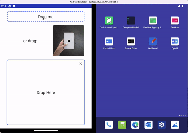 Figure 1. Animation showing drag and drop in single-screen mode
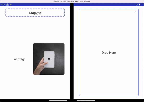
Figure 2. Animation showing drag and drop when spanned across two screens
Resources and feedback
Check out the Surface Duo Jetpack Compose developer documentation and past blog posts for links and details on all our samples. You can find our Jetpack Compose samples on GitHub.
If you have any questions, or would like to tell us about your apps, use the feedback forum or message us on Twitter @surfaceduodev.
Finally, join us live on Twitch at 11am PST to discuss the drag and drop feature, Jetpack Compose, and any other Surface Duo developer questions you might have.
 Light
Light Dark
Dark
0 comments