
Improving app accessibility with Jetpack Compose
Hello Jetpack Compose developers!
This week, we’d like to share how we started improving the accessibility of our Compose samples.
Accessibility in Android can relate to many different aspects of your apps, ranging from content descriptions and color contrast to layout hierarchy and touch target size. Regardless of where you start, know that improving accessibility will ensure better experiences for all users!
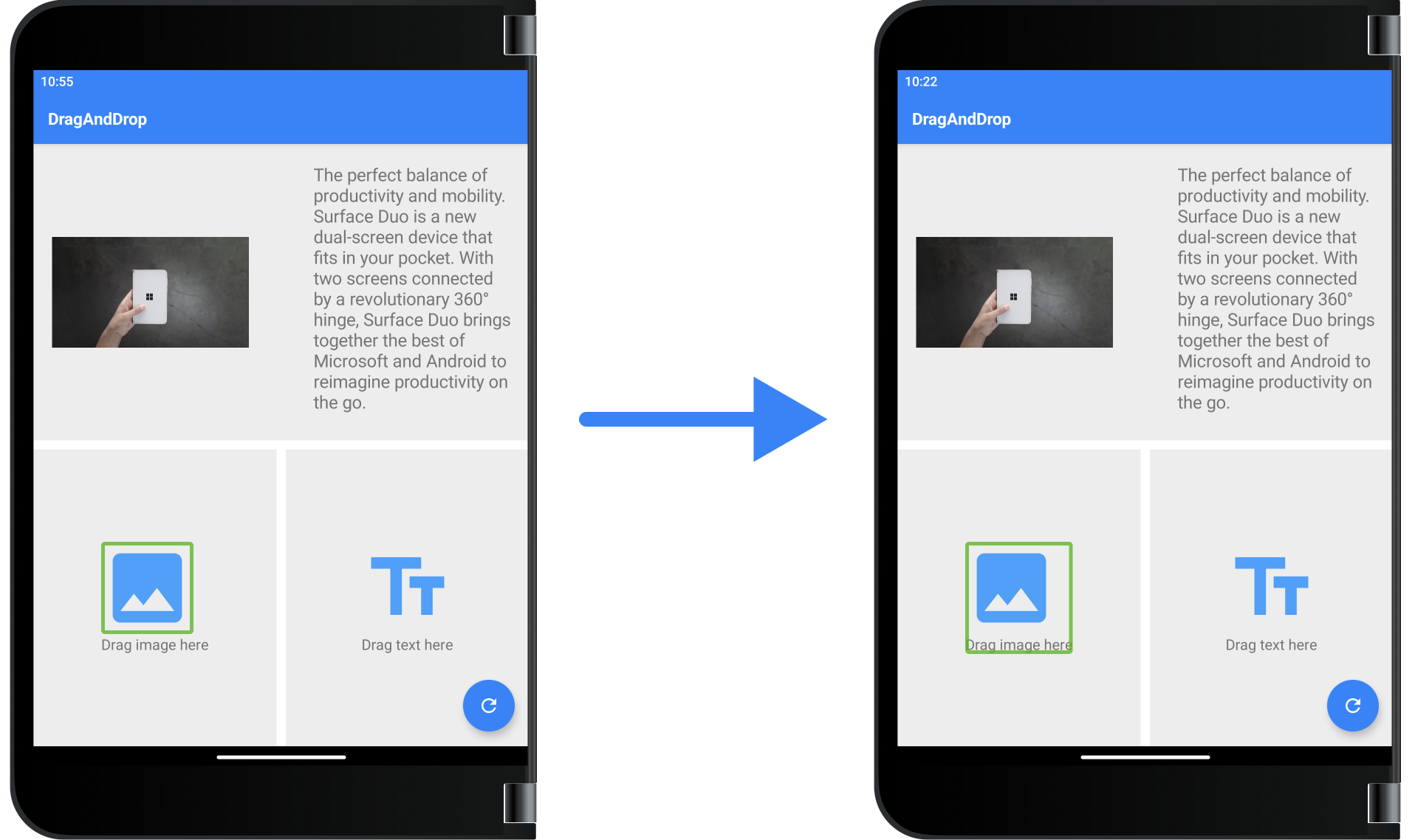
Figure 1. The DragAndDrop sample view groupings in TalkBack before and after accessibility updates.
Getting started
Before making any changes to the samples, we first started off by reading up on accessibility in Android applications, especially for apps built with Jetpack Compose.
Our team published an in-depth blog post on accessibility in a dual-screen application, and this offered a great introduction to popular accessibility testing tools and common accessibility issues. Since that blog post focused on updating an app built with Views, we then moved onto the Jetpack Compose accessibility page to learn more about Compose-specific issues. We also went through the Jetpack Compose Accessibility Codelab to see example improvements in code.
After doing all of this background research, we felt that accessibility improvements could be divided into three main categories:
- Design
Some app elements need to be changed at the design level to improve accessibility; this includes light/dark theme support, color contrast, and font size/weight. For these kinds of improvements, it’s great to work with a designer to make sure all Material Design accessibility guidelines are being followed while maintaining the desired appearance and user experience. The Designer’s Guide to Accessibility is a good resource to share with designers to help improve current and future apps!
- Code
Other app elements need to be updated strictly in code to add accessibility support. This could range from marking text as a heading or making sure all tough targets meet the minimum size requirements, and in general, these changes are simple to detect and fix. Many Compose Material components have already been designed with accessibility in mind, so sometimes these changes can be as easy as setting an optional property or using a specific component.
- Content
Finally, some app elements need to be discussed with overall app content in mind. Examples include choosing helpful images/icons, writing content descriptions, and deciding how views should be presented to screen readers through groupings and focus order. In our opinion, this is the most difficult category of improvement because it can be very subjective, so make sure to discuss and test these changes thoroughly.
Testing apps
Once we knew what to look out for, we started testing all the Compose samples with a few different tools:
- Accessibility Insights
- Accessibility Scanner
- TalkBack
Accessibility Insights
The Accessibility Insights for Android app can be installed on your computer and then used to evaluate layouts on your device via adb. For our samples, we ran checks in every posture to ensure that all versions of our layouts worked well.
Most of our samples passed these scans with no failed instances, but we did get some touch target size warnings for apps with LazyColumn elements that were partially scrolled.
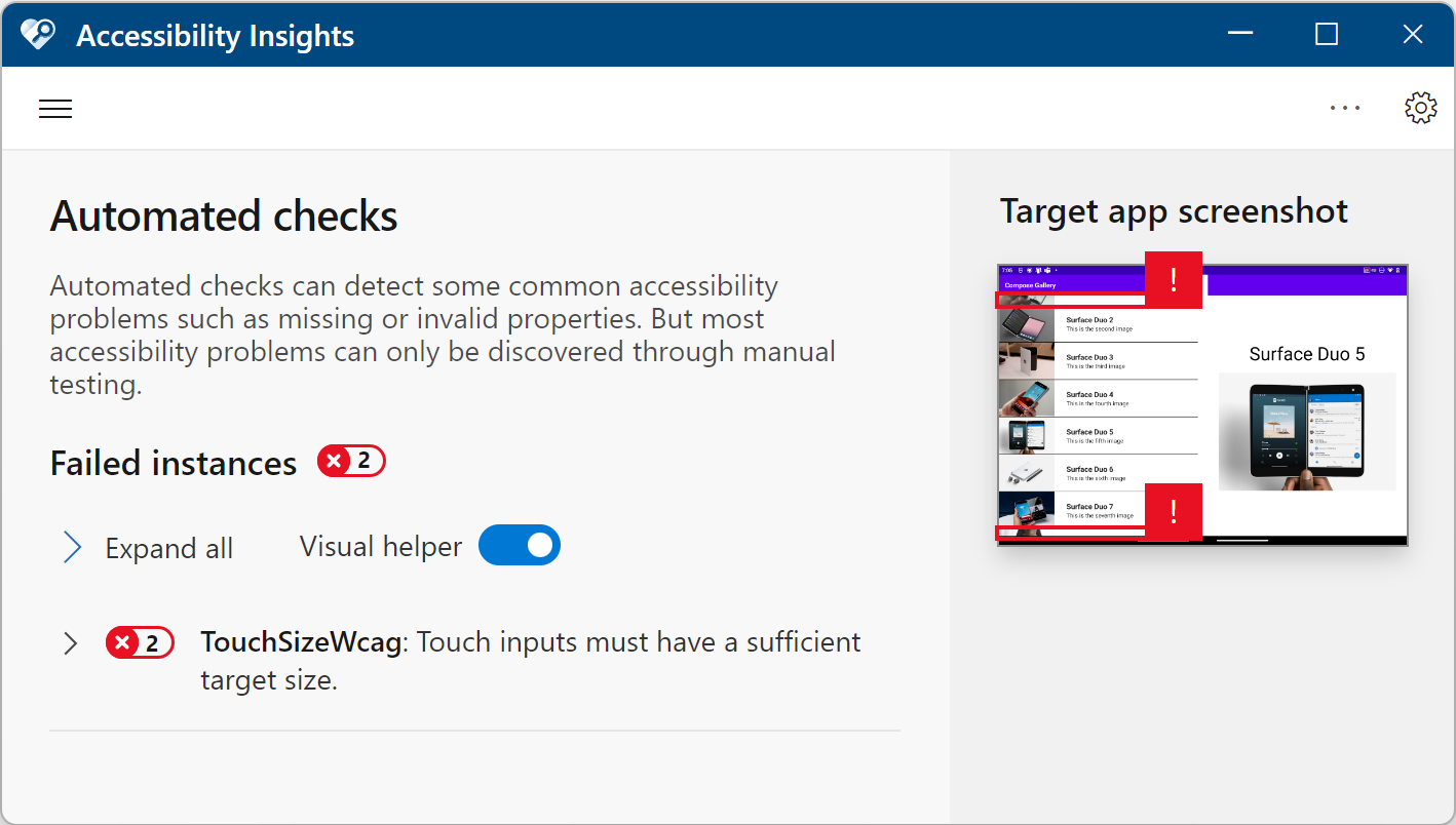
Figure 2. ComposeGallery sample with two touch target size warnings due to a partially scrolled LazyColumn in the Accessibility Insights tool.
Accessibility Scanner
The next tool we used was Accessibility Scanner, which can be downloaded on your device and used to assess screenshots or screen recordings of app behavior. As with the previous tool, we made sure to record and test our samples in every posture (for which the screen recording functionality was very helpful).
We found that this tool was more sensitive to color contrast issues, as we got a few more warnings related to color contrast with images.
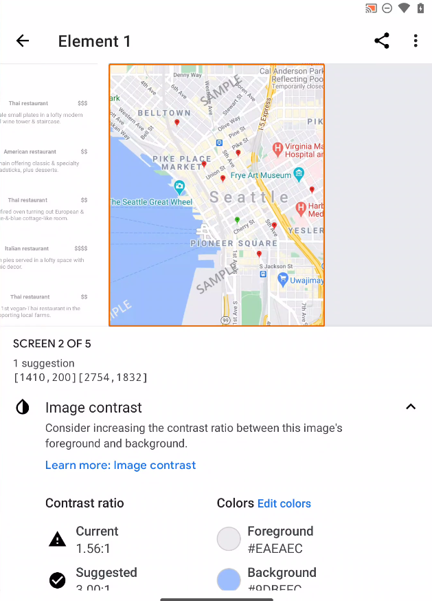
Figure 3. DualView sample with an image color contrast warning detected by Accessibility Scanner.
TalkBack
The last tool we used was TalkBack, which is a screen reader that you can download and enable on your device. You can then manually go through your app to check focus order, layout hierarchy, content descriptions, etc. This was actually how we detected the majority of the accessibility issues in our samples!
Making changes
After identifying accessibility issues in our samples, we started making changes in the code to address these issues. The majority of our updates were related to either content descriptions or semantics.
Content descriptions
The biggest misconception we had before looking into accessibility was that any content description was better than nothing! Throughout this learning process though, we found that repetitive or irrelevant content descriptions were more detrimental than simply omitting a description for certain visual elements.
In some cases, we decided to set the contentDescription field as null for an Image composable. This is recommended for decorative images that have no associated actions/states, such as the placeholder icons in the DragAndDrop sample. It’s also recommended to avoid repetitive information, such as the BottomNavigationItem icons in the NavigationRail sample, which are already described by their labels.
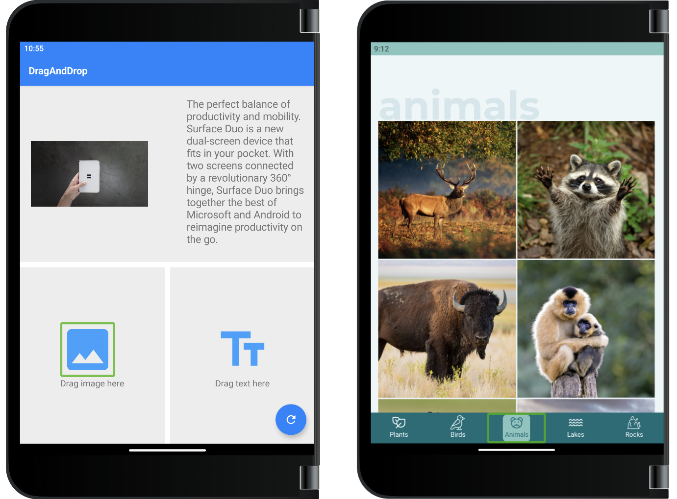
Figure 4. Examples of images/icons that should have null content descriptions.
In other cases, we found that we had to update the content description to include more helpful information. For example, our DualView sample used to have the restaurant name as the content description for its food images, but we realized this was repetitive when hearing about each restaurant item with a screen reader. Instead, we opted to describe the food in each image, which would provide more value to visually impaired users when trying to pick a restaurant to dine at.
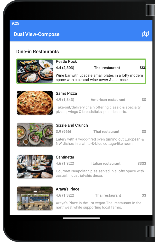
Figure 5. Example of images that provide value and should have thorough content descriptions.
Lastly, by manually testing with screen readers, we were also able to correct typos and bugs in content descriptions. We found that a content description containing “id” was pronounced like “it”, instead of “eye-dee”, so we were able to update the string to “ID” to solve this issue. We also realized that one of our descriptions was mixed up and actually performed the opposite action, so we were able to catch and fix this bug too.
Semantics
We also discovered that our samples could greatly benefit from updated semantics. In Jetpack Compose, elements can be described as nodes in the semantics tree, and as a developer, you have control over how nodes are grouped together and how they are described to accessibility services like screen readers.
Some of our changes involved adding special semantics properties to improve app navigability. One example would be adding the heading semantics property to text in our TwoPage sample.
The remainder of our semantics changes were related to how nodes were grouped. By merging elements in the semantics tree, we were able to improve the experience for users with screen readers.
For example, in the NavigationRail app, our ItemDetailView composable contains various icons and facts about the current nature item. Instead of cycling through each icon and string individually, we updated the semantics of our composables to group relevant icons and information together.
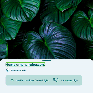
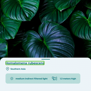
Figure 6. Animations of semantics node groupings before and after our accessibility changes in the NavigationRail app.
One important note is that, after making these semantics changes, you should rerun all UI tests. We had to update many of our UI tests afterwards to match the new semantics tree structure, as the Compose testing APIs rely on semantics properties and relationships to locate nodes!
Summary
Overall, we learned a lot about accessibility and accessibility tools. This update was a great start to improving our samples, but we realized that improving accessibility is a journey and we welcome any feedback or tips/tricks that you’ve learned yourself😊
Accessibility shouldn’t be an afterthought, and getting all team members involved in the process, from designers and technical writers to developers, will help drastically improve app quality and user experience.
To get started with improving your Jetpack Compose apps, just remember to:
- Read up on accessibility in Compose
- Manually test your apps with accessibility tools
- Make changes and test improvements with users
Feedback and resources
You can read more about Jetpack Compose for foldable devices in the Surface Duo developer documentation.
If you have any questions or would like to tell us about your dual-screen applications, use the feedback forum or message us on Twitter @surfaceduodev.
Finally, please join us every Friday on Twitch at 11am Pacific time to chat about Surface Duo developer topics!
 Light
Light Dark
Dark
0 comments