
Get insights into your team’s health with Azure Boards Reports
You can’t fix what you can’t see. That’s why high executing teams want to keep a close eye on the state and health of their work processes. Metrics like Sprint Burndown, Flow of work and Team Velocity give teams the visibility into their progress and help answer questions like:
- How much work do we have left in this sprint? Are we on track to complete it?
- What step of the development process is taking the longest? Can we do something about it?
- Based on previous iterations, how much work should we plan for next sprint?
With Sprint 155 Update, we are making it easier for teams to track these important metrics with minimal effort right inside Azure Boards. We are excited to introduce three new interactive reports: Sprint Burndown under the Sprints hub, and Cumulative Flow Diagram (CFD) and Velocity under the Backlogs and Boards hubs. The new reports are fully interactive and allow teams to adjust them for their needs.
For those of you who are familiar with the previous CFD, Burndown and Velocity charts in boards headers, these are now replaced with the enhanced reports.
Sprint Burndown Report
Burndown is a known Scrum concept, but tracking completed work overtime is not unique to Scrum. In fact, many teams track similar metrics as part of their daily sync. With Azure Boards, every day after you view your sprint board and review what everyone is working on, you can jump into the Analytics tab and evaluate your progress. Using the Sprint Burndown, you can instantly see the work completed so far and detect added scope. While best practices say you shouldn’t add work after the beginning of the sprint, we all know that happens and that is OK! Tracking the scope line helps to see if your team can still meet your goals. The Burndown report also helps you predict the completion of the work; no crystal ball needed! If the work assigned to this sprint is going to slip, you’ll see a red mark at the top of the chart. Knowing in advance gives the team an option to course correct and either reassign work, recruit more resources, or reset expectations.
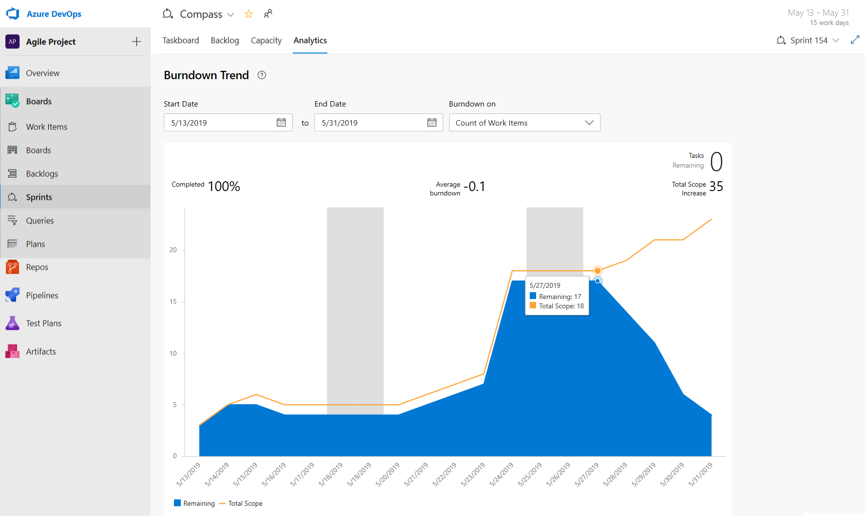
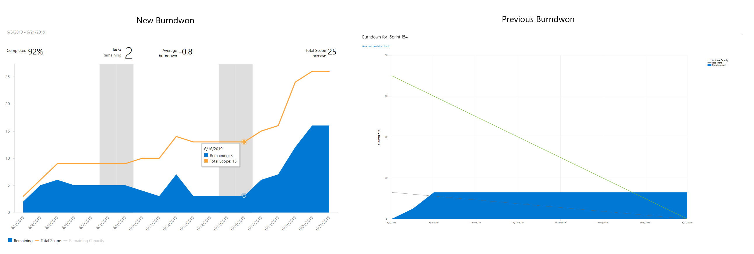
The Sprint Burndown is also great for retrospectives. For example, in the image above you can see Compass team’s sprint burndown at the end of Sprint 154. The team has completed 100% of the work as seen in the top left metric. You can also see that there was a scope increase (yellow line) on May 23rd, indicating that the team was able to take more work than planed and still finish on time (Go team compass!). Notice the below Burndown is using count of work items and not restricted to Remaining work like the previous chart. The dates are automatically set to the selected sprint. Changing them in the report will not affect the “official” sprint dates managed by your project admin. If you need help getting around you can click the ![]() icon next to the report’s title (Burndown Trend) to start a guided tour.
icon next to the report’s title (Burndown Trend) to start a guided tour.
What has changed?
Some of you might be familiar with a previous version of the sprint burndown displayed in the board header. Here are some of the changes and improvements to the burndown:
-
The location of the burndown moved from the header to the Analytics tab.

-
The chart is fully interactive, hover to browse trough the data points, click on the area chart to open a query of the items or click on any of the legend items to visually hide them from the chart.
-
We’ve added additional metrics like: percentage completed, average burndown and the total scope line. Read more about interpreting a Burndown chart . See image below for comparison.

- The Burndown metric supports Count of Work item or any other numeric field in the Iteration work item type. So the chart is useful even if you don’t use remaining work.
- Dates are flexible. For example, omit the first day of the official sprint dates that your team uses for planning without affecting the actual sprints dates.
- See non-working days like weekend represented by a gray watermark. So work done during the weekend is still showing in the chart.
Check Burndown documentation for more details on this report.
Cumulative flow and Velocity Reports
Kanban boards and Backlogs are widely used by teams to track and manage work. Usually, different Board columns represent different stages for completing work. It doesn’t matter if the team has as little as four columns (Todo; Doing; In PR and Done) or 10 columns tracking every step of the way. The flow in which work goes through the columns and the amount of work completed per iteration is the heartbeat of the team. Velocity and Cumulative flow diagram (CFD) reports help teams keep an eye on that heartbeat, recognize outliers, and monitor the load.
These new reports (found under the new Analytics tab in Boards and in Backlogs) have a high level metric shown in the menu below. These cards (showing live data) will give you a quick glance on the current state. They show the average Work in Progress and the average of Velocity for the selected team. Don’t worry If you know your numbers by heart to detect a change. Just click on the cards to see the full report showing the trends and more insights. 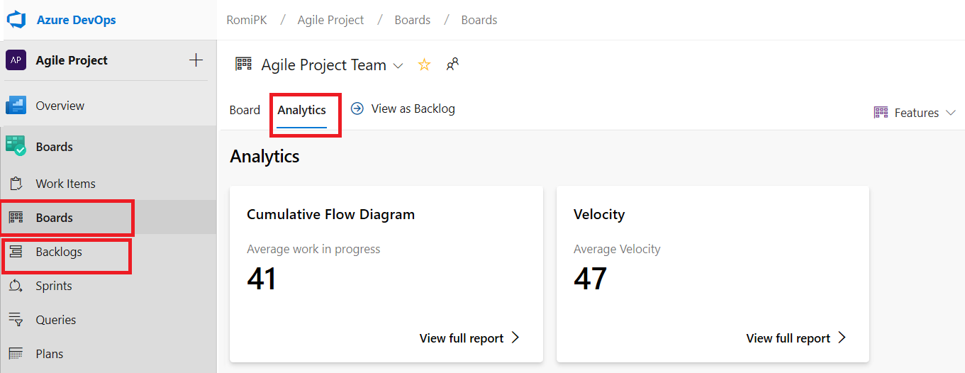
Velocity
We often hear about teams who are stuck in a vicious cycle. They don’t have a stable throughput so they can’t plan correctly and if they don’t plan the amount of work, their throughput is inconsistent. That is where Velocity can help. The Velocity report gives visibility into the amount of work that was delivered each sprint over time. It also exposes the delta between the work that was planned and completed or completed late. Teams should use velocity as a guide for determining how well the team estimates and meets their planned commitments. It’s important to note that tracking velocity over time is not about achieving a higher number per iteration and should not be used a method of comparison between teams! It should be used to improve planning. If the trend is steady teams can use their average number as a threshold for their next sprint commitment.
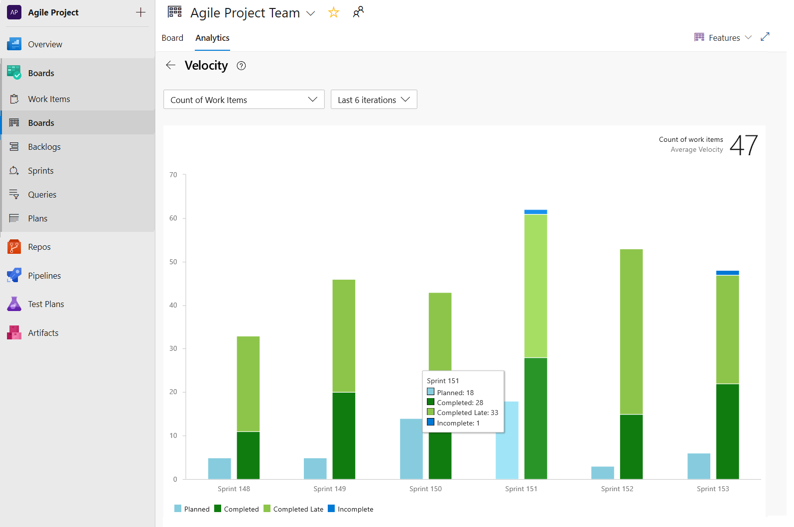
This report replaces the old velocity chart and enhances it: – Now it’s possible to monitor velocity for all backlog levels by simply swapping the selected backlog on the top right corner. – You can also configure the Velocity metric. For example, using Sum of Story point if your team uses User story estimation.
Cumulative flow diagram (CFD)
As the name suggests, the cumulative flow diagram (CFD) helps teams track how well workflows throughout their processes. The stacked area chart shows, at each time interval, the number of items in each column. As time goes by, the chart shows the flow of items through the process. We call it “cumulative” because we’re not measuring the incremental change from interval to interval – we’re always counting every item in each stage, regardless of whether it was in that stage during the last measurement. Seeing the columns trends is very valuable. For example, flat lines for in multiple columns may indicate that work takes longer than planned for. A bulge in a line might indicate that work has built up in one column and it isn’t moving through. More on how to read a CFD can be found in here. The lead metric is WIP. A high number of WIP might for the team might result in context switching and a potential sign that the team is overcommitted is the resources aren’t allocated accordingly. 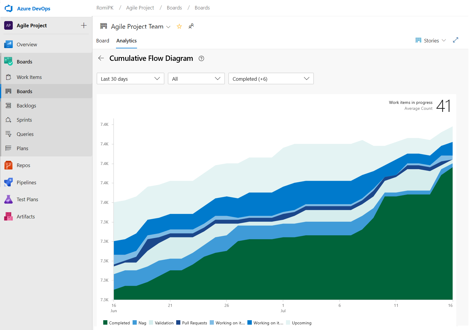
This report replaces the old CFD chart and enhances it: – Control the time periods. Pick from a list or customize your own. – Add and remove board columns to gain more focus on the flow your team controls. – Pick and choose the Swimlines.
Share your feedback with us
Read more about the new Azure Boards reports in the documentation, or watch this live demo.
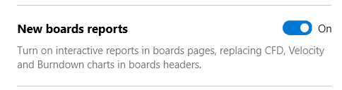
The new reports preview is turned on by default. If you experience any issues, please post on the Developer Community. You can also temporarily go back to the previous chart using Preview features. Toggle the “New Boards reports” as shown in the image below.
 Light
Light Dark
Dark
0 comments